Plotting with Seaborn - Part 1
Seaborn and the Python Visualization Landscape
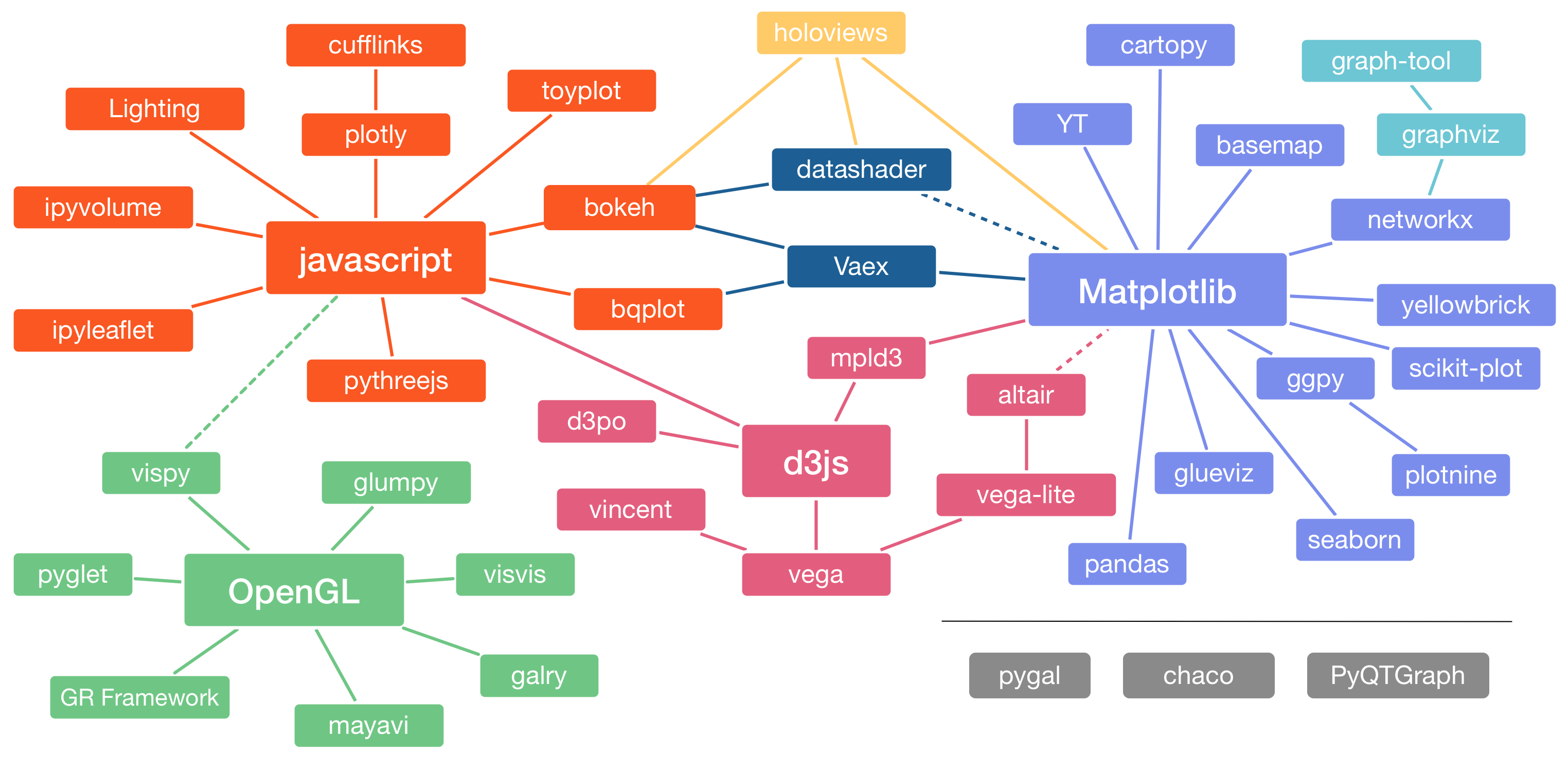
The python visualization landscape is complex and can be overwhelming. How did it get there? (see Jake Vanderplas’ talk at PyCon 2017)
Yet when it comes to data science and machine learning, seaborn is the definitive data visualization library.
Seaborn provides a high-level interface to matplotlib and is compatible with pandas’ data structures. Given a pandas dataframe and a specification of the plot to be created, seaborn automatically converts the data values into visual attributes, internally computes statistical transformations and decorates the plot with informative axis labels and legends. In other words, seaborn saves you all the work you normally have to do when using matplotlib. And if you have already used matplotlib, you know how long it sometimes takes to modify even a small part of your plot.
Nevertheless, to take full advantage of both worlds: the high-level API of seaborn and the deep customizability of matplotlib, it is worthwhile to have some knowledge of the concepts and functions of matplotlib.
But before I cover some important concepts of matplotlib, I would first like to show you the aesthetic difference between the two libraries with a simple example.
Seaborn vs. Matplotlib
This section serves as motivation to learn seaborn. I will use the same random-walk example from Jake Vanderplas’ book [1]. The same code with more comments can be found on the author’s github.
We start by importing the required python libraries. By convention, seaborn is imported as sns.
# imports
import numpy as np
import pandas as pd
import matplotlib.pyplot as plt
import seaborn as sns

# Notebook settings
# Global figure size
plt.rcParams['figure.figsize'] = 9, 4
Then we create some random
# Create random walk data:
rwlk = np.random.RandomState(123)
x = np.linspace(0, 10, 500)
y = np.cumsum(rwlk.randn(500, 6), 0)
# Plot the data with matplotlib defaults
plt.style.use('classic')
plt.plot(x, y)
plt.legend('ABCDEF', ncol=2, loc='upper left');
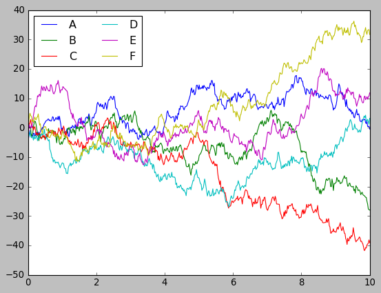
It’s remarkable how similar it looks to Matlab. In this aspect, matplotlib has excelled. Not only does it have a Matlab-like interface, but the graphics are also very similar. In my opinion, this is one of the major points that made python so successful today. However, I have to admit that, although the diagrams are complete in terms of information, they are not very visually appealing.
Let’s plot the same data using seaborn with its default settings, to see what I mean.
sns.set()
# same plotting code as above
plt.plot(x, y)
plt.legend('ABCDEF', ncol=2, loc='upper left');
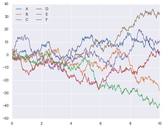
That looks much better, what do you think?
Before you read on, you might want to take a look at the seaborn gallery. It gives an insight into the different types of plots you can generate with seaborn. The thing to note is the wide range of plots and especially the beautiful and professional look they have. In fact, when plotting with seaborn, you don’t have to do the work twice, by that I mean, the plots you create during your exploratory data analysis could be used to communicate your findings to your stakeholders.
A key to success in your role as a data scientist is the ability to effectively communicate your findings visually to a variety of audiences. At least, in a way that accommodates engineers and their desire for detail, while being understandable and simple for managers and different levels of leadership.
The Artist Layer
Matplotlib’s architecture consists of three tiers: Backend layer, Artist layer and the scripting layer. The Artist hierarchy is the middle layer of the matplotlib stack and it is the place where much of the heavy lifting happens.
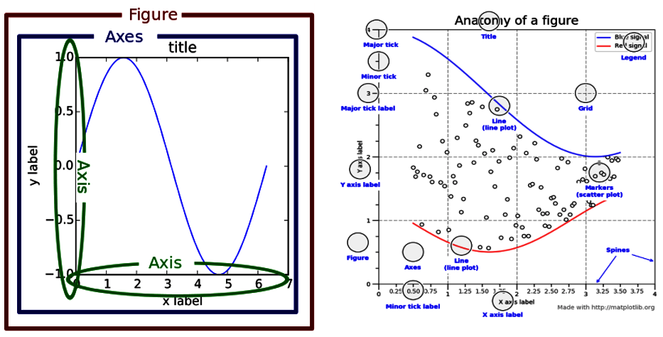
Every single component from the above pictures is an Artist instance and can be accessed and modified with matplotlib. Therefore, if you want to learn how to customize your seaborn charts, the artist is a good place to start.
As you will see below, the seaborn diagrams are usually very well designed and do not require any additional fine-tuning of the plots. In fact, you will be most productive if you focus only on seaborn and leave the design of the artist instances to seaborn.
However, before we go any further and to better understand how seaborn works, it is important to understand the concepts behind the following classes; also known as containers: Figure, Axes and Axis.
Figure
This Artist class refers to the whole figure that you see. It is possible to have multiple sub-plots (Axes) in the same Figure instance.
# create a figure with 4 axes
fig, ax = plt.subplots(nrows=2, ncols=2)
# Annotate the first subplot
ax[0, 0].annotate('This is an Axes',
                  (0.5, 0.5), color='r',
                  weight='bold', ha='center',
                  va='center', size=14)
# Set the axis of the second axes to x = y = [0, 3]
ax[0, 1].axis([0,3, 0,3])
# Title of the figure
plt.suptitle('One Figure with Four Axes', fontsize=18);
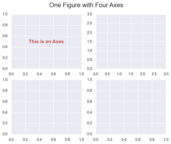
Axes
In the previous example, we plotted a Figure object containing four Axes instances. Axes object refers to the region of the image with the data space. Figure can contain multiple Axes, but a given Axes can only be in one Figure. Axes contains two (or three in the case of 3D) Axis objects [2].
print(fig.axes)
[<AxesSubplot:>, <AxesSubplot:>, <AxesSubplot:>, <AxesSubplot:>]
Axis
Axis instance refers to an actual axis (x-axis/y-axis) in a specific Axes object.
# print the axis of the first axes from the above figure
print(ax[0, 1].axis())
(0.0, 3.0, 0.0, 3.0)
Now that we have reviewed the basics of matplotlib’s Artist layer, lets move on to seaborn plotting functions.
Overview of Seaborn Plotting Functions
In seaborn, each plotting function is either a Figure-level function or an Axes-level function. Grasping the difference between both functions is essential.
Axes-Level Functions
An Axes-level function makes self-contained plots and has no effect on the rest of the figure. They behave like most plotting functions in the matplotlib.pyplot namespace. They plot data onto a single matplotlib.pyplot.Axes object. Thus, they can coexist perfectly in an object-oriented matplotlib script.
The following example illustrates how seaborn axes-level functions and matplotlib plots can coexist together, in the same figure.
# we start by loading our dataset
penguins = sns.load_dataset('penguins')

# Then we create a figure with two axes using matplotlib
fig, axs = plt.subplots(1, 2, figsize=(8, 4), gridspec_kw=dict(width_ratios=[4, 3]))
# We use sns to generate the scatter plot on the first subplot
sns.scatterplot(data=penguins, x="flipper_length_mm", y="bill_length_mm", hue="species", ax=axs[0])

# Finally, we use matplotlib to create a bar chart on the second subplot
xy = dict(penguins['species'].value_counts())
axs[1].bar(xy.keys(), xy.values(),
           color=['royalblue','darkseagreen','darkorange']);
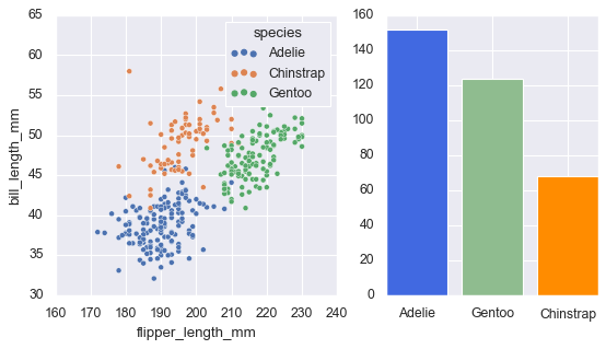
I hope you now have a better understanding of what axes-level functions are and how they co-exist with matplotlib plots.
In the Exploring seaborn’s Common Types of Plots section, we will introduce the most important axis plots that every data scientist needs in their toolkit.
Figure-Level Functions
Figure-level functions, on the other hand, control the entire figure. They create a new figure every time they are invoked and return a FacetGrid object that contains one or more subplots.
Each figure-level function corresponds to several axes-level functions that serve similar purposes.
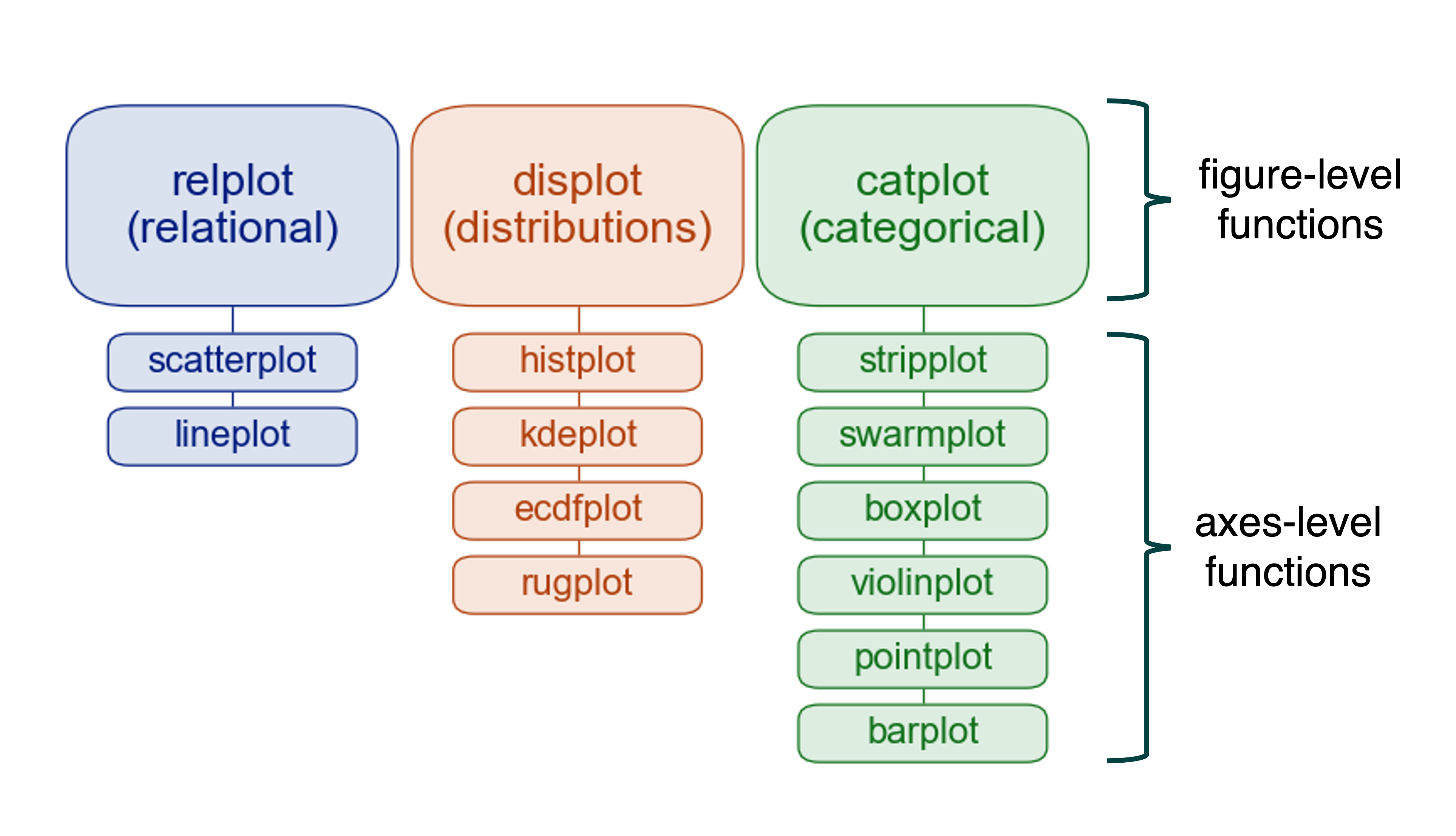
For example, the sns.displot() function is the figure-level function for kernel density estimates (kde).
To draw a kde plot, on a figure-level, we do as follows:
# We create a displot figure then we set kind="kde"
sns.displot(data=penguins, x="", hue="species",
             multiple="stack", kind="kde")
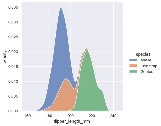
To get such a visually appealing figure with matplotlib, we need more than just one line of code. However, the most interesting thing about the figure-level functions is not the appearance of the figures, but rather the ability to draw multiple instances of the same plot on different subsets of data. Indeed, they are tailor-made for this use case –More about this in a later section.
Exploring Seaborn’s Common Types of Plots
In this section I will summarize the most basic plots using different data sets. As you will notice, all the functions listed below, are axes-level functions, and this for two major reasons:
- This type of plots can be easily integrated as a subplot into matplotlib figures.
- I prefer to use the figure-level functions for more complex use cases. There will be more about that in a later section.
Remember, however, that the same plot generated using an axes-level function can be obtained using the corresponding figure-level function.
For a more extensive tutorial check seaborn’s official webpage.
Bar Plots
The bar plot is perhaps the most common chart when it comes to visualizing categorical variables. It consists of plotting a set of bars, with their heights usually reflecting the mean value of the dependent variable.
To illustrate this, we are going to use the employee.csv dataset.
# load data
df = pd.read_csv('data/employee.csv')
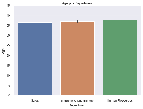
Seaborn comes with four default settings that allow you to set the size of the plot and customize your figure depending on the type of your presentation. Those are: paper, notebook, talk, and poster. The notebook style is the default. You can switch between those styles by using the command sns.set_context().
sns.set_context("notebook", rc={"figure.figsize": (10, 6)})
sns.barplot(x=df['Department'],
            y=df['Age'])
# change the limits of the y axis
plt.ylim(0, 45)
plt.title('Age pro Department');
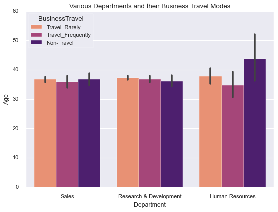
We could also change the color palette of the seaborn plots. Basically, seaborn has six variations of the matplotlib’s color palette: deep, muted, pastel, bright, dark, and colorblind.
In the next figure we are going to display a set of vertical bars with nested grouping by three variables:
# plotting the chart
sns.barplot(x=df['Department'], y=df['Age'],
            hue=df['BusinessTravel'],
            palette='magma_r')
plt.title('Various Departments and their Business Travel Modes');
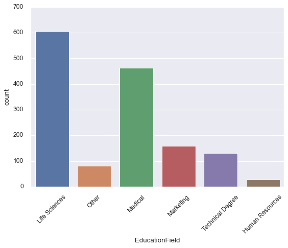
Count Plots
While sns.barplot() shows point estimates, along with the confidence intervals using bars for each category, sns.countplot() on the other hand displays the count of each category using bars.
sns.countplot(df['EducationField'])
# Change the angles of the text on the x ticks
plt.xticks(rotation = 45)
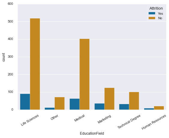
As for bar plots, we could also display a set of count bars with hue:
# plotting a count plot with hue
sns.countplot(x=df['EducationField'],
              hue=df['Attrition'],
              palette='colorblind')
plt.xticks(rotation=30);
Line Plots
The line plot in seaborn is more advanced than the usual line plots from matplotlib and other visualization libraries. By default, the plot aggregates over multiple y values at each value of x and shows an estimate of the central tendency and a confidence interval for the estimate.
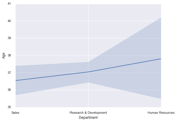
We start by plotting a simple line plot:
sns.lineplot(x=df['Department'],
             y=df['Age']);
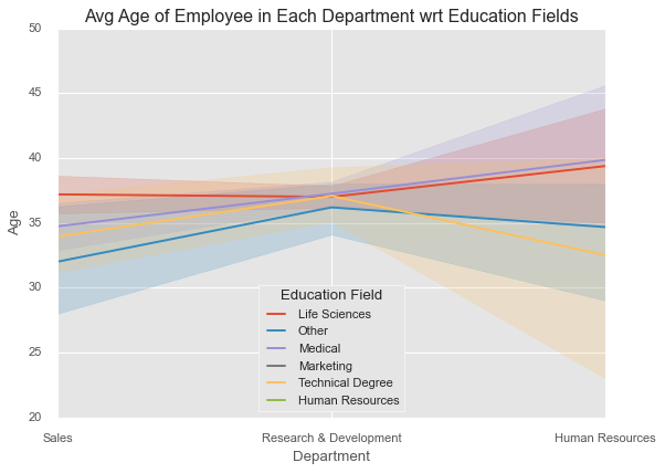
Let’s now introduce a hue into our plot:
plt.style.use('ggplot')
sns.lineplot(x=df['Department'],
             y=df['Age'],
             hue=df['EducationField'])
plt.legend(loc='lower center', title='Education Field')
plt.title('Avg Age of Employee in Each Department wrt Education Fields');
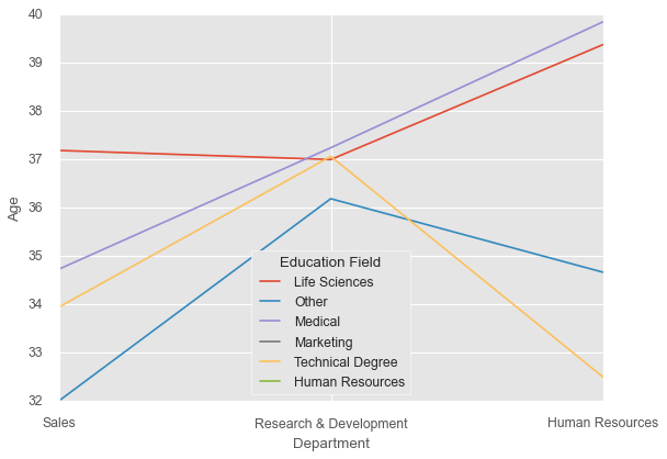
The computation of confidence intervals can take a lot of time, particularly when dealing with large datasets. It is possible to disable them, if not needed:
sns.lineplot(x=df['Department'],
             y=df['Age'],
             hue=df['EducationField'],
             ci=None
             )
plt.legend(loc='lower center', title='Education Field');
Scatter Plots
Scatter plots are commonly used to visualize bivariate data. They use dots to represent the values in a Cartesian coordinate system, with each coordinate representing one variable. We can add more dimensions to the plot by coding the dots, namely through modifying their colour, shape or/and size.
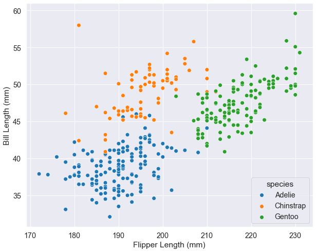
In this section we are going to use the penguins dataset from above. It contains body measurement of three penguin species: Adelie, Gentoo and Chinstrap.
penguins = sns.load_dataset('penguins')
We start by visualizing the bill length as a function of the flipper length with the penguin species as hue. To better visualize the plot, we change some of the default settings of the “notebook” plot style.
# use the tick style
sns.set_style('darkgrid')
# change the font and figure size of the notebook
sns.set_context("notebook", font_scale=1.3,
                rc={"figure.figsize": (10, 8)})
# s: size of the dots
sns.scatterplot(data=penguins, x="flipper_length_mm",
                y="bill_length_mm", hue="species", s=60)
# set x and y labels
plt.xlabel("Flipper Length (mm)")
plt.ylabel("Bill Length (mm)");
We may add two more dimensions to our diagram. However, this is not recommended as the visualization can become rather confusing.
markers = {'Male':'o', 'Female':'X'}
# change the font and figure size of the notebook
sns.set_context("notebook", font_scale=1.2,
                rc={"figure.figsize": (10, 8)})
sns.scatterplot( x="flipper_length_mm", y="bill_length_mm",
                hue="species",  style='sex', size="body_mass_g",
                data=penguins, markers=markers,
                sizes=(20,300), alpha=.5)
plt.legend(ncol=2, loc=4)
# set x and y labels
plt.xlabel("Flipper Length (mm)")
plt.ylabel("Bill Length (mm)");
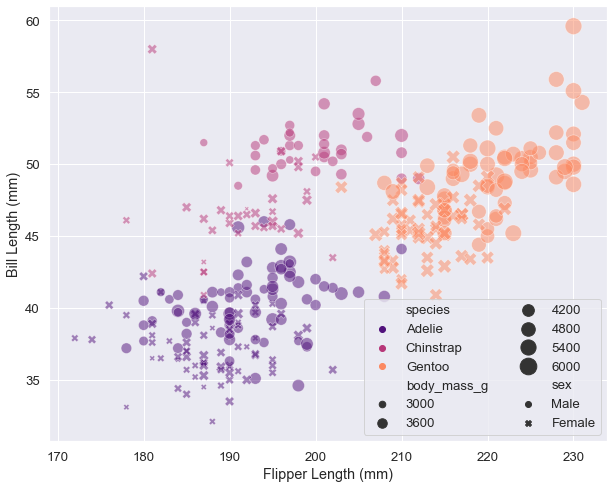
Sometimes you have no choice but to use a figure-level function to display a simple plot. For the obvious reason that the legend is displayed outside the axes, particularly if the data is scattered over the entire plane, so that there is no optimal place left for it. In my experience, such a case occurs rarely, and in general it means that you are using the wrong visualization for the data in question.
Let’s however simulate such a case: Imagine that you want to plot the salaries as function of age, department and years at the company for all the employees in their 30s (Who want to da that?!). Your plot using axes-level function would look as follows:
plt.rcParams["figure.figsize"] = 8, 5
plt.style.use('fivethirtyeight')
# Let's add a size element in the plot

sns.scatterplot(x=df['Age'],
                y=df['MonthlyRate'],
                hue=df['Department'],
                size=df['YearsAtCompany'],
                sizes=(20, 200),
                alpha=.3)
plt.xlim(29.5, 45.5)
plt.title('Age vs Monthly Rate');
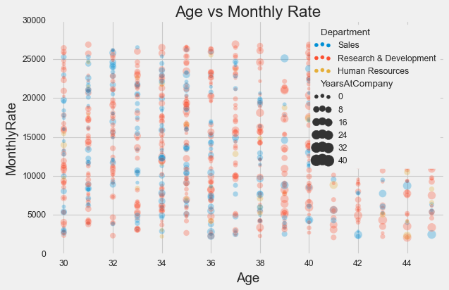
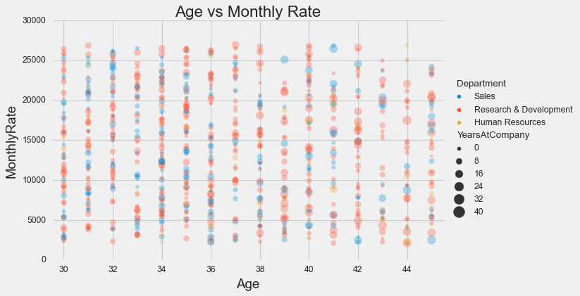
As you can see, a lot of information is lost due to the legend, and you definitely can’t remove it. One quick solution would be to use the corresponting figure-level function. That is, in the case of a scatter plot: sns.relplot(**kwargs, kind="scatter").
sns.relplot(x=df['Age'],
            y=df['MonthlyRate'],
            hue=df['Department'],
            size=df['YearsAtCompany'],
            sizes=(20, 200),
            alpha=.3, kind="scatter",
            height=5, aspect=8/5
           )
plt.xlim(29.5, 45.5)
plt.title('Age vs Monthly Rate');
Heat Maps
A heatmap is a two-dimensional graphical representation of data where the individual values that are contained in a matrix are represented as colors. The heatmap is very useful when it comes to displaying pairwise correlations between every feature of a dataframe. To illustrate this we will load in another pandas data frame example from seaborn for the survival status of individual passengers on the Titanic.
titanic = sns.load_dataset('titanic')
# Heat map with seaborn
sns.heatmap(titanic.corr(),  annot=True, cmap='GnBu');
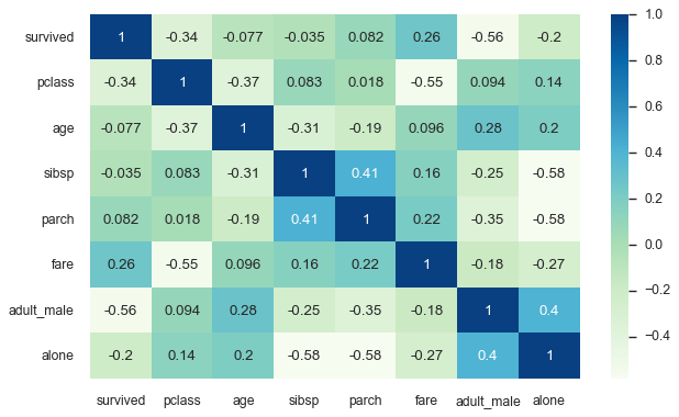
Heat maps are also very useful when it comes to missing data. It is often easier to leave them out and continue working with the remaining data. I think useful information can be found in the reasons for the dropouts, and it is often worth looking at them more closely. In fact, they often provide a better understanding of how the data was collected, and may help reveal certain patterns.
Let’s take a look at the missing data in the titanic dataframe:
sns.heatmap(titanic.isnull(),yticklabels=False,cbar=False,cmap='YlOrRd');
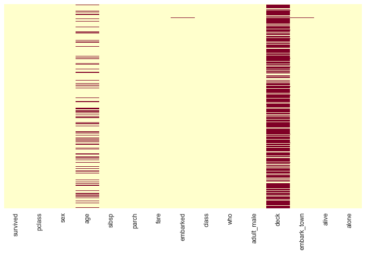
The red dashes represent missing values.
If you want more insight about the missing data you have, consider installing the missingno library. It does just that and works flawlessly on top of seaborn and matplotlib.
Histograms
Histograms are another important type of visualization that is widely to analyze the distribution of a variable.
They provide information about the central tendency, the dispersion and the shape of a variable and can help identify outliers and other anomalies in your data.
Histograms in seaborn are plotted with sns.histplot() and it comes with several advanced features.
To plot the flipper length distribution of all penguins along the x axis:
sns.histplot(data=penguins, x="flipper_length_mm");
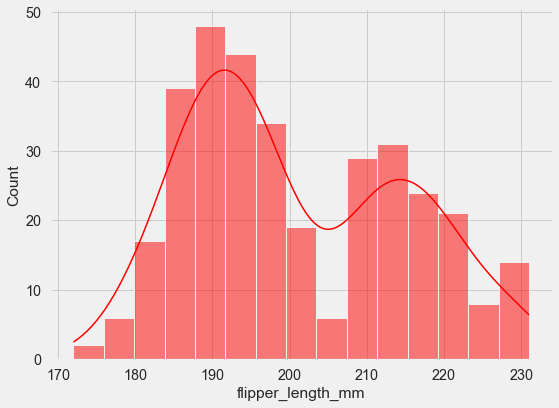
We can also define the total number of bins and add a kernel density estimate to smooth the histogram and provide more information about the shape of the distribution.
sns.histplot(data=penguins, x="flipper_length_mm",
             kde=True, color='red', bins=15);
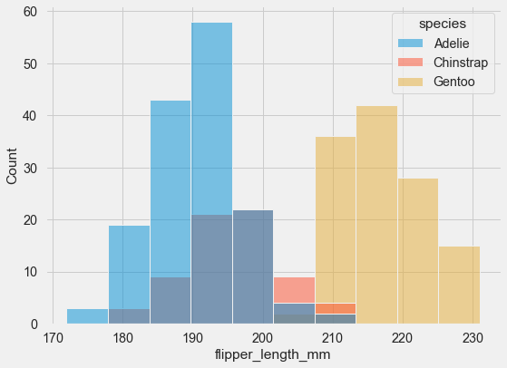
You can plot multiple histograms on the same axes using hue mapping:
sns.histplot(data=penguins, x="flipper_length_mm", hue="species");
Overlapping bars can be hard to visualize. An alternative approach would be to plot a step function.
sns.histplot(data=penguins, x="flipper_length_mm", hue="species", element="step);
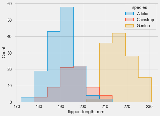
As you can see, seaborn automatically set an alpha value to the plot, to make it more readable.
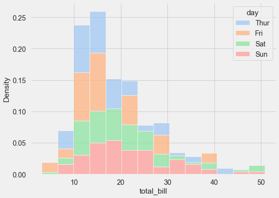
If you have variables that differ substantially in size (as in the tips dataset), use indepdendent density normalization:
sns.histplot(
    tips, x="total_bill", hue="day", multiple="stack",
    stat="density", common_norm=False,
    palette='pastel'
);
I will stop here, however there is much more you can do with the histogram function from seaborn. You can find a more detailed tutorial on histograms under the following link.
Box Plots
Box plots allow to visually assess a lot of information and in a very compact way. They usually show the central tendency, the amount of variation in the data as well as the presence of gaps, outliers or unusual data points. That makes them perfect when it comes to comparing the the underlying probability distribution between several variables.
First let’s load the tips dataset. Seaborn includes 18 datasets, that you can easily load as pandas dataframe using the sns.load_dataset() function. You can list all the available datasets using sns.get_dataset_names().
tips = sns.load_dataset('tips')
This dataset captures the amount of tips in a restaurant as a function of a number of factors, including total bill, day of the week, whether the person was a smoker, and so on.
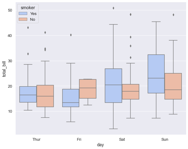
The next code shows how to generate a box plot with hue.
sns.boxplot(x="day", y="total_bill",
            data=tips,
            hue="smoker",
            palette='coolwarm');
Box plots were originally introduced and popularised by the American mathematician John Wilder Turkey more than 40 years ago. They were designed to be calculated and drawn by hand. As statistics are now being performed by computers, it has become much easier to create more complex variations of this plot such as:
These variations attempt to convey more information about the distribution, while maintaining the compact size of the box plots.
Exploring Seaborn’s More Advanced Type of Plots
Letter-Value Plots: Boxplots for Large Data
Conventional boxplots are useful displays for conveying rough information about the central 50% and the extent of data. For small-sized data sets (n < 200), detailed estimates of tail behavior beyond the quartiles may not be trustworthy, so the information provided by boxplots is appropriately somewhat vague beyond the quartiles, and the expected number of “outliers” of size n is often less than 10. Larger data sets (n ~ 10,000-100,000) afford more precise estimates of quantiles beyond the quartiles, but conventional boxplots do not show this information about the tails, and, in addition, show large numbers of extreme, but not unexpected, observations. – Heike Hofmann [6]
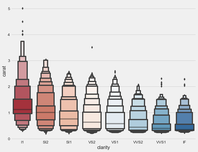
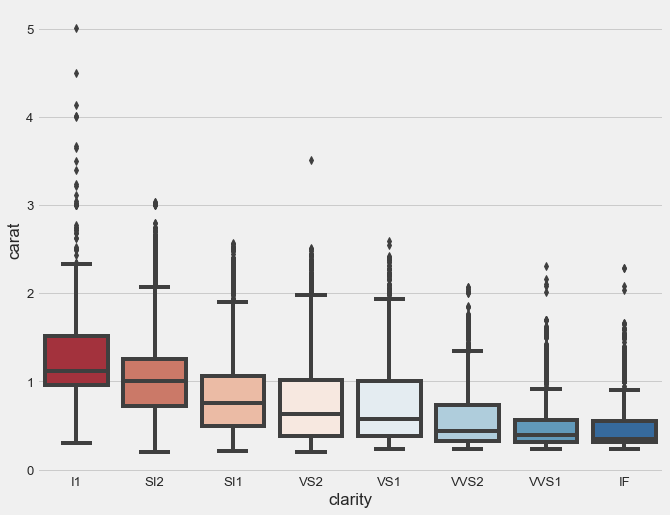
The letter-value plots, also known as “boxenplots” provide a better representation of the distribution of the data than the usual box plots, particularly when the data consists of more than 10,000 observations with many outliers.
To clearly illustrate the benefits of this type of plot we will be using the diamond dataset from seaborn since it contains over 50,000 observations.
# load the diamonds dataframe
diamonds = sns.load_dataset('diamonds')
# use a matplotlib style
plt.style.use('fivethirtyeight')
# clarity ranking
clarity_ranking = ["I1", "SI2", "SI1", "VS2", "VS1", "VVS2", "VVS1", "IF"]
sns.boxenplot(x="clarity", y="carat",
              color="b", order=clarity_ranking,
              scale="linear", data=diamonds,
             palette='RdBu');
As reference here is what we get with a boxplot.
sns.boxplot(x="clarity", y="carat",
            color="b",
            order=clarity_ranking,
            data=diamonds,
            palette='RdBu')
Violin Plots
A Violin Plot is used to visualise the distribution of the data and its probability density. It has the shape of a violin. To compare different variables, their violin plots are palced side by side and they can be used to visualize both quantitative as well as qualitative variables. They are intuitive and easy to read. The shape of the violin displays the distribution shape of the data. It actually contains all data points. This make it excellent to visualize obsevations with a small size. The dot and the bars inside the violin represent the same summary statistics as box plots.
Another cool feature about violins is that you can illustrate a second-order categorical variable in a single violin, instead of drawing separate violins for each group within a category. This is possible due to the symmetrical shape of the violin diagram. As one half of the violin is actually redundant.
Let me show you what I mean:
sns.set(style="whitegrid")
f, ax = plt.subplots(figsize=(8, 6))

# Show each distribution with both violins and points
sns.violinplot(x="day", y="total_bill",
               hue="smoker", data=tips,
               inner="box", split=True,
               palette="Set3_r", cut=2, l
               inewidth=3)

sns.despine(left=True)

ax.set_xlabel("Day",size = 16,alpha=0.7)
ax.set_ylabel("Total Bill ($)",size = 16,alpha=0.7)
ax.legend(loc=2, ncol=2, title='Smoker?' )
f.suptitle('Total Bills by Day of the Week', fontsize=20)
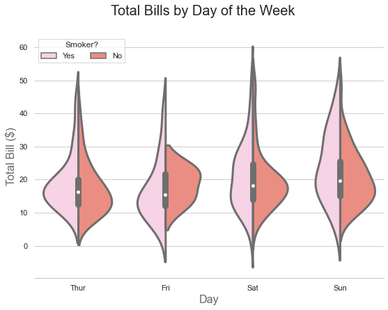
So let’s try to read the information contained in the image above:
- The pink region reflects the distribution shape of the total bills paid by smokers.
- The red area shows the total bills paid by non-smokers.
- And the bars within the violins are nothing more but a boxplot over all the total bills.
You can easily display the five-number summary of the smokers and non-smokers bills instead of the total bills:
# Show each distribution with both violins and points
sns.violinplot(x="day", y="total_bill",
               hue="smoker", data=tips,
               inner="quart", split=True,
               palette="Set3_r", cut=2,
               linewidth=3)

sns.despine(left=True)

ax.set_xlabel("Day",size = 16,alpha=0.7)
ax.set_ylabel("Total Bill ($)",size = 16,alpha=0.7)
ax.legend(loc=2, ncol=2, title='Smoker?' )
f.suptitle('Total Bills by Day of the Week', fontsize=20)
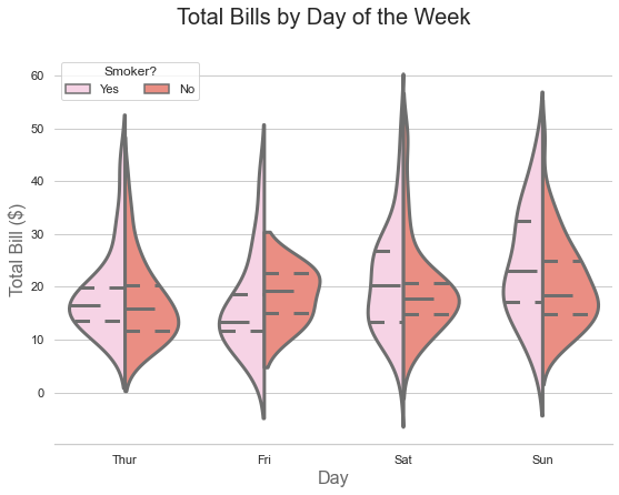
Cool right?
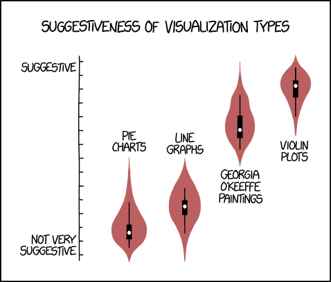
I guess by now you too agree with xkcd comic.
Regression Plots
In simple terms, linear regression attempts to capture the relationship between two or more variables by drawing a straight line that encompasses most of the information from the observed data.
Regplot always draws a line of best fit, regardless of how large the statistical relationship is or whether it exists at all. The data is usually depicted as a scatter plot, with the variable on the y-axis being the dependent variable and the variables (one or more) on the x-axis being the independent variables.
For the first example we are using the penguins dataset.
mpg = sns.load_dataset('penguins')
sns.set_theme(style="whitegrid", palette="colorblind")
# plot bill length vs depth
sns.regplot(data=penguins, x='bill_length_mm', y='bill_depth_mm');
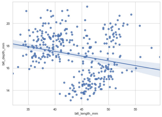
As we can see from above, there is some negative linear relationship between both depicted variables, bill length and bill depth.
The disadvantage of regplot() is that it has no hue parameter and only draws a single regression line per plot. So if we want to examine the observed behavior for each penguin species, we will be using the lmplot() function. It is a figure-level function that combines regplot() and FacetGrid (more on this in the second part of the tutorial)`. So let’s do it.
sns.lmplot(data=penguins, x='bill_length_mm',
           y='bill_depth_mm', hue='species',
           height=6, aspect=8/6,
           palette='cool');
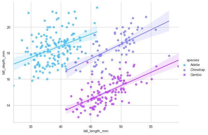
Interesting! We now see that, contrary to the previous assumptions, there is a strong positive linear relationship between both variables. Well, this is a known phenomenon in probablity and statistics, called the simpson’s paradox.
Another cool feature about regplot() is we can change the order of the regression to model nonlinear relationships. To illustrate this we will load in the mpg dataset. It is about the fuel consumption in miles per gallon (mpg) for different kind of cars.
sns.regplot(data=mpg, x='horsepower', y='mpg', order=2);
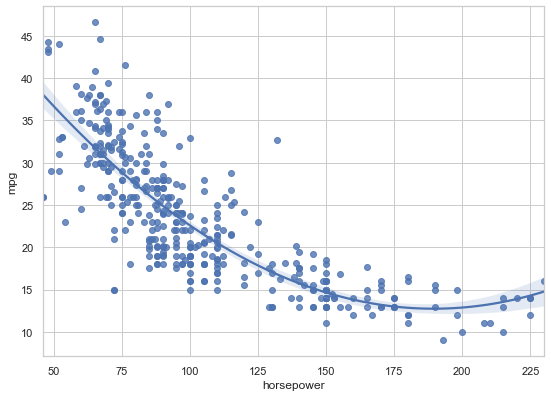
Keep in mind that increasing the order of the regression model is not necessarily a good idea, as we risk over-fitting the data.
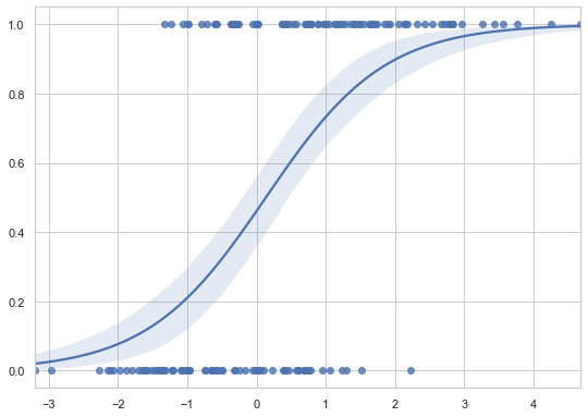
We can also plot logistic regressions using regplot. This time we are going to generate our own data.
# Some random data with y = 0 or 1
x = np.random.normal(size=150)
y = (x > 0).astype(np.float)
x = x.reshape(-1, 1)
x[x > 0] -= .8
x[x < 0] +=.5
# To plot a logistic regression we set logistice=True
sns.regplot(x=x, y=y, logistic=True)
So, regplot() is well suited if we want to plot a simple linear regression model as part of a matplotlib figure. Otherwise, it is preferable to use the lmplot() function.
Complementary Plotting Functions
The plotting functions discussed below are usually used in combination with other plots. When overlaid on the appropriate diagrams, they provide additional insight into the variables being visualised, without being cumbersome.
Strip Plots
Strip plots are a good complement to a box or violin plot in cases where you want to show all observations along with some representation of the underlying distribution. Strip plot always treats one of the variables as categorical and draws data at ordinal positions (0, 1, … n) on the relevant axis, even when the data has a numeric or date type.
Let’s go back to the titanic dataset again.
plt.rcParams["figure.figsize"] = 7, 5
plt.style.use('fivethirtyeight')
params = dict(edgecolor='gray',
palette=['#91bfdb','#fc8d59'],
linewidth=1,
jitter=0.25
)
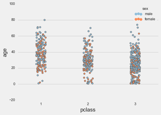
sns.stripplot(data=titanic,
x='pclass',
hue='sex',
y='age',
**params);
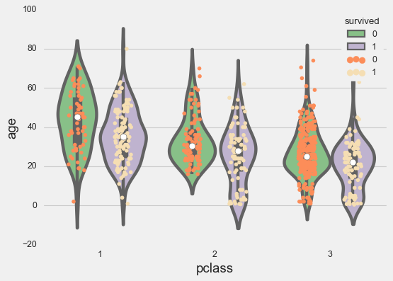
Now in combination with a violin plot.
plt.rcParams["figure.figsize"] = 10, 6

g = sns.stripplot(x=titanic['pclass'],
                  y=titanic['age'],
                  edgecolor='gray',
                  palette=['#fc8d59', 'wheat'],
                  dodge=True,
                  hue=titanic['survived'],
                  jitter=.15)

sns.violinplot(x=titanic['pclass'],
              y=titanic['age'],
              palette='Accent',
              dodge=True,
              hue=titanic['survived']);
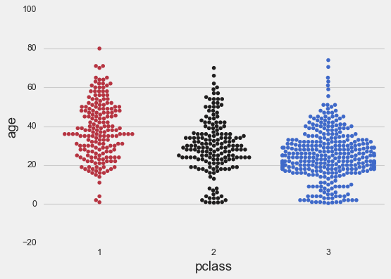
Swarm Plots
Swarm plots are similar to strip plots, only the points are adjusted so to represent the distribution of the data. As for the strip plots, swarm plots can be drawn on their own, or as complement to a box plot.
We first show the swarm plot on its own.
sns.swarmplot(x=titanic['pclass'],
               palette='icefire_r',
              y=titanic['age']);
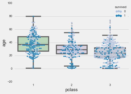
Now in combination with a box plot:
sns.swarmplot(data=titanic,
              x='pclass',
              palette='PuBu',
              hue='survived',
               y='age');

ax = sns.boxplot(x=titanic['pclass'],
                 palette="Accent",
                 y=titanic['age']);

# adding transparency to colors
for patch in ax.artists:
    r, g, b, a = patch.get_facecolor()
    patch.set_facecolor((r, g, b, .5))
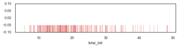
Rug Plots
A rugplot is a simple plot that displays a one-dimensional distribution of data in form of short vertical lines along the x-axis for every data point in a given variable.
fig, axs = plt.subplots(figsize=(8, 1.5))

# Make the rugplot
sns.rugplot(ax = axs, a=tips['total_bill'],
            height=0.25, lw=0.5,
            color = sns.xkcd_rgb["pale red"]) ;
To Sum Up
In this tutorial we covered some of the common visualization techniques using mainly axes-level functions such as bar charts, histograms, scatter plots, etc.
We also showed how simple it is to create elegant and professional visuals with just one line of code. In fact, seaborn not only takes care of the layout, but also internally performs the semantic mapping and statistical aggregation required to create informative graphics.
Your only concern is to understand the various elements of your plots, rather than wasting time on the technicalities of generating them.
References
[1] VanderPlas, Jake. 2016. Python Data Science Handbook. O’Reilly Media, Inc.
[2] Matplotlib - Axes Class
[3] Desai, Meet. “Matplotlib + Seaborn + Pandas” Medium, Towards Data Science, 30 Oct. 2019
[4] Waskom, M. L., (2021). seaborn: statistical data visualization. Journal of Open Source Software, 6(60), 3021, https://doi.org/10.21105/joss.03021
[5] Gureckis, Todd. 2020. Lab in Cognition and Perception
[6] Heike Hofmann, Hadley Wickham & Karen Kafadar (2017) Letter-Value Plots: Boxplots for Large Data, Journal of Computational and Graphical Statistics, 26:3, 469-477, DOI: 10.1080/10618600.2017.1305277
[7] Notebook und Datasets used in this article: Github
Visualization Tutorial Seaborn Python 