Plotting with Seaborn - Part 2
In this part of the tutorial, we will look at more advanced visualization techniques for exploring multivariate and complex datasets, including conditional small multiples and pairwise data relationships. Namely, when exploring multidimensional data, it is useful to draw multiple instances of the same representation for different subsets of your data. This type of representation is also known as faceting and is related to the idea of small multiples.
Faceting
One powerful technique in data visualization, particularly when exploring multidimensional datasets, is to create multiple versions of the same plot with several subsets of that data alongside each other, sharing the same scale and axis. This allows a lot of information to be presented compactly and in a comparable way.
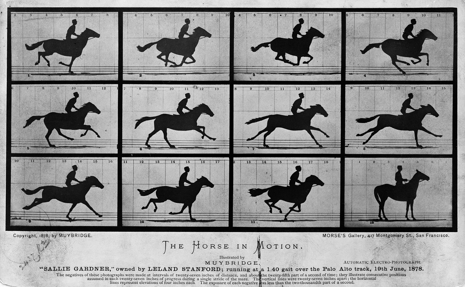
It is related to the idea of “small multiples” (also known as trellis or lattice) first introduced by Eadweard Muybridge, around 1880, and popularized by Edward Tufte [1].
At the heart of quantitative reasoning is a single question: Compared to what? Small multiple designs, multivariate and data bountiful, answer directly by visually enforcing comparisons of changes, of the differences among objects, of the scope of alternatives. For a wide range of problems in data presentation, small multiples are the best design solution. – Edward Tufte, 1990
While this may sound intuitive, it is very tedious to produce unless you use the right visualization library.
One of the most powerful aspects of the seaborn is how easy it is to create these types of plots. With a single command, you can split a given plot into many related plots using: FacetGrid(), JointGrid() or PairGrid().
In the following we’ll put these seaborn’s classes in action, and see why they are so useful.
Faceting with Seaborn
FacetGrid
The most basic utility provided by seaborn for faceting is the FacetGrid. It is an object that specifies how to split the layout of the data to be visualized. It partitions a figure into a matrix of axes defined by row and column faceting variables. It is most useful when you have two discrete variables, and all combinations of the variables exist in the data.. A third dimension can be added by specifying a hue parameter.
For example, suppose that we’re interested in comparing male and female penguins of each specie in some way. To do this, we start by importing the required modules, setting the notebook environment and loading the penguins dataset as pandas DataFrame:
# Import the required libraries
import numpy as np
import pandas as pd
import matplotlib.pyplot as plt
import seaborn as sns

# Set the notebook environment
%precision %.3f
pd.options.display.float_format = '{:,.3f}'.format
plt.rcParams["figure.figsize"] = 9,5
pd.set_option('display.width', 100)
plt.rcParams.update({'font.size': 22})
plt.style.use('fivethirtyeight')

# Load the penguins dataset
penguins = sns.load_dataset('penguins')
Then we create an instance of the FacetGrid class with our data, telling it that we want to break the sex and species variables, by row and col. Since we have 3 species, we obtain a 2x3-grid of facets ready for us to plot something on them.
g = sns.FacetGrid(penguins, row='sex', col='species', aspect=1.75)
g.set_titles(row_template='{row_name}', col_template='{col_name} Penguins');
Each facet is labeled at the top. The overall layout minimizes the duplication of axis labels and other scales.
We then use the FacetGrid.map() method to plot the data on the instantiated grid object.
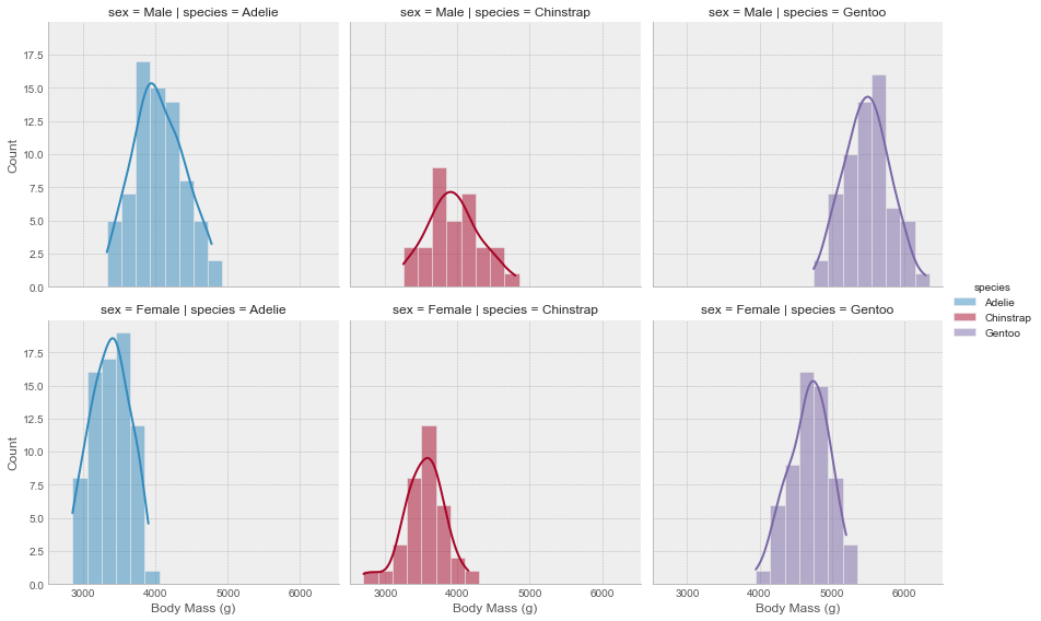
plt.style.use('bmh')

# Create a figure with 6 facet grids
g = sns.FacetGrid(penguins, row='sex', col='species', aspect=1.75)
g.set_titles(row_template='{row_name}', col_template='{col_name} Penguins');

# plot a histogram  in each facet
g.map(sns.histplot, 'body_mass_g', binwidth=200, kde=True)

# set x, y labels
g.set_axis_labels('Body Mass (g)', "Count")
Now, the function we pass to the map method doesn’t have to be a seaborn or matplotlib plotting function. It can handle any type of function as long as it meets the following requirements:
- It must plot on the “currently active” matplotlib
axes. This applies to functions in thematplotlib.pyplotnamespace. In fact you can callmatplotlib.pyplot.gca()to get a reference to the currentaxesif you intend to use their methods. - It must accept the data that it plots as arguments.
- It must have a generic dictionary of
**kwargsand pass it along to the underlying plotting function.
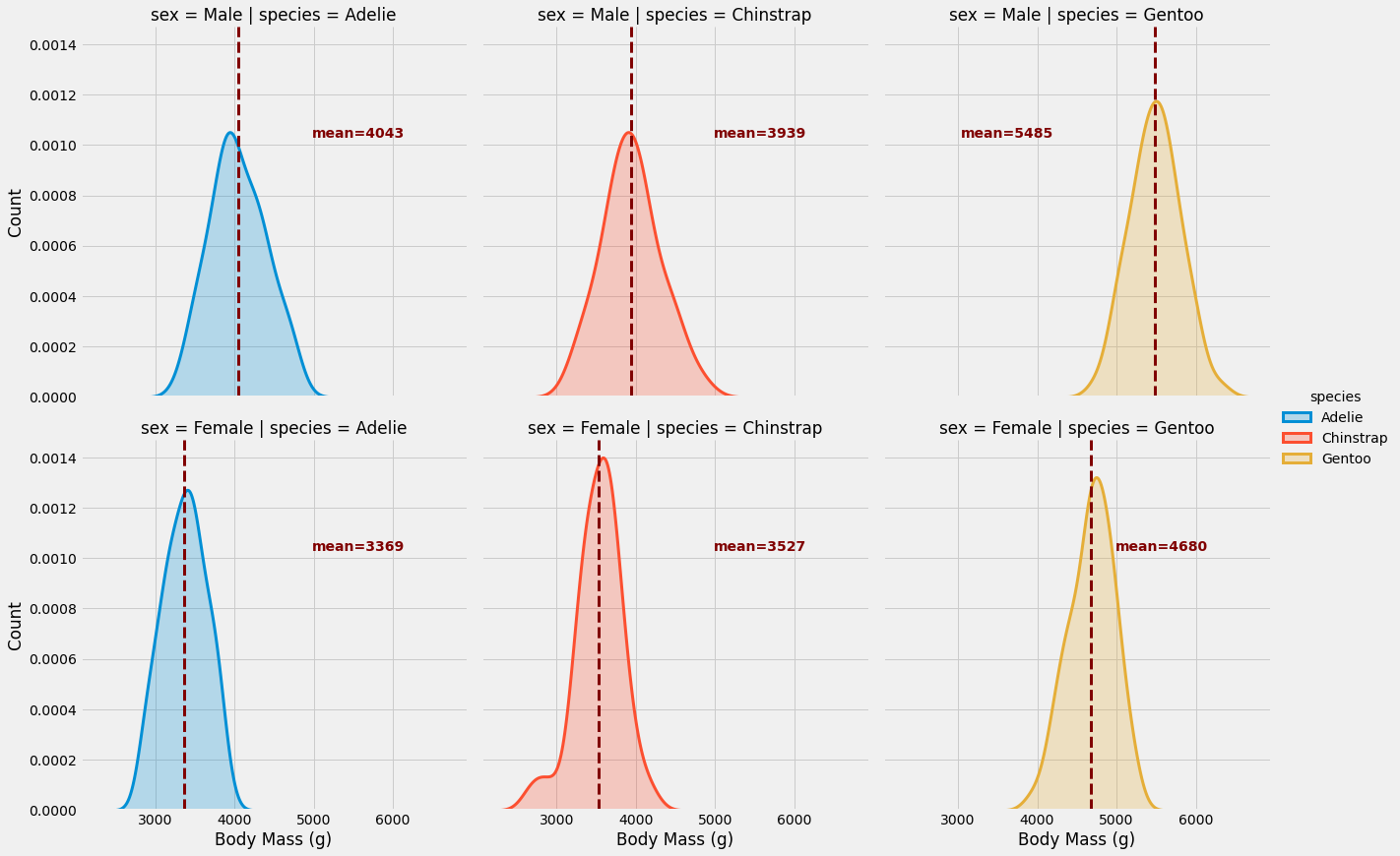
So let’s define our own custom function according to the above requirements. The function is supposed to compute the average of a given variable and add it as a dashed line to the currently active axes.
def add_mean(data, var, **kwargs):

    # 1. requirement
    # Calculate mean for each group
    m = np.mean(data[var])

    # 2. requirement
    # Get current axis
    ax = plt.gca()

    # 3. requirement
    # Add line at group mean
    ax.axvline(m, color='maroon', lw=3, ls='--', **kwargs)

    # Annotate group mean
    x_pos=0.6
    if m > 5000: x_pos=0.2
    ax.text(x_pos, 0.7, f'mean={m:.0f}',
            transform=ax.transAxes,
            color='maroon', fontweight='bold',
            fontsize=14)
Let’s go ahead and plot the same figure as above, but without the histograms and on top of that we will be adding our own custom function.
g = sns.FacetGrid(penguins, row='sex', col='species', hue='species', height=6, aspect=1)

g.map(sns.kdeplot, 'body_mass_g', lw=3, shade=True)
g.map_dataframe(add_mean, var='body_mass_g')
g.set_axis_labels('Body Mass (g)', "Count")
g.add_legend()
As you might notice, instead of using the map() method to call our custom function, we used the map_dataframe() method.
As you can see, FacetGrid is simple yet powerful. In just a few lines and without thinking about the layout and the appearance, you can elegantly convey a great deal of information. In my opinion, this is a vastly under-used technique in visualization and should actually be part of every exploratory data analysis, whether your goal is a report or a model.
FacetGrid serves as a backbone for the following figure-level functions: relplot(), catplot(), lmplot() and displot(). In fact, it is strongly recommended to use one of these functions instead of using FacetGrid directly, particularly if you are using seaborn functions that infer semantic mappings from the dataset within your facets.
PairGrid
PairGrid is another class provided by seaborn for faceting. It shows pairwise relationships between data elements. Unlike FacetGrid, it uses different variable pairs for each facet.
The usage of PairGrid is similar to FacetGrid. We start by calling the PairGrid constructor in order to initialize the facet grid and then call the plotting functions. In the following example we are going to use the iris dataset. To demonstrate the flexibility of PairGrid, I will use different different kind of plots with extra many arguments. The PairGrid object provides three plotting methods for different axes groups: map_diag(), map_upper() and map_lower().
# Load the iris dataset
iris = sns.load_dataset('iris')

# Set the plotting style
plt.style.use('seaborn-paper')

# Initiate the PairGrid instance
g = sns.PairGrid(iris, diag_sharey=False, hue="species", palette="Set2")

# Scatter plots on the upper triangle
g.map_upper(sns.scatterplot)

# Histplot with kde on the diagonal
g.map_diag(sns.histplot, hue=None, legend=False, color='darksalmon',
           kde=True, bins=8, lw=.3)

# Kde without hue parameter on the lower triangle
g.map_lower(sns.kdeplot,  shade=True, lw=1,
            shade_lowest=False, n_levels=6,
            zorder=0, alpha=.7, hue=None,
            color='mediumaquamarine')

g.add_legend();
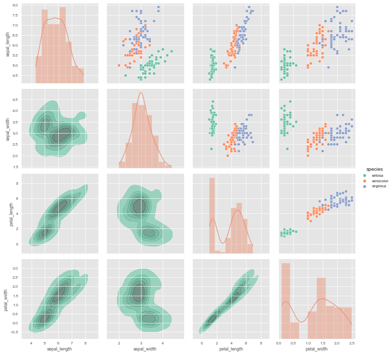
It is important to understand the difference between a FacetGrid and a PairGrid:
In the former, each facet shows the same relationship conditioned on different levels of other variables. In the latter, each plot shows a different relationship (although the upper and lower triangles will have mirrored plots). Using PairGrid can give you a very quick, very high-level summary of interesting relationships in your dataset.
PairGrid serves as the backbone to the high-level interface pairplot() and it is recommended to use it, unless you need more flexibility.
JointGrid
JointGrid is another facet class from seaborn. It combines univariate plots such as histograms, rug plots, and KDE plots with bivariate plots such as scatter and regression.
Let’s create a JointGrid instance without plots, to see how it looks like.
g = sns.JointGrid(data=[])
The middle, large axes, referred to as joint axes, is intended for bivariate plots such as scatter and regression. The other two axes, known as marginal axes, are meant for univariate plots.
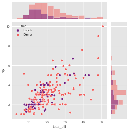
The simplest plot method, plot(), takes a pair of functions: one for the joint axes and one for the two marginal axes.
tips = sns.load_dataset('tips')
g = sns.JointGrid(x="total_bill", y="tip", data=tips, hue="time", palette="magma")
g.plot(sns.scatterplot, sns.histplot)
If you prefer to use different arguments for each function then you should use the following JointGrid class methods: plot_joint() and plot_marginals().
# Let's use the penguins dataset again
g = sns.JointGrid(data=penguins, x="bill_length_mm",
                  y="bill_depth_mm", hue="species", palette="Set1")
# Histplot with kde on both marginal axes
g.plot_marginals(sns.histplot,  kde=True, hue=None, legend=False, element='step')
# kde and scatter plots on the joint axes
g.plot_joint(sns.kdeplot, levels=4)
g.plot_joint(sns.scatterplot)
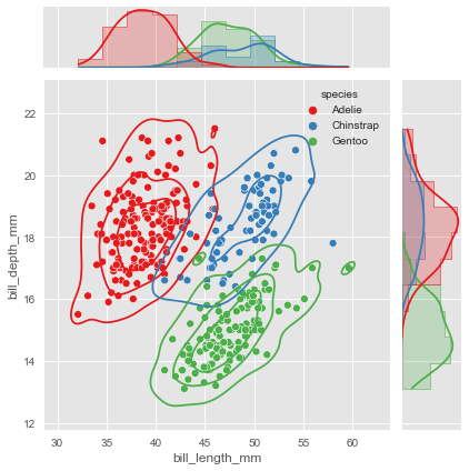
JointGrid serves also as a backbone for a figure-level function.
Now that we have some knowledge of axes-level plotting functions and understand how faceting in Seaborn works, we can finally move on to explore figure-level plotting functions.
Exploring Figure-Level Plotting Functions
The purpose of seaborn’s figure-level functions is to facilitate the plotting process. They provide high-level interfaces with matplotlib through one of the classes discussed above, usually a FacetGrid, which manages the figure. They also provide a uniform interface to their underlying axes-level functions -Remember the following figure from the previous tutorial.
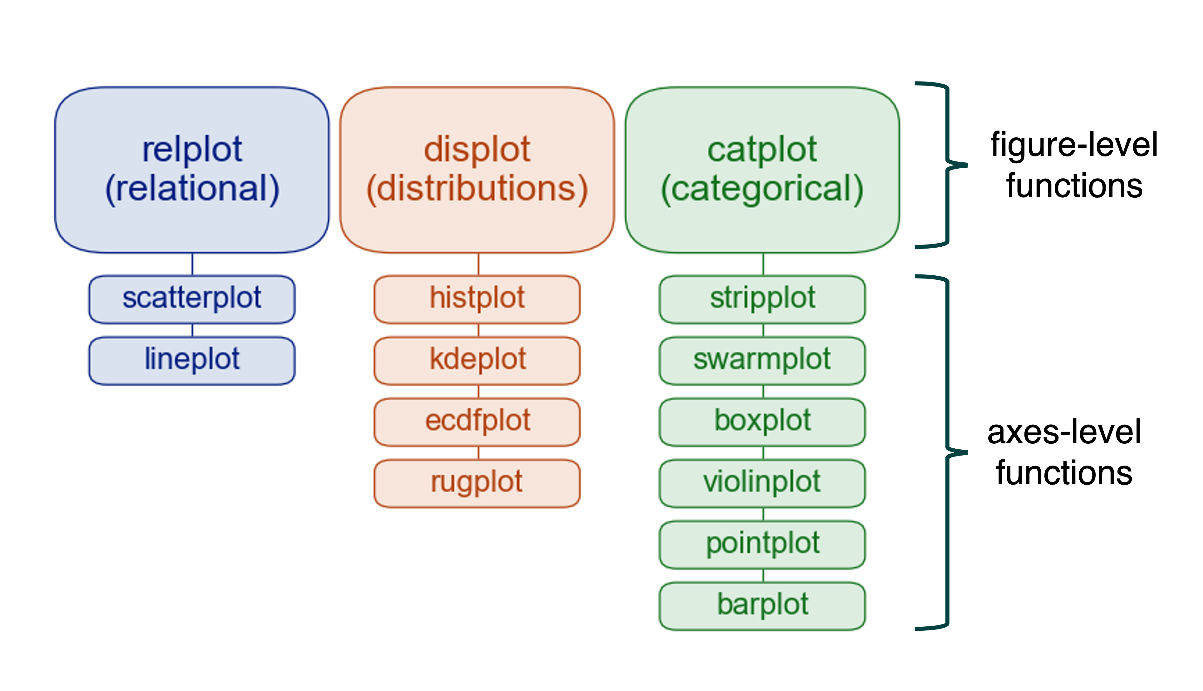
Hence, you don’t need to know the arguments and other details of the corresponding axes-level functions, nor do you need to know how to edit a matplotlib figure. It is perfectly fine to know only the arguments of the few figure-level functions provided by seaborn to generate very advanced figures, well unless you need more flexibility.
So in this section, we basically won’t cover anything that we haven’t already addressed in earlier sections. It is more a showcase of the power of seaborn than a how-to guide for using the figure-level functions.
catplot
seaborn.catplot() is a figure-level interface for drawing categorical plots onto a FacetGrid. The kind parameter specifies the underlying axes-level plotting function to use.
So let me show you how powerful and yet simple are these kind of high-level interfaces. For this purpose we will use the tips dataset.
g = sns.catplot(data=tips, x='day', y='tip', row='sex', col='smoker', kind='violin')
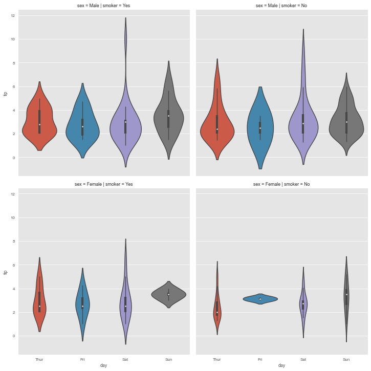
It’s really impressive how much information we can capture with just one line of code. No other visualization library can compete with this. Well, at least not that I knew of.
Let’s take a look at another figure-level function.
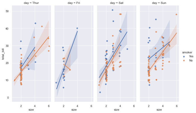
lmplot
This figure-level function combine regplot() and FacetGrid. It is designed to provide a convenient interface for fitting regression models across conditional subsets of a given dataset.
sns.set_theme(color_codes=True)
g = sns.lmplot(x="size", y="total_bill", hue="smoker", col="day",
               data=tips, height=6, aspect=.4, x_jitter=.1)
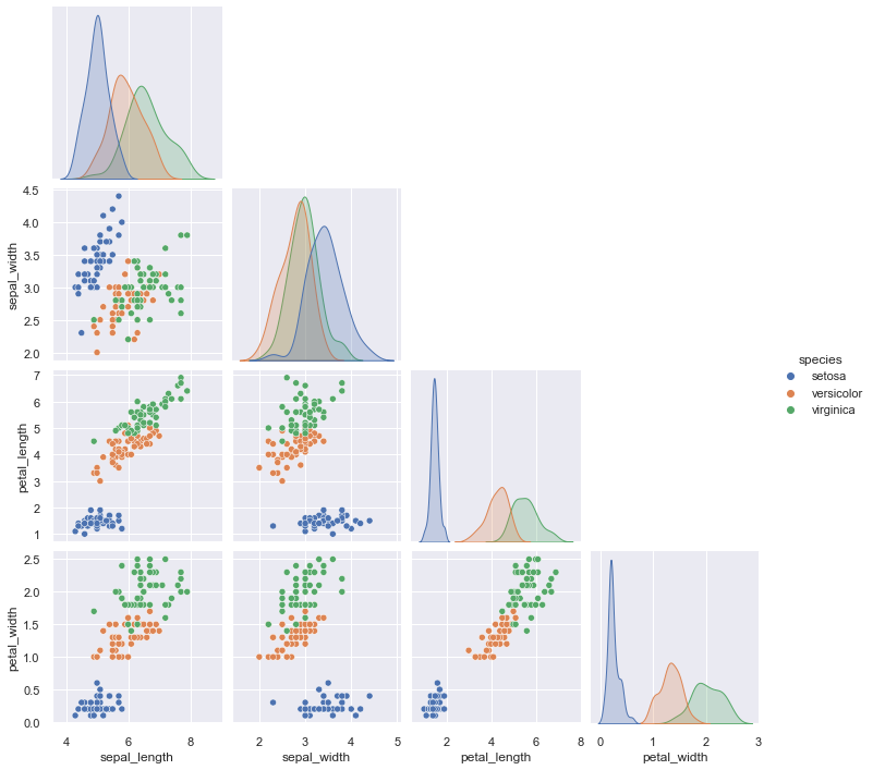
pairplot
pairplot() is a high-level interface for PairGrid class with the purpose to make it easy to plot a few common styles. However, if you need more flexibility, you should use PairGrid directly.
g = sns.pairplot(iris, hue="species", corner=True)
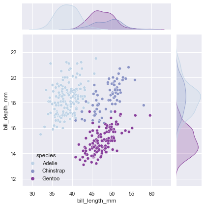
jointplot
jointplot() is also meant to provide a convenient high-level interface to JointGrid.
g = sns.jointplot(data=penguins, x="bill_length_mm", y="bill_depth_mm",
               kind="scatter", palette="BuPu", hue='species')
Wrapping Up
With this series of visualization tutorials we have covered the most important aspects of seaborn.
In the first part, we introduced the matplotlib figure grammar and then discussed some common types of plots and their use cases, using only axes-level functions.
In the second part of the tutorial, we looked at more advanced visualization techniques that use figure-level functions to analyze multivariate data, such as conditional small multiples and pairwise data relationships.
Both parts focused on the power and simplicity of seaborn. After all, no matter what plotting technique you use, there is no universally best way to represent your data. Different questions are better answered with different plotting techniques. Seaborn just makes it easy for you to switch between different visual representations by providing a consistent high-level API, while internally taking care of the layout design along with performing the necessary statistical computations. So that your only concern is to understand the various elements of your plots, rather than wasting time on the technicalities of generating them.
References
[1] Tufte, Edward (1990). Envisioning Information. Graphics Press. p. 67. ISBN 978-0961392116.
[2] seaborn official website
Visualization Tutorial Seaborn Python 