SKU Clustering for Inventory Optimization
Introduction
In this first tutorial we are going to tackle a central, yet often overlooked, topic in online stores: Inventory management based on store level stock keeping units (SKU).
The goal of inventory management is to determine the right amount and timing of product orders. Inventories should be neither too high, to avoid waste and extra costs of storage and labour force, nor too low – to prevent stock-outs and lost sales.
Indeed, online retailers depend crucially on accurate demand forecasting to make decisions concerning their capital allocation. A common problem is the abundance of product lines or SKUs, which makes accurate forecasting for each individual product very time and resource consuming, while conversely inaccurate forecasting leads to unnecessary costs and/or poor customer satisfaction.
So, how do we find the optimal level of inventories that guarantees customer satisfaction while minimizing costs?
-
The first step is to make sure you have well-defined SKUs. I can’t stress enough how important it is to define SKUs carefully. In e-commerce platforms like Shopify, SKUs can be generated with a click. I don’t advise you to proceed this way. You do have to think about the design of SKUs. After all, they are the cornerstone for your forecasts. That is, however, beyond the scope of this tutorial
-
The second step is to identify groups and patterns among SKUs. This is the main subject of this tutorial and the topic of our next sections.
Identifying Groups Among SKUs
The objective of finding groups across data is to find the right balance between similarities and differences. On one hand, we want to treat similar cases similarly to benefit from economies of scale and thus improve efficiency. On the other hand, we want to address different cases in distinctive ways in order to improve action’s effectiveness. So, by grouping similar data together, we are actually improving our business efficiency. That is why SKU classification is the most common approach to inventory control in operations management.
Imagine you work as sales or supply and logistics manager and you want to organize your supply chain more efficiently. You realize that some products are sold at different speeds and in different quantities than others. It’s impacting your ability to deliver the right products at the right time. Sure, you could keep a maximum stock level to ensure customer satisfaction. However, this costs you a lot of money and comes at the expense of other potential investment opportunities. A simple approach to tackling such a problem, very much like in other industries, is to analyze the issue along two dimensions:
- Average Daily Sales and
- Volatility
The volatility of something may be measured with coefficient of variation (CV), also known as relative standard deviation (RSD). The CV is defined as the ratio of the standard deviation to the mean.
Certainly, we can plot the sales data along the above two dimensions and visually define clusters. However, we are interested in a more systematic approach to this task.
Hierarchical Cluster Analysis (HCA)
Clustering algorithms are unsupervised machine learning algorithms. They look for similarities or dissimilarities between data points so that similar points can be grouped together. There are many different approaches and algorithms for performing clustering tasks. Hierarchical clustering is the most widely used.
As its name implies, hierarchical clustering is an algorithm that builds a hierarchy of clusters. It starts with all the data points each assigned to a cluster of their own. Then the two nearest clusters are merged into a single cluster. There are multiple metrics for deciding the closeness of two clusters, such as Euclidean distance, Manhattan distance or Mahalanobis distance.
The algorithm is than terminated when only a single cluster is left.
An illustration of how hierarchical clustering works can be nicely conveyed using a dendrogram:
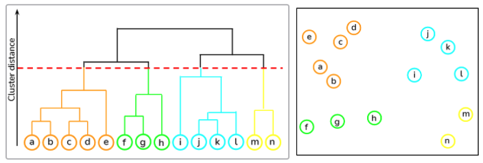
As we can see from above, we start at the bottom with 14 data points (the letters a to n), each assigned to separate clusters. The two nearest clusters are then merged together so that there is only one cluster at the top. The height of the union of two clusters, depicted by a horizontal line, indicates the distance between two clusters in the data space.
The dendrogram is also a very useful tool when it comes to choosing the number of clusters to map. In fact, the ideal choice is equal to the number of vertical lines in the dendrogram, with the largest distance.
Now that we have some theoretical background, we can move on to programming an example using python.
SKU Clustering Using Python
We start by loading the required libraries as well as the dataset:
import numpy as np
import pandas as pd
import matplotlib.pyplot as plt
import matplotlib as mpl
import seaborn as sns

# Read the csv file
df = pd.read_csv('DATA_2.01_SKU.csv')
The dataframe consists of 100 SKUs with their corresponding average daily sales (ADS) as well as the product sales volatility (CV).
Hierarchical Cluster Analysis
In statistics, similarity is often measured with the Euclidean distance between samples. This can be easily done in Python using the pdist() function from scipy.spatial.distance. However, before computing the distance we need to make sure that our variables are comparable. Otherwise, we need to standardize our data. This can be done using the function scale() from the sklearn.preprocessing module.
# Import missing libraries
from scipy.spatial.distance import pdist
from sklearn.preprocessing import scale

# Scale the data
df = scale(df)

# Compute the distance of all observations
d = pdist(df) # default metric is Euclidean
The linkage() function from scipy implements several clustering functions. In the following we use weighted linkage clustering with Euclidean distance as the dissimilarity measure.
# import linkage
from scipy.cluster.hierarchy import linkage

# Perform hierarchical clustering on distance metrics
hcward = linkage(d, method='weighted')
We can now plot the dendrogram obtained using the dendrogram() function. The numbers at the bottom of the plot identify each SKU:
from scipy.cluster.hierarchy import dendrogram

# Calculate and plot full dendrogram
plt.title("SKU Dendrogram")
dend = dendrogram(hcward,
                  leaf_rotation=90, # rotates the x axis labels
                    leaf_font_size=7 # font size for the x axis labels
                    );
plt.xlabel('SKU index')
plt.ylabel('Distance')
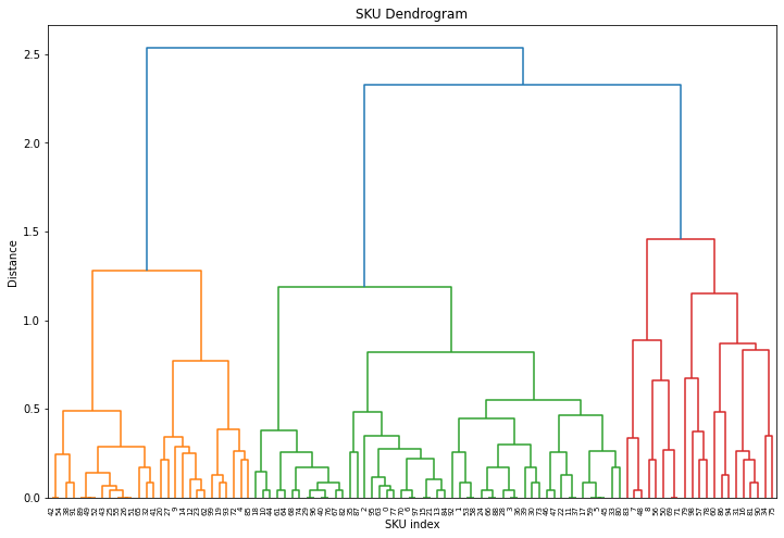
The horizontal lines are cluster merges. Their heights tell us about the distance covered for merging the next closest cluster to form a new one.
In this example we have only 100 observations and it is already not that easy to follow. In case of a bigger dataset we could truncate the results and show only the last $p$ merged clusters.
# Plotting a more clear dendrogram
plt.title("SKU Dendrogram - Truncated")
dend = dendrogram(hcward,
                  truncate_mode='lastp',
                  p = 14,
                  show_contracted=True,
                  leaf_rotation=90,
                  leaf_font_size=12)
plt.xlabel('SKU index')
plt.ylabel('Distance');
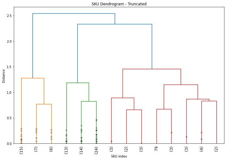
The parameter show_contracted allows to draw black dots at the heights of those previous cluster merges. The cluster size of the truncated clusters are displayed in brackets.
Determining the Number of Clusters
When it comes to cut-off selection there is no golden rule on how to pick the perfect number of clusters. What matters is to use the right clustering approach for the business problem at hand and that your conclusions are actionable. However, there is tradeoff between too many nuances and too few:
- Select too many clusters and you will confuse and lose your audience
- Too few and your audience my over-generalize your results.
In this example, we can see from the dendrogram that 3 clusters is the best choice, as the maximum dissimilarity between clusters is at the vertical blue lines. However, if the number of clusters is not that obvious we could make use of some automated cut-off selection such as the Elbow Method.
For more information about determining the number of cluster check out the following link.
Now, we can go ahead and capture our three clusters.
# Capture the 3 clusters
df['groups'] = cut_tree(hcward, n_clusters=3)

# Plot the result
fig, ax = plt.subplots()
col = ['orange', 'red', 'green']

grouped = df.groupby('groups')
for key, group in grouped:
        group.plot(ax=ax, kind='scatter', x='CV',
                   y='ADS', label='group ' + str(key),
                   linewidths=5, color=col[key],alpha=.6)
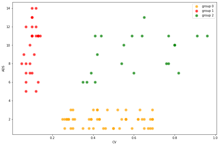
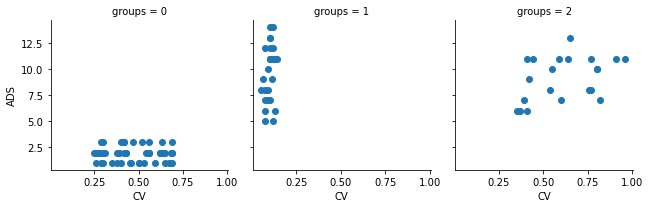
Where:
- ADS = Average day sales and
- CV = Coefficient of Variation or volatility.
Alternatively, we can use a facet grid to visually separate the 3 SKU clusters from one another:
grid1 = sns.FacetGrid(df, col='groups')
grid1.map(plt.scatter, 'CV', 'ADS');
Now that we got our clusters, we need to be able to express the complexity of the results in simple terms.
Analysis, Communication and Actionable Recommendations
Too often when dealing with data we see it as a mean to understand a situation better and we stop there. It’s actually not the end of it. The purpose of data analysis is to understand the problem we want to solve in order to determine business actions.
The questions we want to answer as business analyst are: What is the business issue that data can solve? What are the relevant conclusions of the data analysis? How can we make those conclusions actionable to improve our business efficiency?
At the end of the day, the objective is to create value by making actionable recommendations based on data analysis to solve current business issues. So let’s do that with our clusters.
Once we get the result with the different clusters, it is crucial to understand what they mean, how do they differ and give them understandable names. From the above figures we recognize that:
- Group 1: has high sales and low volatility. Let’s call them “horses” since those products are strong and reliable
- Group 2 has also high sales but also high volatility. Let’s call them “bulls”, since they are strong, but difficult to control.
- Group 0: we name the group of low sales and high volatility “crickets”. Because they are small, but can jump unexpectedly.
# Scatter plot of the clusters with group separation lines and better names
plt.scatter(df['CV'], df['ADS'], facecolors='none', edgecolors='b', )

plt.title('SKU Example')
plt.xlabel('Coefficient of Variation')
plt.ylabel('Average Daily Sales')

# Vertical line
plt.axvline(x=.2, color='r')
# Horizontal line
plt.axhline(y=4, color='r')

# We can add some text to our plot  using text()
fsize = 18
col = 'orange'
plt.text(0.09, 9.4, "Horses", color=col, fontsize=fsize)
plt.text(0.6, 9, "Wild Bulls", color=col, fontsize=fsize)
plt.text(0.75, 1.8, "Crickets", color=col, fontsize=fsize)
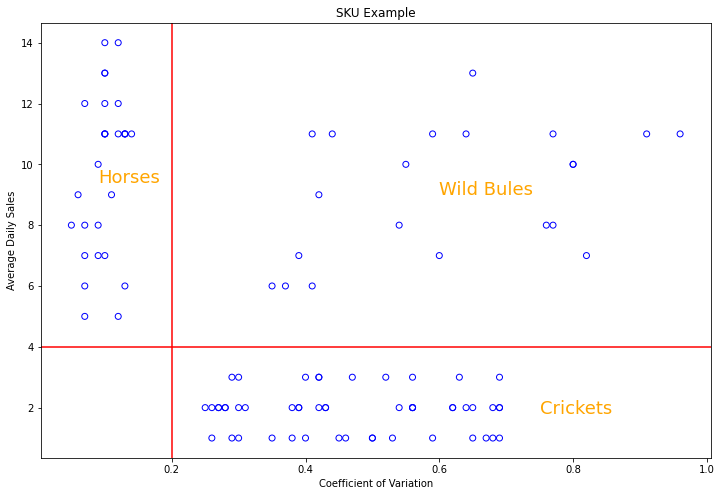
As already mentioned, the purpose of finding groups within data is to maximize the business efficiency: we want to treat similar cases similarly and different cases specifically! So how can we manage our supply chain differently for those three clusters?
- Products in the horses category should be made quickly available and we should ensure that we have enough in stock: made to Stock. It may seem expensive to keep everything in stock, but the benefits cover largely the costs. Because sales are expected to be high, and the risk of inaccurate forecast is low, since the coefficient of variation is small for this group.
- Crickets will be made to order. Since the sales are small, it’s not really efficient to keep them on stock. So we want to reduce the risks by producing or ordering the goods, only if a customer places an order. This will create additional wait time for the consumer to receive the product, but allowing for more flexible customization when compared to purchasing stocked SKUs. Another possibility is dropshipping. In this case, we act as an middleman by forwarding the customer order to a third-party supplier or directly to the manufacturer, who then delivers the order to the customer.
- Products in the “bulls” category should be dealt with on a case by case basis. Due to the high volatility of this category, it is not possible to establish a general rule, and this is a good thing, because there are only a few of them. Therefore, we should take a pragmatic approach and analyze the situation in each case in more detail. We could also multiply the splits by adding other dimensions. And maybe then we will get a more suitable final segmentation of the SKUs of this group.
Summary
This brief introduction to business analysis shows a practical application of hierarchical clustering in supply chain management. Although simple and straightforward, it can be very powerful. Provided you come up with the right actionable business recommendations for each group. Consequently, the question of how many groups to have is crucial. Ideally, you want to treat similar cases similarly to take advantage of economies of scale to improve efficiency. While at the same time, you want to treat different cases in different ways to improve the effectiveness of your measures. Indeed, grouping is about increasing the efficiency of your business operations, and in today’s competitive environment, every additional percentage point of efficiency gain can translate into a competitive advantage.
References
- Prasad Pai. Hierarchical clustering explained. Medium, 2021.
- Barbará, Axel Axel Nahuel, and Tomás Dominguez Molet. “SKU clustering for supply chain planning efficiency.” PhD diss., Massachusetts Institute of Technology, 2015.
- Cohen, Maxime C. Demand Prediction in Retail: A Practical Guide to Leverage Data and Predictive Analytics. Springer Nature, 2022.
- Nicolas Glady. Foundations of strategic business analytics (MOOC). Coursera
Business Analytics Tutorial Hierarchical Cluster Analysis Supply Chain Management 