The Confusion Matrix: Why Accuracy Is a Dangerous Illusion
Consider a fraud detection system with 99.9% accuracy. By most standards, this would be considered exceptional performance. Yet if fraudulent transactions constitute only 0.1% of the total, a trivial classifier that labels everything as legitimate achieves identical accuracy while providing zero value. Worse, it creates a false sense of security that could cost millions.
This is the accuracy paradox, and it exposes a fundamental problem with scalar metrics in classification tasks. Accuracy collapses the complexity of model behavior into a single number, obscuring critical information about error distribution and failure modes. The confusion matrix offers a more granular view: rather than asking “how often is the model right?”, it asks “what specific mistakes does the model make, and what are their consequences?”
The distinction matters because in real-world systems, errors are rarely symmetric. Missing a fraudulent transaction differs fundamentally from flagging a legitimate one. Failing to diagnose cancer carries different weight than a false positive. The confusion matrix makes these asymmetries visible and quantifiable.
Anatomy of Classification Errors
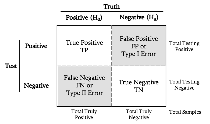
For binary classification, the confusion matrix is a 2×2 contingency table that cross-tabulates predicted classes against ground truth. The resulting four cells capture every possible outcome:
Let’s ground this in diagnostic testing, where the implications of different error types are immediately apparent. Consider a COVID-19 PCR test, where the stakes (both individual and epidemiological) make error analysis particularly salient:
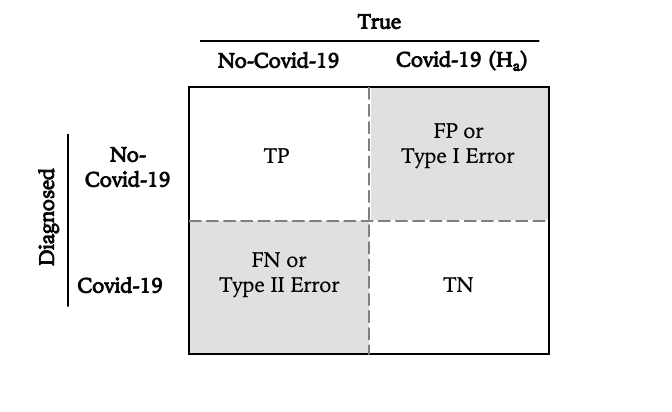
The four outcomes decompose as follows:
-
True Negative (TN): Patient is healthy, test correctly returns negative. The null hypothesis (no infection) holds and is correctly retained.
-
True Positive (TP): Patient is infected, test correctly returns positive. The alternative hypothesis is correctly accepted.
-
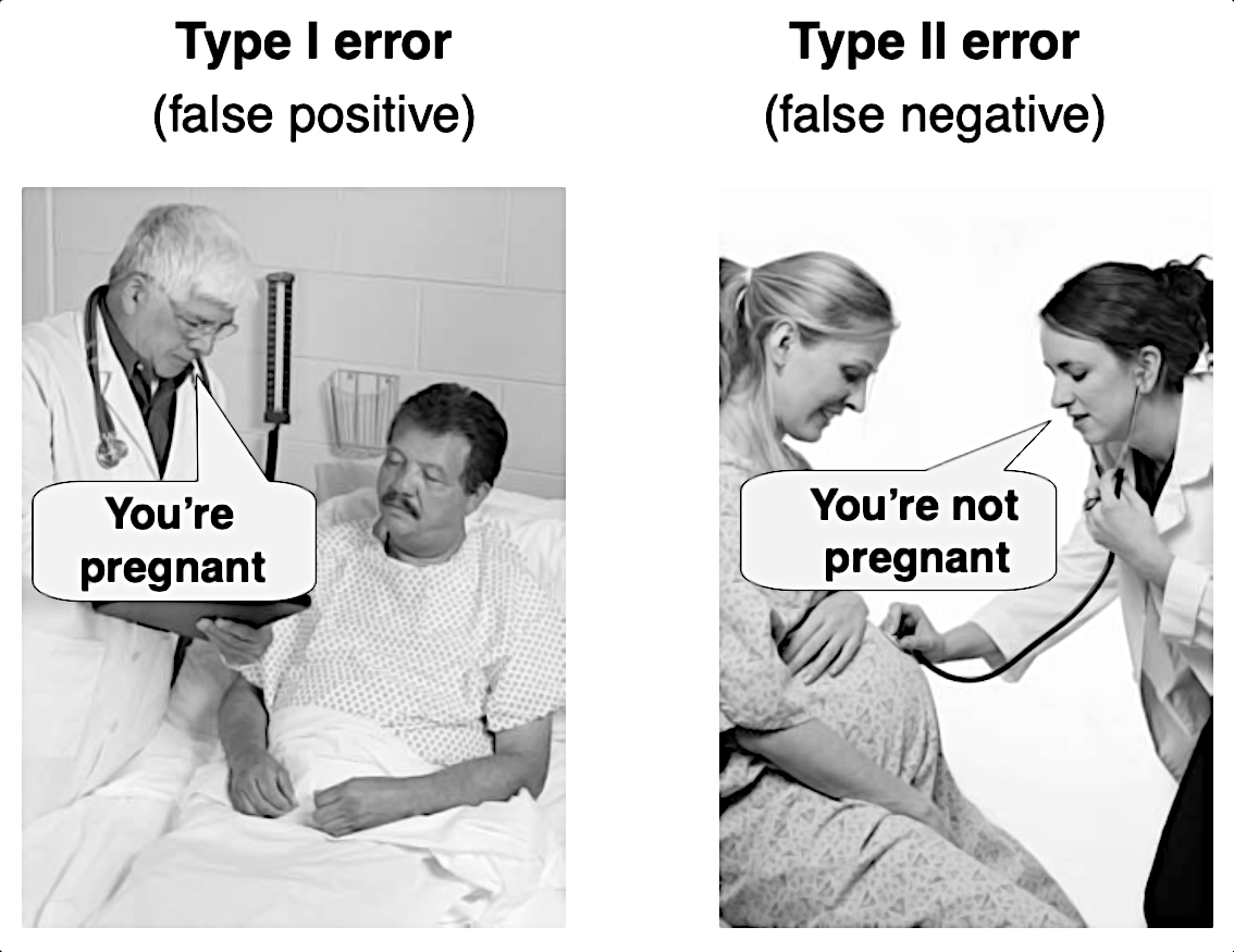
False Positive (FP): Patient is healthy, test incorrectly returns positive. This is a Type I error: rejecting a true null hypothesis. In hypothesis testing terms, we’ve claimed an effect that doesn’t exist.
-
False Negative (FN): Patient is infected, test incorrectly returns negative. This is a Type II error: failing to reject a false null hypothesis. We’ve missed a real effect.
The matrix is ultimately just a bookkeeping device, but it makes explicit something that aggregate metrics obscure: the structure of failure is as important as its frequency.
The Asymmetry of Error
The critical insight is that Type I and Type II errors rarely carry equivalent costs. In most real-world applications, the loss functions are fundamentally asymmetric.
Type I errors (false positives) represent false alarms. Signal detected where only noise exists. In Bayesian terms, we’ve assigned high posterior probability to a hypothesis that’s actually false. The human cognitive bias toward pattern recognition makes us particularly susceptible to this error; our brains evolved to prefer false positives (seeing a predator that isn’t there) over false negatives (missing one that is).
Type II errors (false negatives) represent missed detections. Signal present but undetected. These are failures of sensitivity, where insufficient statistical power or poor model calibration prevents us from distinguishing effect from noise.
The classic legal framework provides useful intuition:
- Type I error: Convicting the innocent (the cost of false imprisonment)
- Type II error: Acquitting the guilty (the cost of unpunished crime)
In diagnostic medicine, the calculus becomes even more explicit. A false positive COVID-19 result triggers unnecessary quarantine, costly but reversible. A false negative releases an infectious patient into the population, potentially seeding exponential transmission chains. The expected value of these errors differs by orders of magnitude.
This asymmetry forces us to design systems with deliberate bias. In pandemic response, we accept higher false positive rates to drive down false negatives. In spam filtering, we tolerate missed spam (false negatives) to avoid filtering legitimate email (false positives). In criminal justice, we nominally prioritize avoiding false convictions even at the cost of some false acquittals, though actual practice often fails this principle.
The confusion matrix makes these tradeoffs explicit and measurable. By decomposing aggregate accuracy into its constituent parts, it reveals where our models are biased and whether that bias aligns with our stated priorities.
Constructing a Confusion Matrix: A Practical Example
Let’s implement this concretely. We’ll simulate a diagnostic test scenario with known error characteristics, then examine how the confusion matrix reveals the underlying performance structure.
import numpy as np
import pandas as pd
import matplotlib.pyplot as plt
from sklearn.metrics import confusion_matrix, classification_report
import seaborn as sns
# Configuration
%matplotlib inline
sns.set_style('white')
np.random.seed(42) # Reproducibility
# Population parameters
n_patients = 50
prevalence = 0.44 # 44% base rate of infection
n_sick = int(n_patients * prevalence)
n_healthy = n_patients - n_sick
# Ground truth distribution
# 0 = healthy (negative), 1 = sick (positive)
y_true = np.array([0] * n_healthy + [1] * n_sick)
np.random.shuffle(y_true)
# Simulate test with known sensitivity and specificity
# Sensitivity (recall): P(test+ | disease+) = 0.95
# Specificity: P(test- | disease-) = 0.93
sensitivity = 0.95
specificity = 0.93
y_pred = []
for actual in y_true:
if actual == 1: # Patient is sick
# Test positive with probability = sensitivity
y_pred.append(1 if np.random.random() < sensitivity else 0)
else: # Patient is healthy
# Test negative with probability = specificity
y_pred.append(0 if np.random.random() < specificity else 1)
y_pred = np.array(y_pred)
# Generate confusion matrix
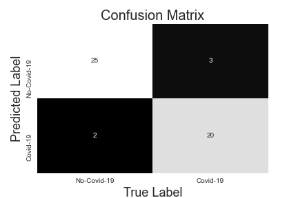
cm = confusion_matrix(y_true, y_pred, labels=[0, 1])
print("Confusion Matrix:")
print(cm)
print(f"\nMatrix structure: [[TN, FP],")
print(f" [FN, TP]]")
Confusion Matrix:
[[26  2]
 [ 1 21]]

Matrix structure: [[TN, FP],
                    [FN, TP]]
The matrix encodes considerable information. We have:
- 26 True Negatives: Healthy patients correctly identified
- 21 True Positives: Infected patients correctly identified
- 2 False Positives: Healthy patients incorrectly flagged (Type I errors)
- 1 False Negative: Infected patient missed (Type II error)
Note the critical false negative. In an epidemic context, this represents a failure of containment. An infectious individual released into the population under the false assurance of a negative test.
Now let’s visualize the matrix with proper context:
def plot_confusion_matrix(cm, labels, ax=None):
    """
    Visualize confusion matrix with proportional context.

    Args:
        cm: Confusion matrix array
        labels: Class labels
        ax: Matplotlib axis object (optional)
    """
    if ax is None:
        fig, ax = plt.subplots(figsize=(8, 6))

    # Create DataFrame for cleaner handling
    df_cm = pd.DataFrame(
        cm,
        index=[f'Actual {l}' for l in labels],
        columns=[f'Predicted {l}' for l in labels]
    )

    # Plot with annotations
    sns.heatmap(df_cm, annot=True, fmt='d', cmap='Blues',
                cbar=False, ax=ax, annot_kws={'size': 16},
                linewidths=1, linecolor='gray')

    ax.set_title('Confusion Matrix', fontsize=18, pad=20)

    # Add summary statistics as text
    total = cm.sum()
    accuracy = (cm[0,0] + cm[1,1]) / total
    ax.text(0.5, -0.15, f'Overall Accuracy: {accuracy:.1%}',
            ha='center', transform=ax.transAxes, fontsize=12)

    return ax

plot_confusion_matrix(cm, ['Healthy', 'Sick'])
plt.tight_layout()
Derived Metrics: Information-Theoretic Perspectives
The confusion matrix serves as the basis for several derived metrics, each emphasizing different aspects of classifier performance. These metrics effectively reweight the matrix elements according to different loss functions and use cases.
Precision: Predictive Value of Positive Calls
Precision measures the reliability of positive predictions—what fraction of positive calls are actually correct:
\[\text{Precision} = \frac{TP}{TP + FP} = P(\text{actual positive} \mid \text{predicted positive})\]In our example: \(\frac{21}{21 + 2} = 0.913\)
This is the posterior probability that a patient is truly infected given a positive test result. High precision means low false discovery rate—when the test says positive, it’s probably right. In information theory terms, precision quantifies how much a positive prediction reduces our uncertainty about the true state.
For applications where false positives are costly (e.g., invasive follow-up procedures, wrongful accusations), precision becomes the primary optimization target.
Recall (Sensitivity, True Positive Rate): Completeness of Detection
Recall measures what fraction of actual positives the classifier successfully identifies:
\[\text{Recall} = \frac{TP}{TP + FN} = P(\text{predicted positive} \mid \text{actual positive})\]In our example: \(\frac{21}{21 + 1} = 0.955\)
This is the conditional probability that an infected patient tests positive—the test’s sensitivity. High recall means low Type II error rate. In signal detection theory, this relates directly to statistical power: the probability of detecting an effect when one truly exists.
For applications where false negatives are catastrophic (cancer screening, fraud detection, pandemic containment), recall becomes paramount. You’d rather deal with false alarms than miss critical cases.
Specificity: The Complement of False Positives
While less commonly emphasized in ML contexts, specificity measures the true negative rate:
\[\text{Specificity} = \frac{TN}{TN + FP} = P(\text{predicted negative} \mid \text{actual negative})\]In our example: \(\frac{26}{26 + 2} = 0.929\)
Specificity and recall form a natural duality. They measure performance on the two classes symmetrically. In medical diagnostics, specificity is often reported alongside sensitivity to fully characterize test performance.
F₁ Score: The Harmonic Mean as Compromise
The F₁ score provides a single metric that balances precision and recall through their harmonic mean:
\[F_1 = 2 \times \frac{\text{Precision} \times \text{Recall}}{\text{Precision} + \text{Recall}} = \frac{2TP}{2TP + FP + FN}\]In our example: \(2 \times \frac{0.913 \times 0.955}{0.913 + 0.955} = 0.934\)
The harmonic mean penalizes extreme imbalance. A classifier with perfect precision but poor recall (or vice versa) will have a low F₁ score. This makes it useful for model comparison when you need a single number but want to avoid the pitfalls of accuracy.
More generally, the F_β score allows you to weight precision and recall according to your priorities:
\[F_\beta = (1 + \beta^2) \times \frac{\text{Precision} \times \text{Recall}}{\beta^2 \times \text{Precision} + \text{Recall}}\]Setting β > 1 emphasizes recall; β < 1 emphasizes precision.
Let’s compute these metrics programmatically:
from sklearn.metrics import precision_score, recall_score, f1_score

# Calculate metrics
precision = precision_score(y_true, y_pred)
recall = recall_score(y_true, y_pred)
specificity = cm[0,0] / (cm[0,0] + cm[0,1])
f1 = f1_score(y_true, y_pred)
accuracy = (cm[0,0] + cm[1,1]) / cm.sum()

# Display with context
print("Performance Metrics:")
print(f"{'='*40}")
print(f"Accuracy:    {accuracy:.3f}")
print(f"Precision:   {precision:.3f}")
print(f"Recall:      {recall:.3f}")
print(f"Specificity: {specificity:.3f}")
print(f"F₁ Score:    {f1:.3f}")
print(f"\n{'='*40}")
print(f"Error Analysis:")
print(f"False Positive Rate: {1-specificity:.3f}")
print(f"False Negative Rate: {1-recall:.3f}")
Performance Metrics:
========================================
Accuracy:    0.940
Precision:   0.913
Recall:      0.955
Specificity: 0.929
F₁ Score:    0.934

========================================
Error Analysis:
False Positive Rate: 0.071
False Negative Rate: 0.045
Notice how these metrics tell a richer story than accuracy alone. While accuracy sits at 94%, the breakdown reveals a test that slightly favors sensitivity over specificity, appropriate for a diagnostic where false negatives are more dangerous than false positives.
Metric Selection as Decision Theory
Choosing which metric to optimize is ultimately a question of loss function design. Each metric encodes implicit assumptions about the relative costs of different error types. The choice depends on the consequences of misclassification in your specific domain.
Optimize for Recall when false negatives dominate the loss function:
- Medical screening for serious diseases (cancer, genetic disorders)
- Security applications (intrusion detection, fraud prevention)
- Epidemic containment (infectious disease testing)
- Search and rescue operations
- Any scenario where the cost of a missed detection is catastrophic or irreversible
The implicit assumption: \(\text{Cost}(FN) \gg \text{Cost}(FP)\)
In these cases, you’re willing to tolerate higher false positive rates to drive down false negatives. The system accepts reduced precision as the price of increased sensitivity.
Optimize for Precision when false positives dominate the loss function:
- Criminal accusations and legal proceedings
- Spam filtering (don’t lose important emails)
- Automated decision systems with limited human review capacity
- Situations where false alarms erode trust or deplete resources
- Cases where follow-up investigation is expensive
The implicit assumption: \(\text{Cost}(FP) \gg \text{Cost}(FN)\)
Here you’re more conservative with positive predictions, accepting that some true cases will slip through to avoid false accusations or alarm fatigue.
Use F₁ (or F_β) when you need to balance competing concerns:
- Model comparison across different architectures
- Benchmarking without domain-specific cost information
- Multi-objective optimization where both error types matter
- Situations where the cost ratio isn’t clearly asymmetric
Consider Multi-Threshold Approaches:
In practice, many classifiers output probabilities rather than hard classifications. Rather than committing to a single threshold, you can:
- Generate precision-recall curves to visualize the tradeoff space
- Use ROC analysis to find optimal operating points given cost ratios
- Implement threshold-dependent decision rules where different contexts demand different sensitivities
For instance, a COVID-19 test might use a lower threshold (higher sensitivity) during epidemic peaks when containment is critical, and a higher threshold (higher precision) during endemic periods when resources for contact tracing are limited.
Conclusion: From Scalar Metrics to Structural Understanding
The confusion matrix represents a shift from evaluation-as-summary-statistic to evaluation-as-error-analysis. Rather than reducing model performance to a single number, it preserves the structure of how and where the model fails.
This matters because real-world deployment demands more than knowing your model is “94% accurate.” You need to understand:
- Where the model is biased: Does it systematically miss certain classes?
- Whether that bias aligns with your priorities: Are you missing the cases you most need to catch?
- How errors will compound in production: Will false positives overwhelm your review capacity? Will false negatives create downstream failures?
- How performance degrades under distribution shift: Which error types increase when deployment data differs from training data?
The confusion matrix answers these questions. It transforms model evaluation from a pass/fail judgment into a diagnostic tool that reveals failure modes and guides improvement.
In the broader context of model development, this granular error analysis enables:
- Targeted data collection: Identify underrepresented cases driving high error rates
- Class rebalancing strategies: Apply cost-sensitive learning or sampling techniques where asymmetric errors demand it
- Ensemble design: Combine models that make different types of errors to reduce specific failure modes
- Threshold calibration: Find operating points that minimize your actual cost function rather than generic accuracy
Perhaps most importantly, the confusion matrix makes model limitations transparent. When you deploy a 94% accurate model, stakeholders often assume near-perfection. When you show them the confusion matrix and explain that 1 in 20 sick patients will be missed, they can make informed decisions about appropriate use cases and necessary safeguards.
The next time you train a classifier, don’t stop at accuracy. Build the confusion matrix. Calculate the metrics that matter for your application. Understand the structure of your model’s errors. Because in deployed systems, the difference between “94% accurate” and “misses 1 in 20 critical cases” isn’t just semantic. It’s the difference between a useful tool and a dangerous one.
References
- Basic Evaluation Measures From the Confusion Matrix by Takaya Saito and Marc Rehmsmeier
- Confusion Matrix Explained by Dynamo
- Ellis, Paul D. The Essential Guide to Effect Sizes
- Fawcett, Tom. “An introduction to ROC analysis.” Pattern recognition letters 27.8 (2006): 861-874
Data Science 