Plotting with Seaborn - Part 1: Foundations & Essential Plots
Why Seaborn?
matplotlib gives you complete control over every pixel of your visualization, but that control costs time. Seaborn sits on top of matplotlib and handles the tedious work: statistical aggregations, color schemes, legends, and professional styling by default.
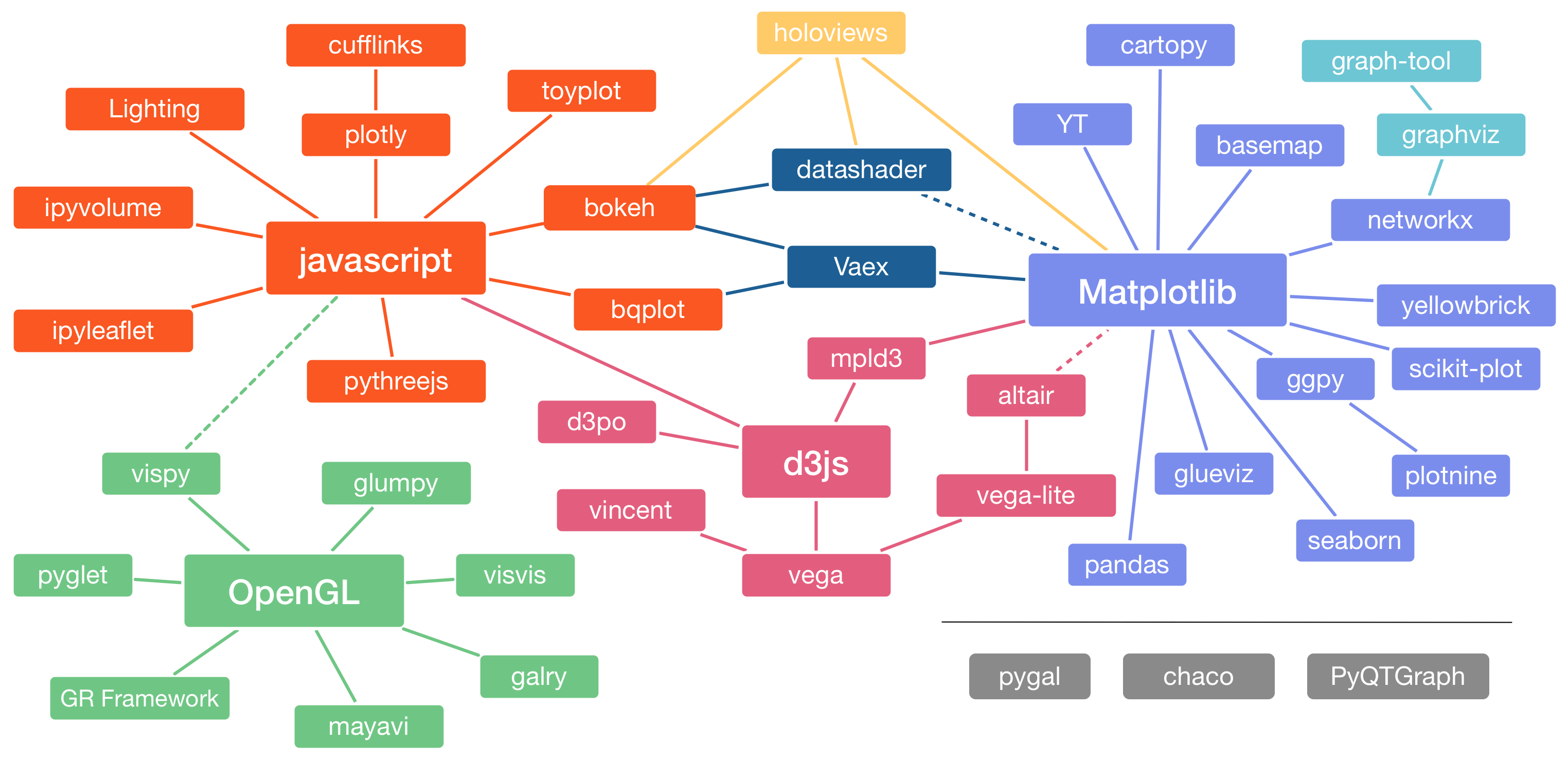
The Python visualization ecosystem is complex. matplotlib provides low-level control, plotly creates interactive visualizations, bokeh powers dashboards. For a deep dive, check out Jake Vanderplas’ PyCon 2017 talk. For data science and ML work, Seaborn has become the definitive choice for statistical data visualization.
Seaborn automatically converts DataFrames into visual attributes, computes statistical transformations, and makes aesthetic choices that would take hours in matplotlib. But when you need fine-grained control, matplotlib is still accessible.
Matplotlib vs. Seaborn Comparison
Let’s see the difference:
# imports
import numpy as np
import pandas as pd
import matplotlib.pyplot as plt
import seaborn as sns

# Notebook settings
plt.rcParams['figure.figsize'] = 9, 4
Random walk data with matplotlib defaults:
# Create random walk data
rng = np.random.RandomState(123)
x = np.linspace(0, 10, 500)
y = np.cumsum(rng.randn(500, 6), 0)

# Plot with matplotlib defaults
plt.style.use('classic')
plt.plot(x, y)
plt.legend('ABCDEF', ncol=2, loc='upper left');
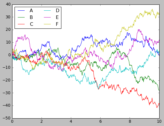
Functional, but looks like it’s from the 1990s. Now with one line to enable Seaborn’s styling:
sns.set()
# Same plotting code as above
plt.plot(x, y)
plt.legend('ABCDEF', ncol=2, loc='upper left');
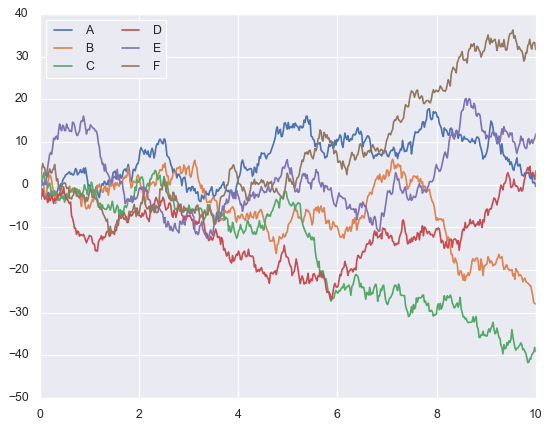
Better colors, cleaner grid lines, improved contrast. One line of code. Browse the Seaborn gallery to see the range of visualizations possible.
Matplotlib’s Foundation
Matplotlib has three layers: Backend (rendering), Artist (visual elements), and Scripting (the interface you use). Seaborn’s defaults are so well-designed you’ll rarely need to dig into the Artist layer.
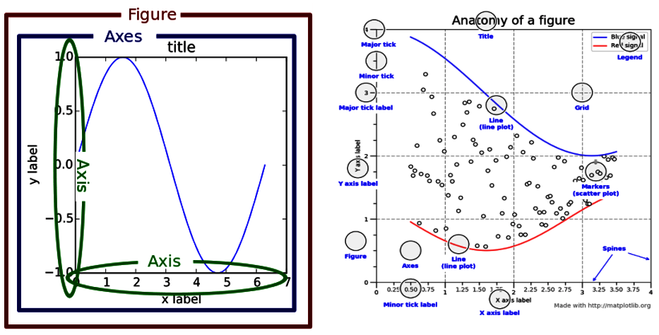
Three concepts will save you hours of frustration: Figure, Axes, and Axis. People confuse these constantly.
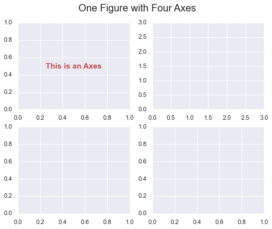
Figure, Axes, and Axis
Figure is the canvas, the entire window. Axes (plural, with ‘s’) is an individual plot area. Axis (singular) is the x-axis or y-axis with tick marks.
Let’s create a Figure with four plots:
# create a figure with 4 axes
fig, ax = plt.subplots(nrows=2, ncols=2)

# Annotate the first subplot
ax[0, 0].annotate('This is an Axes',
                  (0.5, 0.5), color='r',
                  weight='bold', ha='center',
                  va='center', size=14)

# Set the axis limits of the second subplot
ax[0, 1].axis([0, 3, 0, 3])

# Title of the figure
plt.suptitle('One Figure with Four Axes', fontsize=18);
print(fig.axes)
# Output: [<AxesSubplot:>, <AxesSubplot:>, <AxesSubplot:>, <AxesSubplot:>]

# Print the axis limits of the second subplot
print(ax[0, 1].axis())
# Output: (0.0, 3.0, 0.0, 3.0)
Keep these straight, and you’ll never be confused when reading documentation.
Two Flavors of Seaborn Functions
Seaborn functions come in two types.
Axes-Level Functions
Axes-level functions work with a single Axes object and integrate with matplotlib. When you call one, it creates a plot on a single Axes without affecting anything else in your Figure.
Example with the penguins dataset:
# Load our dataset
penguins = sns.load_dataset('penguins')

# Create a figure with two subplots using matplotlib
fig, axs = plt.subplots(1, 2, figsize=(8, 4),
                        gridspec_kw=dict(width_ratios=[4, 3]))

# Use Seaborn to generate a scatter plot on the first subplot
sns.scatterplot(data=penguins, x="flipper_length_mm",
                y="bill_length_mm", hue="species", ax=axs[0])

# Use matplotlib to create a bar chart on the second subplot
species_counts = dict(penguins['species'].value_counts())
axs[1].bar(species_counts.keys(), species_counts.values(),
           color=['royalblue', 'darkseagreen', 'darkorange']);
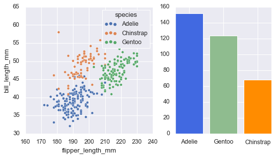
The ax=axs[0] parameter tells Seaborn exactly where to draw.
Figure-Level Functions
Figure-level functions take charge of the entire Figure, creating it from scratch and returning a FacetGrid object. They sacrifice flexibility for convenience in creating multi-panel visualizations.
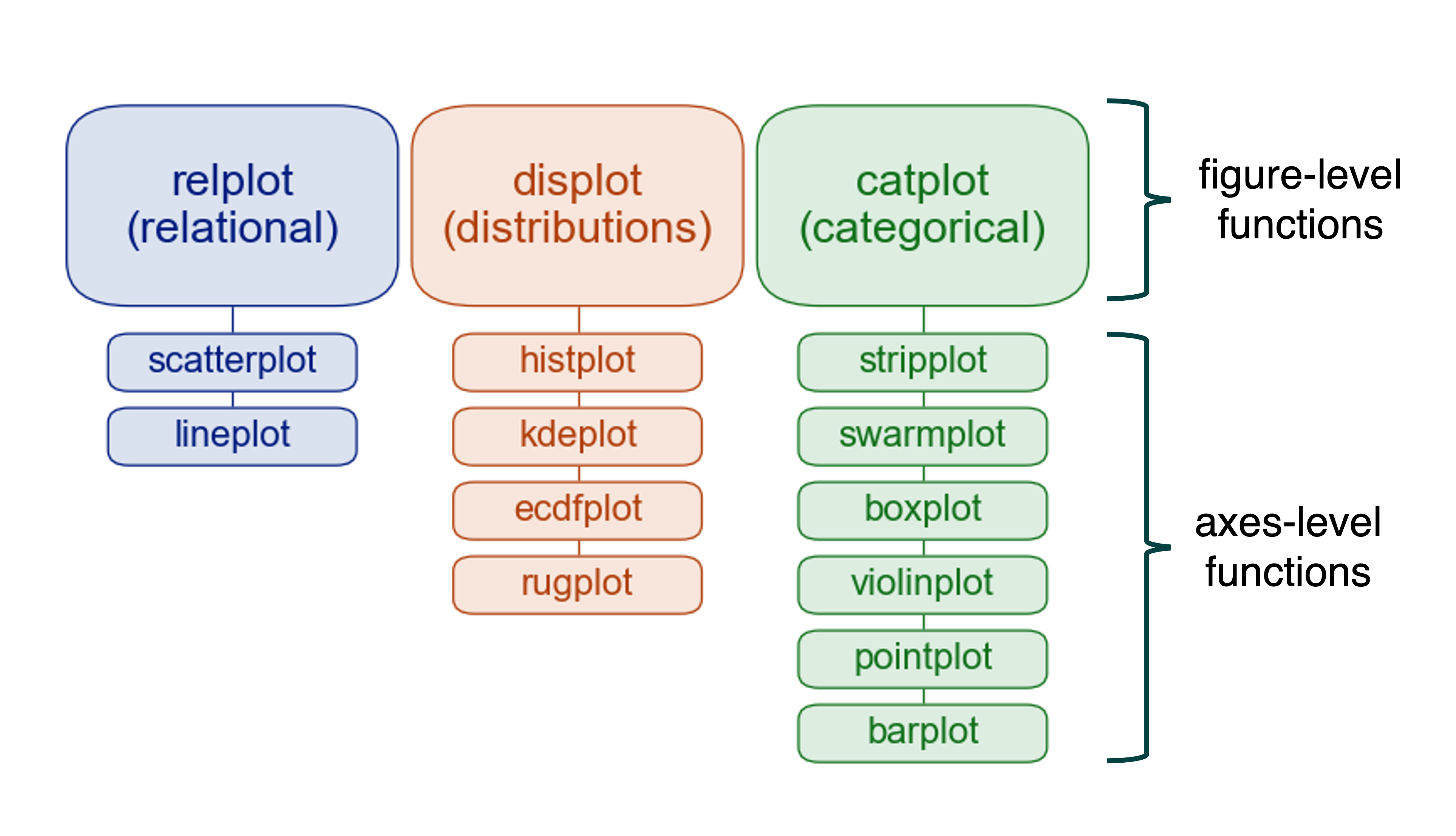
Each figure-level function acts as a coordinator for several related axes-level functions. For example, displot() is the figure-level function that can create histograms, kernel density plots, and other distribution visualizations.
Let’s see it in action:
# Create a kernel density estimate plot
sns.displot(data=penguins, x="flipper_length_mm", hue="species",
            multiple="stack", kind="kde")
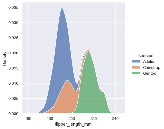
One line of code for a publication-ready visualization. Figure-level functions excel at faceted plots (explored in Part 3). For now, we focus on axes-level functions because they integrate better with matplotlib.
Essential Plot Types
Five visualizations handle 80% of everyday data analysis needs. For deeper dives, see the Seaborn official tutorial.
Bar Plots: Comparing Categories
When you need to compare average values across categories, nothing beats a well-designed bar chart. Let’s work with an employee dataset:
# Load data
df = pd.read_csv('data/employee.csv')
Seaborn offers four presentation styles: paper, notebook, talk, and poster. They’re optimized for different contexts - from journal publications to conference presentations. The default is notebook, which works great for Jupyter notebooks and typical screens. You switch between them like this:
sns.set_context("notebook", rc={"figure.figsize": (10, 6)})

sns.barplot(x=df['Department'], y=df['Age'])
plt.ylim(0, 45)
plt.title('Average Age by Department');
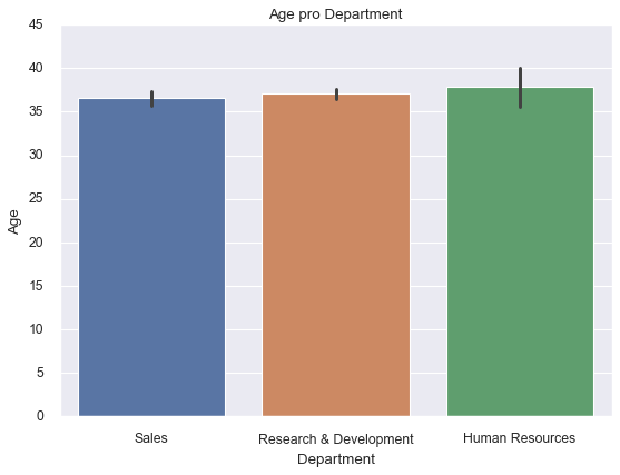
The plot shows mean age for each department with confidence intervals (error bars). To add another dimension, the hue parameter splits each bar into nested groups:
sns.barplot(x=df['Department'], y=df['Age'],
            hue=df['BusinessTravel'],
            palette='magma_r')
plt.title('Average Age by Department and Travel Frequency');
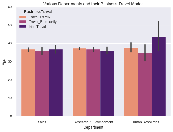
Seaborn includes palette variations: deep, muted, pastel, bright, dark, and colorblind. The colorblind palette ensures everyone can distinguish categories. Bar plots work best with fewer than ten categories.
Count Plots: Showing Distribution
Count plots answer “How many of each category do I have?” Before building a classification model, you need to know whether classes are balanced.
sns.countplot(df['EducationField'])
plt.xticks(rotation=45)
plt.title('Employee Distribution by Education Field');
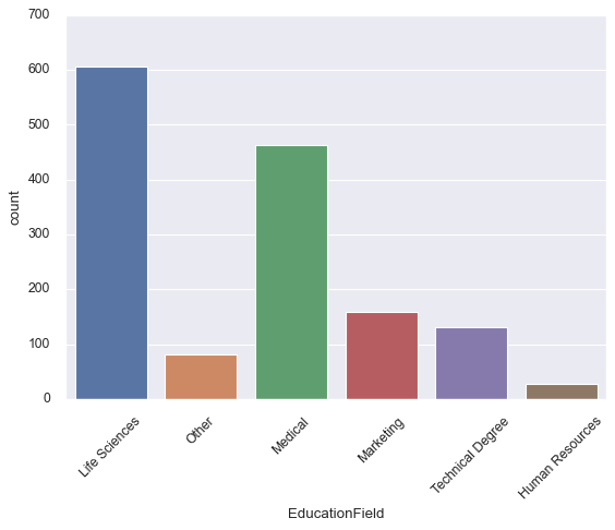
Now you can immediately see that life sciences and medical fields dominate this workforce, while human resources and technical degrees are underrepresented. This context matters when you’re interpreting any analysis based on this data.
As with bar plots, you can add a second categorical variable with hue. Let’s examine how employee attrition relates to education field:
sns.countplot(x=df['EducationField'],
              hue=df['Attrition'],
              palette='colorblind')
plt.xticks(rotation=30)
plt.title('Attrition Rates by Education Field');
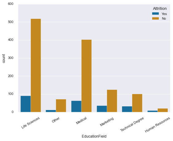
Interesting pattern emerging here - some fields show higher attrition rates than others. This single visualization could spark valuable conversations about retention strategies in different departments.
Line Plots: Trends and Relationships
Here’s where we need to pause for an important conversation. If you’re coming from matplotlib or other libraries, Seaborn’s line plots might surprise you. They don’t just connect points - they do something more sophisticated.
By default, when Seaborn encounters multiple y-values for the same x-position, it aggregates them. It shows you the mean and wraps a confidence interval around it. This behavior is incredibly useful for time series and grouped data, but if you just want simple point-to-point lines, you might find it confusing.
Let’s see what I mean:
sns.lineplot(x=df['Department'], y=df['Age']);
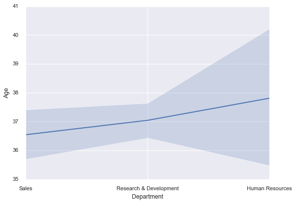
That shaded region? It’s showing you the 95% confidence interval around the mean age for each department. Seaborn is automatically computing statistics and visualizing uncertainty. Pretty neat, right?
This becomes even more powerful when you’re comparing multiple groups:
plt.style.use('ggplot')
sns.lineplot(x=df['Department'], y=df['Age'],
             hue=df['EducationField'])
plt.legend(loc='lower center', title='Education Field')
plt.title('Average Age by Department and Education Field');
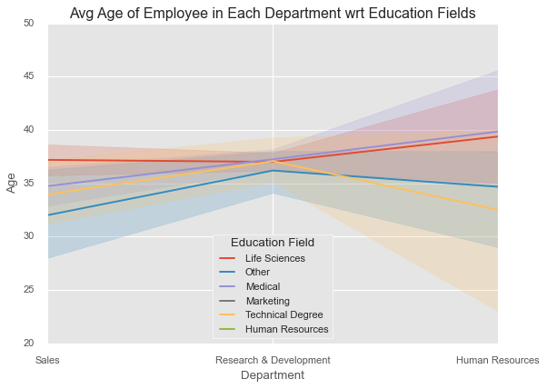
Now you’re seeing trends across both department and education field simultaneously, with automatic handling of all the complexity underneath.
But here’s the thing: computing confidence intervals is computationally expensive. If you’re working with large datasets and those intervals aren’t adding value to your analysis, turn them off:
sns.lineplot(x=df['Department'], y=df['Age'],
             hue=df['EducationField'],
             ci=None)
plt.legend(loc='lower center', title='Education Field');
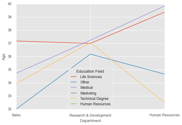
Much faster to render, and for large datasets (say, more than 10,000 points), the confidence intervals often become so narrow that they don’t add much information anyway.
One more thing: if you want simple point-to-point line connections without any statistical aggregation, just use matplotlib’s plt.plot() instead. There’s no shame in that - use the right tool for the job.
Scatter Plots: Exploring Relationships
If line plots show trends over sequences, scatter plots reveal relationships between two continuous variables. Each point is an observation, and patterns in the cloud of points tell you about correlations, clusters, and outliers.
Scatter plots are fundamental to exploratory data analysis. They help you discover relationships you didn’t know existed and verify assumptions about relationships you suspected.
Let’s work with the penguins dataset again. These are real measurements from three Antarctic penguin species, collected by researchers studying how body size relates to ecological niches:
penguins = sns.load_dataset('penguins')

# Customize the appearance
sns.set_style('darkgrid')
sns.set_context("notebook", font_scale=1.3,
                rc={"figure.figsize": (10, 8)})

sns.scatterplot(data=penguins, x="flipper_length_mm",
                y="bill_length_mm", hue="species", s=60)

plt.xlabel("Flipper Length (mm)")
plt.ylabel("Bill Length (mm)");
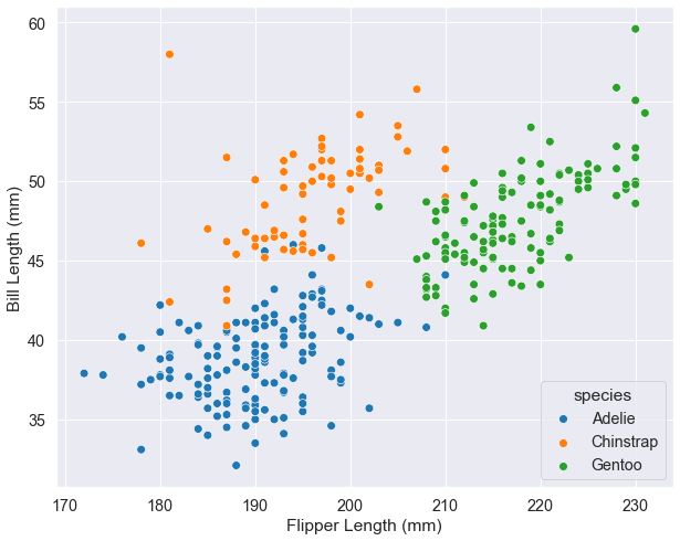
Look at how the species cluster - each occupies a distinct region of the plot. This isn’t random; it reflects real biological differences in how these penguins have adapted to their environments. Adelie penguins (orange) are smaller overall, Gentoo (green) have long flippers relative to bill length, and Chinstrap (blue) sit in between.
Now, you can add even more dimensions to a scatter plot. Color (hue), size, and shape can all encode additional variables:
markers = {'Male': 'o', 'Female': 'X'}

sns.set_context("notebook", font_scale=1.2,
                rc={"figure.figsize": (10, 8)})

sns.scatterplot(x="flipper_length_mm", y="bill_length_mm",
                hue="species", style='sex', size="body_mass_g",
                data=penguins, markers=markers,
                sizes=(20, 300), alpha=.5)
plt.legend(ncol=2, loc=4)
plt.xlabel("Flipper Length (mm)")
plt.ylabel("Bill Length (mm)");
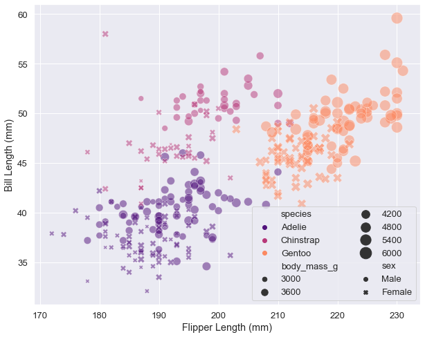
Technically impressive? Yes. Easy to interpret? Debatable. We’re now encoding five dimensions: x-position, y-position, color, shape, and size. This can work for presentations where you guide people through the plot, but for written reports or exploratory analysis, simpler is usually better.
Here’s a design principle worth remembering: more dimensions don’t automatically mean better insights. If your plot becomes a puzzle to decode, you’ve gone too far. Sometimes the best solution is creating multiple simpler plots rather than one complex visualization.
There’s one situation where you might prefer figure-level functions over axes-level: when your legend blocks important data. This happens when data fills the entire plot area and the legend is large. Here’s the problem:
plt.rcParams["figure.figsize"] = 8, 5
plt.style.use('fivethirtyeight')

sns.scatterplot(x=df['Age'], y=df['MonthlyRate'],
                hue=df['Department'],
                size=df['YearsAtCompany'],
                sizes=(20, 200), alpha=.3)
plt.xlim(29.5, 45.5)
plt.title('Age vs Monthly Rate');
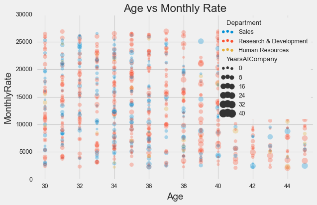
See how the legend covers a chunk of data? Frustrating. The figure-level solution puts the legend outside:
sns.relplot(x=df['Age'], y=df['MonthlyRate'],
            hue=df['Department'],
            size=df['YearsAtCompany'],
            sizes=(20, 200), alpha=.3,
            kind="scatter",
            height=5, aspect=8/5)
plt.xlim(29.5, 45.5)
plt.title('Age vs Monthly Rate');
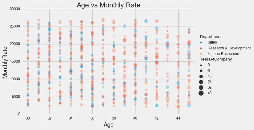
Problem solved. This is one of those cases where the figure-level function’s opinionated layout actually helps.
Heat Maps: Seeing Patterns in Matrices
Some data naturally lives in a matrix - correlation coefficients, confusion matrices, missing data patterns. For this kind of data, heat maps are unbeatable. They encode matrix values as colors, letting you spot patterns at a glance that would be invisible in a table of numbers.
The classic use case is correlation matrices. Let’s look at the Titanic dataset:
titanic = sns.load_dataset('titanic')

sns.heatmap(titanic.corr(), annot=True, cmap='GnBu');
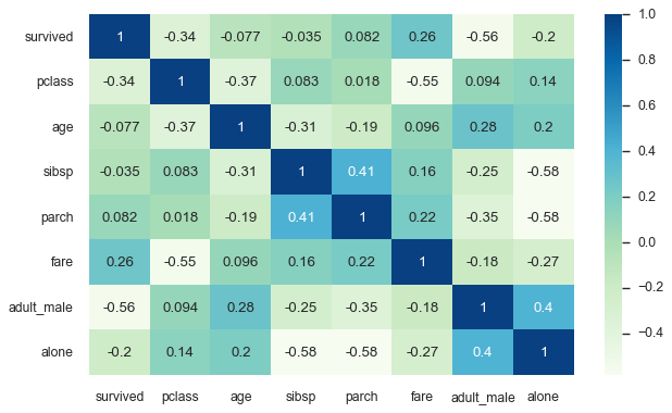
The annot=True parameter displays the actual correlation values in each cell, while the color intensity provides immediate visual ranking. You can instantly see that fare and passenger class are strongly related (not surprising - first class tickets cost more), while age has weak correlations with most other variables.
But heat maps shine in another, often overlooked application: visualizing missing data. When data is missing, it’s rarely random. The pattern of missingness often reveals something important about how your data was collected, and that insight can be valuable.
sns.heatmap(titanic.isnull(), yticklabels=False,
            cbar=False, cmap='YlOrRd');
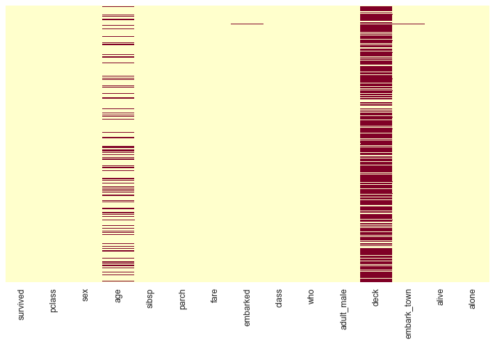
The red streaks show missing values. Immediately you can see that the deck column is mostly empty, and age has scattered missingness throughout. This isn’t just trivia - it affects how you should handle these variables in analysis. Maybe passengers in certain classes had deck information recorded while others didn’t. Maybe age was left blank when passengers didn’t provide it at booking.
Understanding missingness patterns can save you from making wrong assumptions later. If you want to go deeper into missing data analysis, check out the missingno library - it builds on matplotlib and Seaborn to provide specialized visualizations just for this purpose.
Your Essential Toolkit
You’ve now mastered the five plot types that handle most everyday data visualization needs:
Bar plots for comparing means across categories - your go-to for showing “which group is highest/lowest.”
Count plots for showing frequencies - essential for understanding your data’s composition before analysis.
Line plots for trends with statistical aggregation - perfect for time series and comparing trajectories across groups.
Scatter plots for exploring relationships - the foundation of correlation analysis and pattern discovery.
Heat maps for matrix data - unmatched for correlation analysis and missing data patterns.
These five plot types will serve you well in most situations. They’re simple enough to interpret quickly, flexible enough to handle various data types, and professional enough for any audience.
What’s Next
In Part 2: Distributions & Statistical Plots, we’ll go deeper into statistical visualizations. You’ll learn to understand distributions through histograms and box plots, handle large datasets with letter-value plots, reveal distribution shapes with violin plots, and model relationships with regression plots. These tools transform you from creating plots to conducting visual statistical analysis.
You’ll also learn about complementary plots like strip plots, swarm plots, and rug plots that add detail to your visualizations without overwhelming them.
The journey continues - you have the essentials, now let’s add depth.
Resources for Going Deeper
The Seaborn official tutorial is comprehensive and well-maintained. The example gallery shows what’s possible and provides code for each visualization. When you need details about specific parameters, the API reference is authoritative.
All the code from this tutorial, along with the datasets used, is available in this GitHub repository. Feel free to download and experiment.
References
[1] VanderPlas, Jake. 2016. Python Data Science Handbook. O’Reilly Media, Inc.
[3] Desai, Meet. “Matplotlib + Seaborn + Pandas.” Medium, Towards Data Science, 30 Oct. 2019
[4] Waskom, M. L., (2021). seaborn: statistical data visualization. Journal of Open Source Software, 6(60), 3021, https://doi.org/10.21105/joss.03021
Data Science 