Plotting with Seaborn - Part 2: Distributions & Statistical Plots
Beyond the Basics
In Part 1, you mastered the essential toolkit: bar plots for comparisons, count plots for frequencies, line plots for trends, scatter plots for relationships, and heat maps for matrix data. These five plot types handle most everyday visualization needs.
But data science goes deeper than just displaying values. You need to understand distributions. Are your variables normally distributed or skewed? Where are the outliers? How do different groups compare statistically? These questions require a different set of tools.
In this tutorial, we’ll explore Seaborn’s statistical visualization capabilities. You’ll learn to analyze distributions with histograms, compare groups with box plots, handle large datasets with letter-value plots, reveal complex distribution shapes with violin plots, and model relationships with regression analysis. By the end, you’ll be conducting visual statistical analysis, not just creating pretty pictures.
Let’s dive into the world of distributions.
Histograms: Understanding Distributions
If you want to understand a single variable’s distribution, you start with a histogram. It’s that fundamental. Histograms bin your data and show how many observations fall into each bin, revealing the shape, center, and spread of your distribution.
They answer questions like: Is this normally distributed? Are there outliers? Is the data skewed? These aren’t academic questions - they directly impact which statistical methods you can validly apply.
Let’s start simple with our penguin data:
import numpy as np
import pandas as pd
import matplotlib.pyplot as plt
import seaborn as sns

penguins = sns.load_dataset('penguins')

sns.histplot(data=penguins, x="flipper_length_mm");
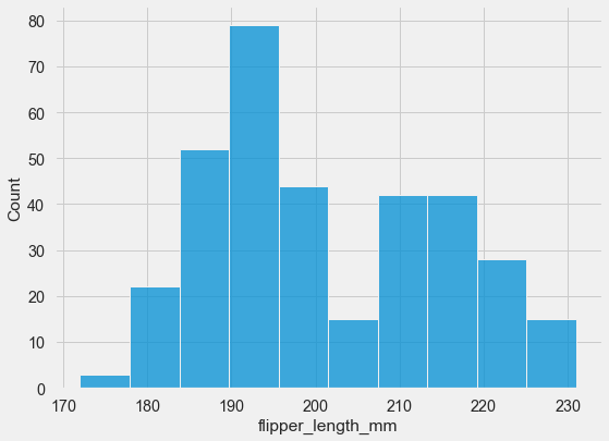
You can see the distribution is roughly bell-shaped, maybe slightly left-skewed, with most flippers between 190 and 220 mm.
To understand the shape better, you can overlay a kernel density estimate - a smooth curve representing the underlying probability distribution:
sns.histplot(data=penguins, x="flipper_length_mm",
             kde=True, color='red', bins=15);
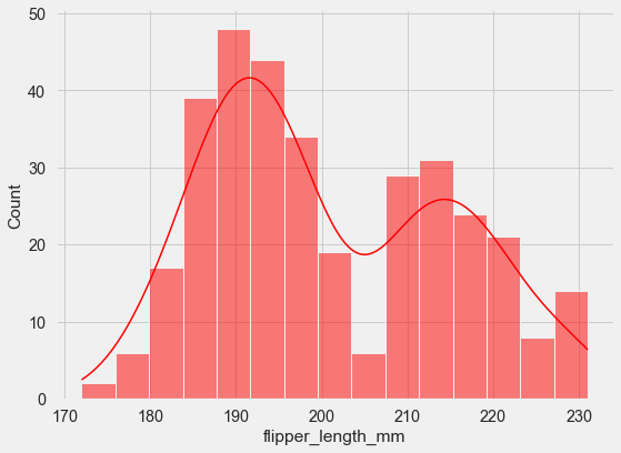
The KDE curve shows you what the “true” distribution might look like if you had infinite data. It’s particularly useful for spotting multiple peaks (multimodality) that might not be obvious from bars alone.
Now, what if you want to compare distributions across groups? The hue parameter creates overlaid histograms:
sns.histplot(data=penguins, x="flipper_length_mm",
             hue="species");
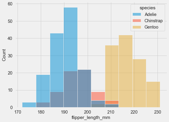
The overlapping bars can be hard to read though. An alternative is the step function approach:
sns.histplot(data=penguins, x="flipper_length_mm",
             hue="species", element="step");
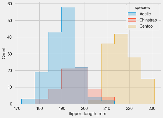
Much clearer! Seaborn automatically applies some transparency to help with visibility, but the step function makes comparison even easier.
Advanced Technique: Independent Normalization
Here’s a more advanced technique. Sometimes you’re comparing variables with dramatically different scales - imagine comparing the number of purchases (hundreds) with dollar amounts (thousands). Raw counts become incomparable. The solution is independent normalization:
tips = sns.load_dataset('tips')

sns.histplot(tips, x="total_bill", hue="day",
             multiple="stack",
             stat="density", common_norm=False,
             palette='pastel');
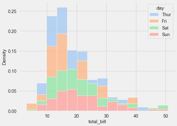
Setting common_norm=False normalizes each distribution independently, so you’re comparing shapes rather than absolute counts. This lets you see that Tuesday and Thursday have similar distribution shapes despite potentially having different numbers of observations.
Histograms have lots more options - different binning strategies, various normalization methods, cumulative distributions. The official documentation is worth exploring when you need something specific.
Box Plots: Compact Statistical Summaries
Sometimes you need to compare distributions across many categories, but creating separate histograms for each would be overwhelming. This is where box plots excel - they condense an entire distribution into five key numbers, displayed compactly enough that you can compare dozens of groups side by side.
Each box shows you the quartiles (25th, 50th, and 75th percentiles), the whiskers extend to the data’s range, and individual points beyond the whiskers are flagged as potential outliers. It’s an incredibly efficient use of space.
Let’s work with the tips dataset - this captures restaurant tipping behavior:
tips = sns.load_dataset('tips')
The data includes tip amounts, total bills, day of week, party size, and whether patrons were smokers. Here’s what a grouped box plot looks like:
sns.boxplot(x="day", y="total_bill",
            hue="smoker",
            data=tips,
            palette='coolwarm');
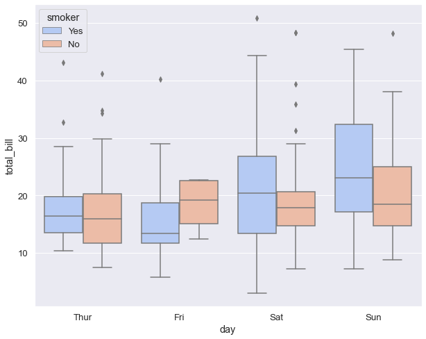
You can immediately see patterns: bills tend to be higher on Saturday and Sunday, and within each day, smokers and non-smokers have similar distributions (the boxes overlap substantially).
Box plots were invented by statistician John Tukey back in the 1970s, designed to be drawn by hand when doing statistics with pencil and paper. Now that we have computers, we can create more sophisticated variations that show additional distribution details while keeping the compact format.
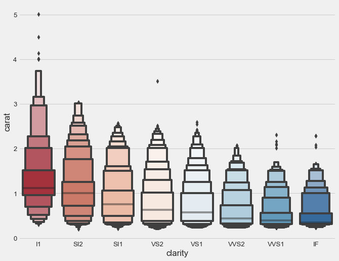
Letter-Value Plots: When Data Gets Big
Here’s a problem you’ll encounter with large datasets: traditional box plots show lots of “outliers” that aren’t really anomalies - they’re just the natural tails of large distributions. With 50,000 observations, even rare events appear hundreds of times. Flagging them all as outliers creates visual noise without adding insight.
Letter-value plots solve this by showing additional quantiles beyond the standard quartiles, giving you better representation of the tail behavior. Think of them as box plots that grow more detailed as your dataset grows larger.
Let’s use the diamonds dataset, which has over 50,000 observations:
diamonds = sns.load_dataset('diamonds')
plt.style.use('fivethirtyeight')

clarity_ranking = ["I1", "SI2", "SI1", "VS2", "VS1", "VVS2", "VVS1", "IF"]

sns.boxenplot(x="clarity", y="carat",
              color="b", order=clarity_ranking,
              scale="linear", data=diamonds,
              palette='RdBu');
Compare this to a standard box plot of the same data:
sns.boxplot(x="clarity", y="carat",
            color="b",
            order=clarity_ranking,
            data=diamonds,
            palette='RdBu')
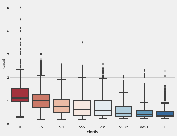
See the difference? The standard box plot is overwhelmed by thousands of “outlier” points that obscure the boxes themselves. The letter-value plot reveals the actual distribution structure that all those points represent.
Use letter-value plots when you have more than 10,000 observations and traditional box plots become cluttered. Below that size, regular box plots work fine.
Violin Plots: Seeing the Full Shape
Box plots show you five numbers. Histograms show you the full distribution. Violin plots give you both - the complete distribution shape plus summary statistics, all in one compact visualization.
The width of the violin at any height shows you the density of observations at that value. It’s like a mirror-image KDE plot, rotated vertically. The inner markings show the same summary statistics as a box plot.
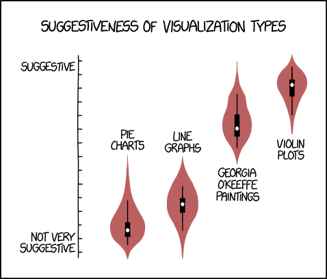
Even XKCD comics recognize the intuitive appeal of violin plots for showing distribution shape.
Here’s what makes violin plots clever: since they’re symmetric, you can split them down the middle to compare two groups side-by-side. Let me show you:
sns.set(style="whitegrid")
f, ax = plt.subplots(figsize=(8, 6))

sns.violinplot(x="day", y="total_bill",
               hue="smoker", data=tips,
               inner="box", split=True,
               palette="Set3_r", cut=2,
               linewidth=3)

sns.despine(left=True)
ax.set_xlabel("Day", size=16, alpha=0.7)
ax.set_ylabel("Total Bill ($)", size=16, alpha=0.7)
ax.legend(loc=2, ncol=2, title='Smoker?')
f.suptitle('Total Bills by Day of the Week', fontsize=20)
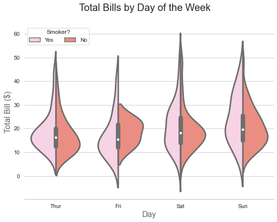
Reading this plot takes a moment to learn, but then it becomes second nature. The pink half-violins show the distribution of bills for smokers. The red half-violins show non-smokers. The inner box shows summary statistics for all bills combined on that day, regardless of smoking status.
You can also show separate summaries for each group:
sns.violinplot(x="day", y="total_bill",
               hue="smoker", data=tips,
               inner="quart", split=True,
               palette="Set3_r", cut=2,
               linewidth=3)

sns.despine(left=True)
ax.set_xlabel("Day", size=16, alpha=0.7)
ax.set_ylabel("Total Bill ($)", size=16, alpha=0.7)
ax.legend(loc=2, ncol=2, title='Smoker?')
f.suptitle('Total Bills by Day of the Week', fontsize=20)
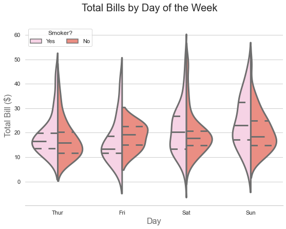
Now the inner lines show quartiles separately for smokers and non-smokers, giving you even more granular information.
Violin plots work best with small to medium datasets where the distribution shape carries meaningful information. With very large datasets, the computational cost increases and the added detail may not justify the complexity.
Regression Plots: Lines of Best Fit
Linear regression is one of the oldest statistical techniques, but it remains powerful for understanding relationships between variables. Regression plots visualize these relationships by fitting a line through your data and showing the uncertainty around that line.
A word of caution though: Seaborn will always draw a regression line, even when your data has no meaningful relationship. The line itself doesn’t prove anything - you need to evaluate the relationship’s strength statistically. Think of the plot as a visualization tool, not a statistical test.
Let’s start simple:
penguins = sns.load_dataset('penguins')
sns.set_theme(style="whitegrid", palette="colorblind")

sns.regplot(data=penguins, x='bill_length_mm', y='bill_depth_mm');
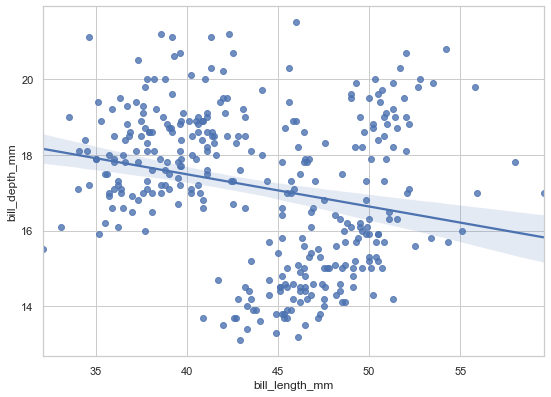
The plot suggests a negative relationship - as bill length increases, depth decreases. The shaded region shows the confidence interval for the regression line. But here’s where things get interesting…
When Aggregation Lies: Simpson’s Paradox
The basic regplot() function has a limitation: no hue parameter. It can only show one regression line for all your data. For grouped data, this can be dangerously misleading. Watch what happens when we use lmplot(), which lets us separate by species:
sns.lmplot(data=penguins, x='bill_length_mm',
           y='bill_depth_mm', hue='species',
           height=6, aspect=8/6,
           palette='cool');
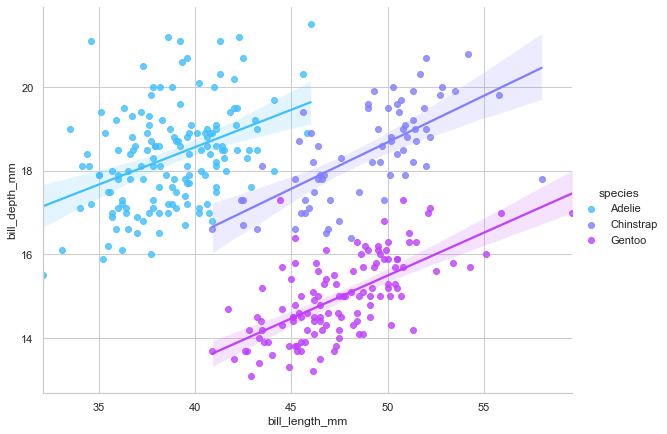
Wait, what? Now each species shows a positive relationship, completely contradicting the overall negative trend we saw before. This isn’t an error - it’s Simpson’s Paradox in action.
Simpson’s Paradox occurs when a trend in aggregated data reverses when you properly separate the data into meaningful groups. Here’s what’s happening: the three penguin species have different body plans. Gentoo penguins are generally larger with both longer and deeper bills. Adelie penguins are smaller on both dimensions. When you lump all species together, the between-species differences dominate the within-species pattern, creating a spurious negative correlation.
This is a crucial lesson for data analysis: always examine relationships within meaningful subgroups. Aggregating across distinct populations can produce completely misleading conclusions. The relationship you see in aggregated data might not exist at all - or worse, might be the opposite of the truth.
Beyond Linear Relationships
Not everything is linear. For curved relationships, you can fit polynomial regressions:
mpg = sns.load_dataset('mpg')

sns.regplot(data=mpg, x='horsepower', y='mpg', order=2);
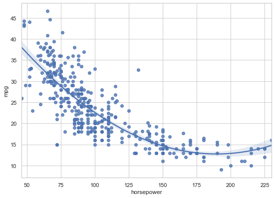
The order=2 parameter fits a quadratic curve. Be careful though - higher-order polynomials can overfit your data, fitting noise rather than signal. Use them judiciously.
For binary outcomes, logistic regression is the right tool:
# Generate binary outcome data
x = np.random.normal(size=150)
y = (x > 0).astype(np.float)
x = x.reshape(-1, 1)
x[x > 0] -= .8
x[x < 0] += .5

# Plot logistic regression
sns.regplot(x=x, y=y, logistic=True)
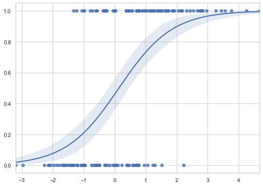
The S-shaped curve is characteristic of logistic regression, showing how probability changes with the predictor variable.
When should you use regplot() versus lmplot()? Use regplot() when you want a single regression as part of a larger matplotlib figure. Use lmplot() when you need separate regressions for different groups or want to create faceted regression plots.
The Supporting Cast: Complementary Plots
These last few plot types rarely stand alone - they’re best used as overlays on other visualizations, adding detail without overwhelming the viewer.
Strip Plots: Showing Every Point
Sometimes summary statistics hide important details. You need to see the individual observations - how many there are, where they cluster, whether any stand out as unusual. Strip plots display every data point at categorical positions.
plt.rcParams["figure.figsize"] = 7, 5
plt.style.use('fivethirtyeight')

titanic = sns.load_dataset('titanic')

params = dict(edgecolor='gray',
              palette=['#91bfdb', '#fc8d59'],
              linewidth=1,
              jitter=0.25)

sns.stripplot(data=titanic, x='pclass',
              hue='sex', y='age',
              **params);
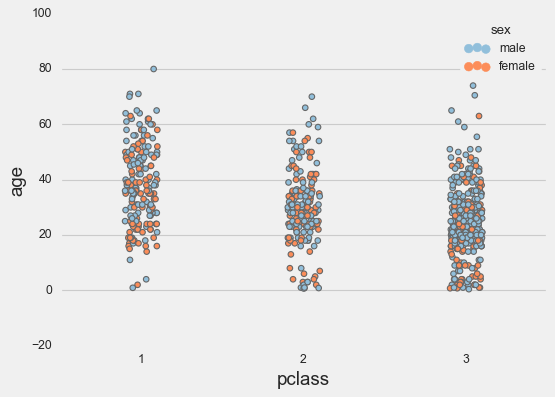
The jitter parameter adds random horizontal displacement so overlapping points don’t hide each other completely. Without jitter, they’d all stack vertically in lines, and you’d lose the sense of how many observations you have.
Strip plots shine when layered over violin or box plots:
plt.rcParams["figure.figsize"] = 10, 6

# First plot the violins
sns.violinplot(x=titanic['pclass'], y=titanic['age'],
               palette='Accent', dodge=True,
               hue=titanic['survived'])

# Then overlay the strip plot
g = sns.stripplot(x=titanic['pclass'], y=titanic['age'],
                  edgecolor='gray',
                  palette=['#fc8d59', 'wheat'],
                  dodge=True,
                  hue=titanic['survived'],
                  jitter=.15);
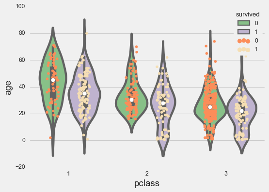
Now you see both the distribution shape and the actual data points. This combination works beautifully for datasets up to a few hundred points per group.
Swarm Plots: Intelligent Point Placement
Strip plots add random jitter. Swarm plots do something smarter - they arrange points algorithmically to avoid overlap while revealing the distribution shape. The result looks like a swarm of bees, hence the name.
sns.swarmplot(x=titanic['pclass'],
              y=titanic['age'],
              palette='icefire_r');
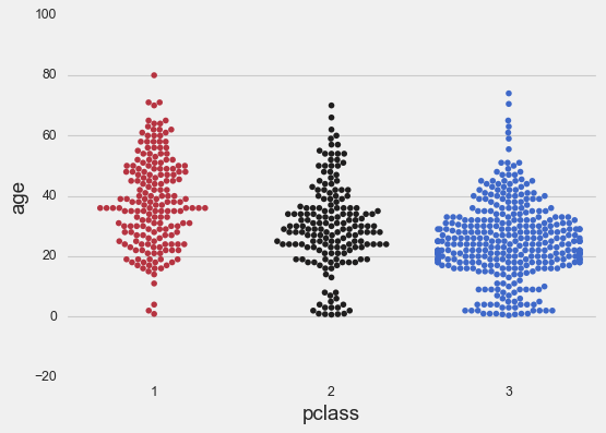
The point arrangement itself shows you the distribution density. Where points spread wider, you have more observations. The shape emerges naturally from the algorithm trying to pack points efficiently.
The downside? Swarm plots are computationally expensive. With thousands of points, they become slow to render. They work best with small to medium datasets - say, under 2,000 points total.
Like strip plots, swarm plots pair beautifully with box plots:
# First the swarm plot
sns.swarmplot(data=titanic, x='pclass',
              palette='PuBu', hue='survived',
              y='age')

# Then overlay the box plot with transparency
ax = sns.boxplot(x=titanic['pclass'],
                 y=titanic['age'],
                 palette="Accent")

# Add transparency to boxes
for patch in ax.artists:
    r, g, b, a = patch.get_facecolor()
    patch.set_facecolor((r, g, b, .5))
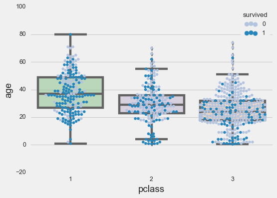
Now you see individual points, distribution shape, and summary statistics all at once. It’s a lot of information in one plot, but it works because each layer adds meaning without creating clutter.
Rug Plots: Marginal Distributions
The humblest plot in our toolkit is the rug plot - just tiny tick marks along the axis showing where each data point sits. They’re called rug plots because the marks resemble the fringe on a rug.
fig, axs = plt.subplots(figsize=(8, 1.5))

sns.rugplot(ax=axs, a=tips['total_bill'],
            height=0.25, lw=0.5,
            color=sns.xkcd_rgb["pale red"]);
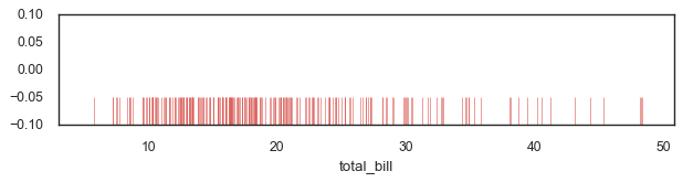
On their own, rug plots don’t tell you much. But as marginal distributions alongside 2D visualizations like scatter plots or regression plots, they add context about the underlying data density. They answer the question “where is my data actually concentrated?” without interfering with the main visualization.
Your Statistical Toolkit: A Quick Reference
You now have a comprehensive set of tools for statistical visualization. Here’s when to use each:
| Plot Type | Best For | Avoid When |
|---|---|---|
| Histogram | Understanding single variable distributions | Comparing >5 distributions simultaneously |
| Box Plot | Comparing distributions across many groups | Dataset is very large (>10k points per group) |
| Letter-Value Plot | Large datasets (>10k points) | Small datasets (<1k points) |
| Violin Plot | Showing distribution shapes with statistics | Dataset is extremely large or computation time matters |
| Regression Plot | Visualizing linear relationships | Relationship is clearly non-linear |
| Strip Plot | Showing individual points with categories | Too many points cause severe overplotting |
| Swarm Plot | Small/medium datasets with distribution shape | Large datasets (very slow rendering) |
| Rug Plot | Adding marginal distributions | As standalone visualization |
Key Principles Learned
Distribution matters. Before running statistical tests or building models, understand your variable distributions. Are they normal? Skewed? Multimodal? The right plot makes this obvious.
Context reveals truth. Simpson’s Paradox taught us that aggregated data can lie. Always examine relationships within meaningful subgroups, not just across your entire dataset.
Layering adds insight. Combining plot types - strip plots over violins, rug plots with scatter plots - provides richer understanding than any single visualization.
Choose the right tool. Box plots for many groups. Histograms for distribution details. Violin plots when shape matters. Each plot type has its sweet spot.
What’s Next
You’ve now mastered both essential plots (Part 1) and statistical depth (Part 2). You can create professional visualizations, compare groups rigorously, understand distributions, and model relationships.
But what happens when you need to compare these relationships across multiple categories simultaneously? What if you want to see how every variable in your dataset relates to every other variable? What if your data has so many dimensions that individual plots become overwhelming?
In Part 3: Multivariate Visualization, you’ll discover Seaborn’s most powerful feature: Grid classes that let you create sophisticated multi-panel visualizations with a single command. You’ll learn about FacetGrid for conditional comparisons, PairGrid for exploring all relationships at once, and JointGrid for focused bivariate analysis with marginal context.
These tools transform how you approach complex data. Instead of struggling to cram multiple dimensions into one plot, you’ll create multiple simple plots that work together to tell a complete story.
The journey continues - you have the foundation and the depth, now let’s add breadth.
Resources for Continued Learning
Official Documentation:
- Seaborn Tutorial - Comprehensive guide to all features
- Example Gallery - Visual inspiration with code
- API Reference - Complete function documentation
This Tutorial Series:
- Part 1 covered essential plots for everyday visualization
- Part 2 (this tutorial) covered distributions and statistical analysis
- Part 3 will cover multivariate visualization with Grid classes
- Code and Datasets - Download and experiment
References
[1] VanderPlas, Jake. 2016. Python Data Science Handbook. O’Reilly Media, Inc.
[2] Waskom, M. L., (2021). seaborn: statistical data visualization. Journal of Open Source Software, 6(60), 3021, https://doi.org/10.21105/joss.03021
[3] Gureckis, Todd. 2020. Lab in Cognition and Perception
[4] Hofmann, Heike, Hadley Wickham & Karen Kafadar (2017) Letter-Value Plots: Boxplots for Large Data, Journal of Computational and Graphical Statistics, 26:3, 469-477, DOI: 10.1080/10618600.2017.1305277
Data Science 