Plotting with Seaborn - Part 3: Multivariate Visualization
The Small Multiples Revolution
In Parts 1 and 2, you learned to create beautiful individual visualizations. You can make scatter plots, histograms, box plots, violin plots, and regression analyses. You understand distributions, can compare groups statistically, and know how to model relationships.
But here’s a problem you’ve probably encountered: what happens when you need to make that same comparison across twenty different categories?
Your first instinct might be to cram everything into one plot - different colors for each category, maybe different shapes, perhaps varying sizes. We even tried this in Part 1 with that five-dimensional scatter plot, remember? It worked, technically. But was it easy to interpret? Not really.
There’s a better way, and it’s based on an idea that’s been around for over a century. In 1878, photographer Eadweard Muybridge needed to settle a bet: do all four of a horse’s hooves leave the ground during a gallop? He set up 24 cameras along a racetrack and captured history’s first motion sequence.
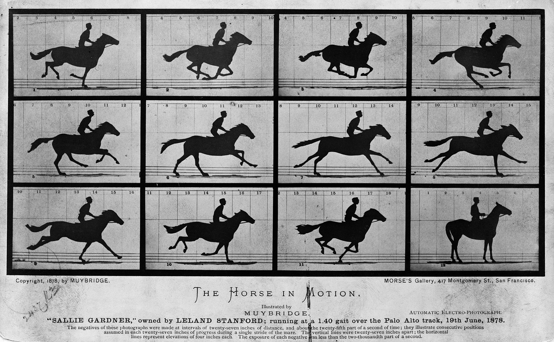
Look at that image. Instead of trying to show motion in a single complex frame, Muybridge created a series of simple, comparable images. Each frame is easy to understand on its own, but together they tell a story that no single image could. This is the essence of small multiples - also called trellis plots or lattice plots.
Edward Tufte, the data visualization pioneer, put it perfectly:
“At the heart of quantitative reasoning is a single question: Compared to what? Small multiple designs, multivariate and data bountiful, answer directly by visually enforcing comparisons of changes, of the differences among objects, of the scope of alternatives. For a wide range of problems in data presentation, small multiples are the best design solution.”
The idea sounds simple: create multiple versions of the same plot for different subsets of your data, keeping everything else constant so comparisons are effortless. But implementing this manually? Tedious doesn’t begin to describe it. You’d need to calculate subplot layouts, manage shared axes, ensure consistent scales, synchronize styling…
Unless you use Seaborn.
This is where Seaborn truly shines. With a single command, you can transform one plot into a carefully arranged grid of related plots. Three specialized classes - FacetGrid, PairGrid, and JointGrid - handle all the complexity for you. In this tutorial, you’ll learn how to wield these powerful tools to explore multivariate datasets efficiently.
Let’s dive in.
Understanding Faceting
Faceting means splitting your data into subsets and creating the same visualization for each subset, arranged in a grid. Imagine you’re analyzing penguin body mass. A single histogram shows the overall distribution. But what if male and female penguins have different body mass patterns? What if those patterns vary by species? Suddenly you need six histograms: two sexes times three species.
You could create six separate plots. You could try cramming everything into one plot with complex color coding. Or you could use faceting - arrange those six histograms in a 2×3 grid where rows represent sex and columns represent species. Each histogram is simple and clear. The grid layout makes comparisons obvious. The shared axes ensure fairness. This is faceting.
Seaborn provides three classes for creating these grids, each designed for different scenarios. Think of them as three different tools in your workshop, each perfect for particular jobs.
FacetGrid: The Same Story, Told Many Times
FacetGrid is your go-to tool when you want to see the same relationship repeated across different subsets of your data. It creates a matrix of plots where each cell shows identical variables under different conditions.
Let’s set up our environment and load the data:
# Import the required libraries
import numpy as np
import pandas as pd
import matplotlib.pyplot as plt
import seaborn as sns

# Set the notebook environment
%precision %.3f
pd.options.display.float_format = '{:,.3f}'.format
plt.rcParams["figure.figsize"] = 9,5
pd.set_option('display.width', 100)
plt.rcParams.update({'font.size': 22})
plt.style.use('fivethirtyeight')

# Load the penguins dataset
penguins = sns.load_dataset('penguins')
Now, suppose we want to compare penguin body mass distributions across species and sex. We could describe this in words, create complex overlapping histograms, or… we could use FacetGrid:
g = sns.FacetGrid(penguins, row='sex', col='species', aspect=1.75)
g.set_titles(row_template='{row_name}', col_template='{col_name} Penguins');
Look at what we just created with two lines of code. A 2×3 grid of empty plots, already labeled and ready for data. The rows split by sex, the columns by species. Notice how the layout minimizes duplicate labels - no cluttered repetition of axis labels. Seaborn handles all these design decisions for you.
But empty grids don’t tell stories. Let’s add actual data. The .map() method lets you apply any plotting function to all facets simultaneously:
plt.style.use('bmh')

# Create a figure with 6 facet grids
g = sns.FacetGrid(penguins, row='sex', col='species', aspect=1.75)
g.set_titles(row_template='{row_name}', col_template='{col_name} Penguins');

# Plot a histogram in each facet
g.map(sns.histplot, 'body_mass_g', binwidth=200, kde=True)

# Set x, y labels
g.set_axis_labels('Body Mass (g)', "Count")
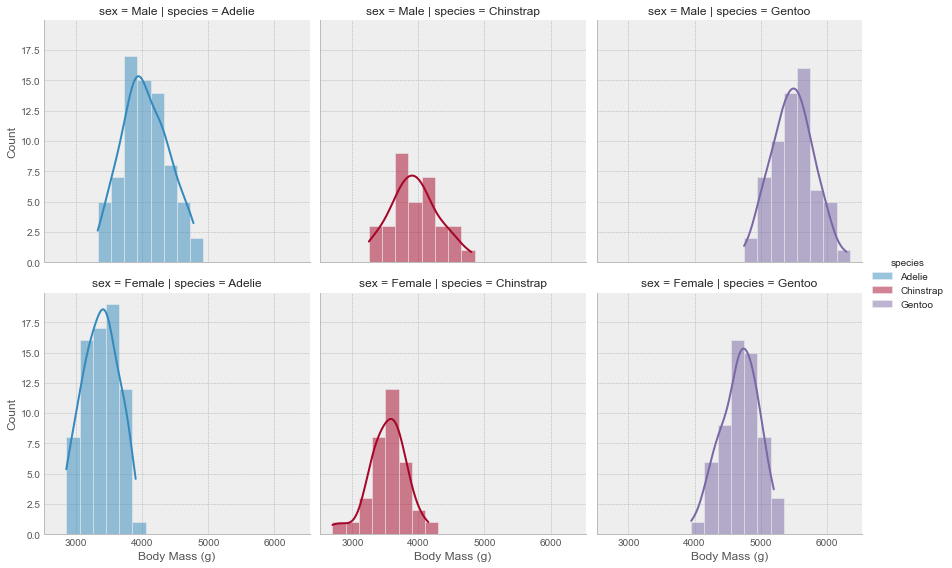
Now we’re seeing patterns. Male penguins generally have higher body mass than females across all species - you can see this by comparing rows. Gentoo penguins are notably heavier than the other species - compare columns. These insights would be much harder to extract from a single overlapping histogram or a table of numbers.
Creating Your Own Mapping Functions
Here’s something powerful: the function you pass to .map() doesn’t have to be from Seaborn or matplotlib. You can write your own custom functions. This opens up limitless possibilities.
There are three simple rules your function must follow. First, it needs to work with matplotlib’s current axes system - it should plot on whatever axes matplotlib is currently using. Second, it must accept data as arguments. Third, it should accept extra keyword arguments and pass them along. That’s it.
Let me show you what this looks like in practice. Let’s create a function that calculates the mean for each facet and adds it as an annotated vertical line:
def add_mean(data, var, **kwargs):
    # Calculate mean for the current subset
    m = np.mean(data[var])

    # Get the current axes matplotlib is working with
    ax = plt.gca()

    # Add a vertical line at the mean
    ax.axvline(m, color='maroon', lw=3, ls='--', **kwargs)

    # Annotate the mean value
    # Position the text based on where the mean falls
    x_pos = 0.6
    if m > 5000:
        x_pos = 0.2
    ax.text(x_pos, 0.7, f'mean={m:.0f}',
            transform=ax.transAxes,
            color='maroon', fontweight='bold',
            fontsize=14)
This function follows all three rules. It gets the current axes with plt.gca(), it accepts data and var as arguments, and it includes **kwargs that get passed to axvline(). Now let’s use it:
g = sns.FacetGrid(penguins, row='sex', col='species', hue='species',
                  height=6, aspect=1)
g.map(sns.kdeplot, 'body_mass_g', lw=3, shade=True)
g.map_dataframe(add_mean, var='body_mass_g')
g.set_axis_labels('Body Mass (g)', "Count")
g.add_legend()
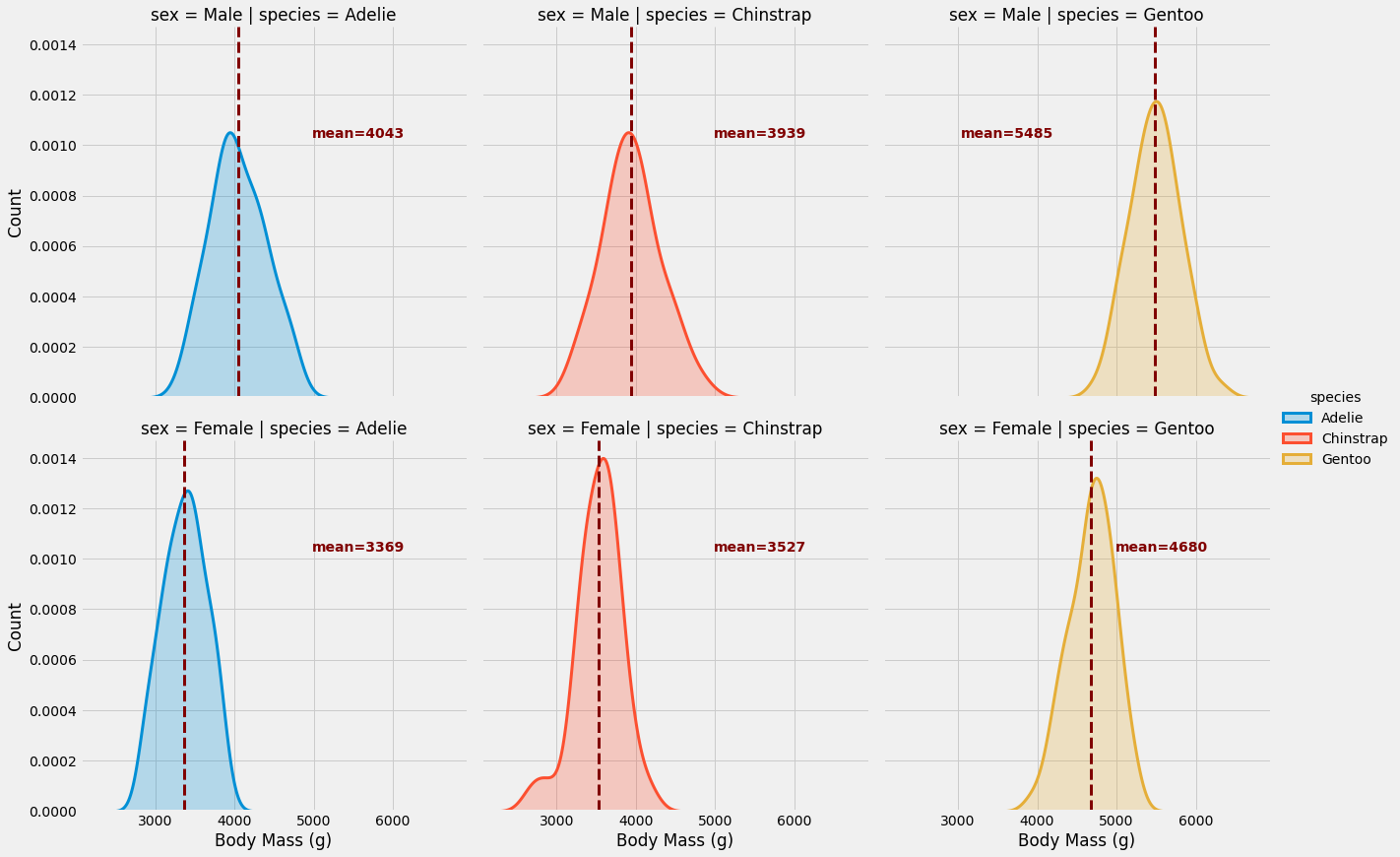
Beautiful! Notice we used .map_dataframe() instead of .map() for our custom function. This method passes the entire subset DataFrame to your function, giving you more flexibility for complex calculations.
Think about what we accomplished here. In just a few lines, without manually managing layouts or axes, we created a sophisticated multi-panel visualization with custom annotations. Each facet tells a clear story, comparisons are effortless, and the professional styling came for free.
This is FacetGrid’s superpower: it lets you think about your data and your message, not about plot management.
When FacetGrid Shines
Use FacetGrid when you have categorical variables that naturally partition your data into groups, and you want to see the same relationship within each group. It’s perfect for answering questions like:
- How does this distribution vary across categories?
- Does this trend hold for all subgroups?
- Are there patterns specific to certain combinations of conditions?
Here’s an important note: you rarely use FacetGrid directly anymore. Instead, you use figure-level functions like relplot(), catplot(), lmplot(), and displot(), which wrap FacetGrid with smarter defaults. We’ll explore these shortly. But understanding FacetGrid helps you grasp what those functions do under the hood.
PairGrid: Seeing All Relationships At Once
While FacetGrid shows the same relationship under different conditions, PairGrid tackles a different problem: what if you want to see how all your variables relate to each other?
When you start exploring a new dataset, you don’t always know which relationships matter. Maybe X correlates with Y. Maybe Y predicts Z. Maybe there’s a surprising connection between A and C that you’d never have guessed. You could manually create scatter plots for every pair of variables, but with five variables that’s already ten plots. With ten variables? Forty-five plots.
PairGrid automates this exploration. It creates a matrix where each cell shows a different pair of variables. The diagonal shows the distribution of each variable on its own, while the off-diagonal cells show pairwise relationships.
Let’s use the famous iris dataset - measurements of iris flowers across three species:
# Load the iris dataset
iris = sns.load_dataset('iris')

# Set the plotting style
plt.style.use('seaborn-paper')

# Initiate the PairGrid instance
g = sns.PairGrid(iris, diag_sharey=False, hue="species", palette="Set2")

# Scatter plots on the upper triangle
g.map_upper(sns.scatterplot)

# Histplot with kde on the diagonal
g.map_diag(sns.histplot, hue=None, legend=False, color='darksalmon',
           kde=True, bins=8, lw=.3)

# Kde without hue parameter on the lower triangle
g.map_lower(sns.kdeplot, shade=True, lw=1,
            shade_lowest=False, n_levels=6,
            zorder=0, alpha=.7, hue=None,
            color='mediumaquamarine')

g.add_legend();
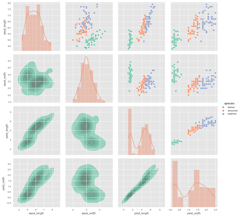
Look at the sophistication we achieved here. The upper triangle shows scatter plots - perfect for seeing clusters and correlations. The diagonal shows distributions of individual variables - revealing shapes and spreads. The lower triangle shows kernel density contours - highlighting regions of high density that might not be obvious from scatter plots alone.
And notice something clever: the upper and lower triangles show the same relationships, just with different visualization methods. Petal length vs petal width appears twice - once as a scatter plot (upper right area) and once as a density plot (lower left). This redundancy isn’t wasteful; it’s informative. Different visualizations reveal different aspects of the same relationship.
The Key Distinction
Here’s what separates PairGrid from FacetGrid, and it’s crucial to understand this:
FacetGrid shows the same relationship (same variables) under different conditions. Think: “Show me age vs income for each education level.”
PairGrid shows different relationships (different variable pairs) all together. Think: “Show me how age, income, education, and experience all relate to each other.”
With PairGrid, you’re not asking about one specific relationship - you’re conducting reconnaissance across your entire dataset. You’re looking for patterns, hunting for correlations, discovering unexpected connections. It’s exploration in the truest sense.
The Practical Reality
In practice, you’ll probably use pairplot() instead of PairGrid directly. The pairplot() function wraps PairGrid with sensible defaults that work well for most cases. But when you need fine-grained control - like using different plot types for different triangles - PairGrid gives you that power.
JointGrid: Two Perspectives, One Relationship
Sometimes you want to focus on a single relationship between two variables, but you want to see it from multiple angles. You want the scatter plot showing how X and Y relate, but you also want histograms showing how each variable is distributed on its own. This is where JointGrid comes in.
Think of JointGrid as zooming in where PairGrid gives you the wide view. Instead of showing all possible relationships, it focuses on one relationship but gives you richer context about that single relationship.
Let’s look at the structure first:
g = sns.JointGrid(data=[])
The layout reveals the concept immediately. The large center plot is for your bivariate relationship - typically a scatter plot or regression. The plots along the top and right edges are for univariate distributions of each variable. It’s a main stage with supporting context.
Let’s put real data into this framework. We’ll examine the relationship between bill total and tip amount in our restaurant tips dataset:
tips = sns.load_dataset('tips')

g = sns.JointGrid(x="total_bill", y="tip", data=tips,
                  hue="time", palette="magma")
g.plot(sns.scatterplot, sns.histplot)
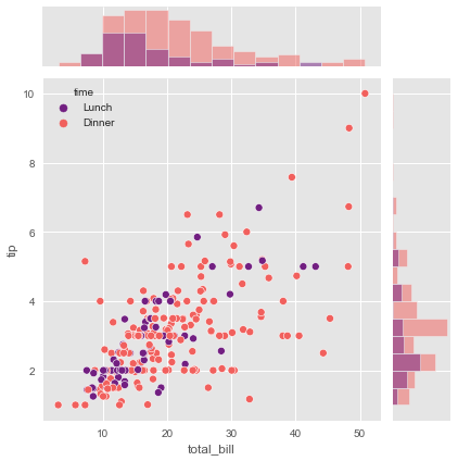
The .plot() method is the simplest approach - you give it two functions, one for the center and one for the margins. Here we’re using scatter plots in the center (showing the bill-tip relationship) and histograms on the margins (showing the distribution of bills and tips separately).
But you can get more sophisticated. Maybe you want different plot types or different parameters for center versus margins. That’s when you use .plot_joint() and .plot_marginals() separately:
# Let's use the penguins dataset again
g = sns.JointGrid(data=penguins, x="bill_length_mm",
                  y="bill_depth_mm", hue="species", palette="Set1")

# Histplot with kde on both marginal axes
g.plot_marginals(sns.histplot, kde=True, hue=None,
                 legend=False, element='step')

# Kde and scatter plots on the joint axes
g.plot_joint(sns.kdeplot, levels=4)
g.plot_joint(sns.scatterplot)
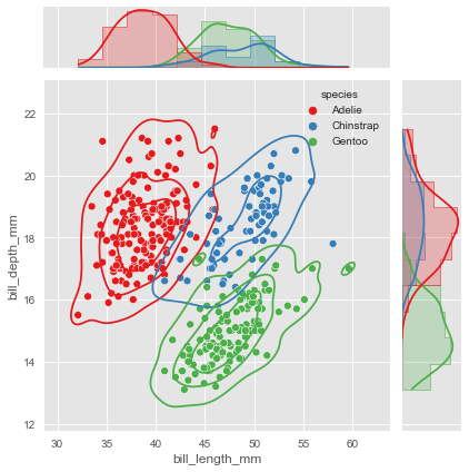
Notice we called .plot_joint() twice - first adding a density contour, then overlaying scatter points. This layering creates a rich visualization where you can see both the overall density patterns and the individual data points.
The marginal plots use hue=None to show the overall distributions without species separation. This is deliberate - sometimes you want the margins to show the complete distribution while the center plot breaks down by categories. Other times you might want consistent grouping throughout. JointGrid gives you control over these decisions.
When JointGrid Makes Sense
Use JointGrid when you have one specific relationship you want to understand deeply. The bivariate plot shows you the relationship itself - correlation, clusters, outliers. The marginal plots provide crucial context - distribution shapes, skewness, potential issues with one or both variables.
This combination often reveals insights that either view alone would miss. Maybe your scatter plot shows what looks like a weak correlation, but the marginal histograms reveal that one variable is heavily skewed - transform it and the relationship might strengthen. Maybe you see an outlier in the scatter plot, and the marginal plot confirms it’s truly extreme, not just unusual relative to the other variable.
As with the other Grid classes, you’ll often use the figure-level wrapper jointplot() instead of JointGrid directly. But knowing JointGrid helps you understand what’s possible.
The Figure-Level Shortcuts
You now understand the three Grid classes - FacetGrid, PairGrid, and JointGrid. They’re powerful, flexible tools. But Seaborn’s designers noticed that people kept using them in similar ways, configuring the same common options repeatedly. So they created figure-level functions that wrap these Grid classes with smart defaults.
Remember this diagram from Part 1?
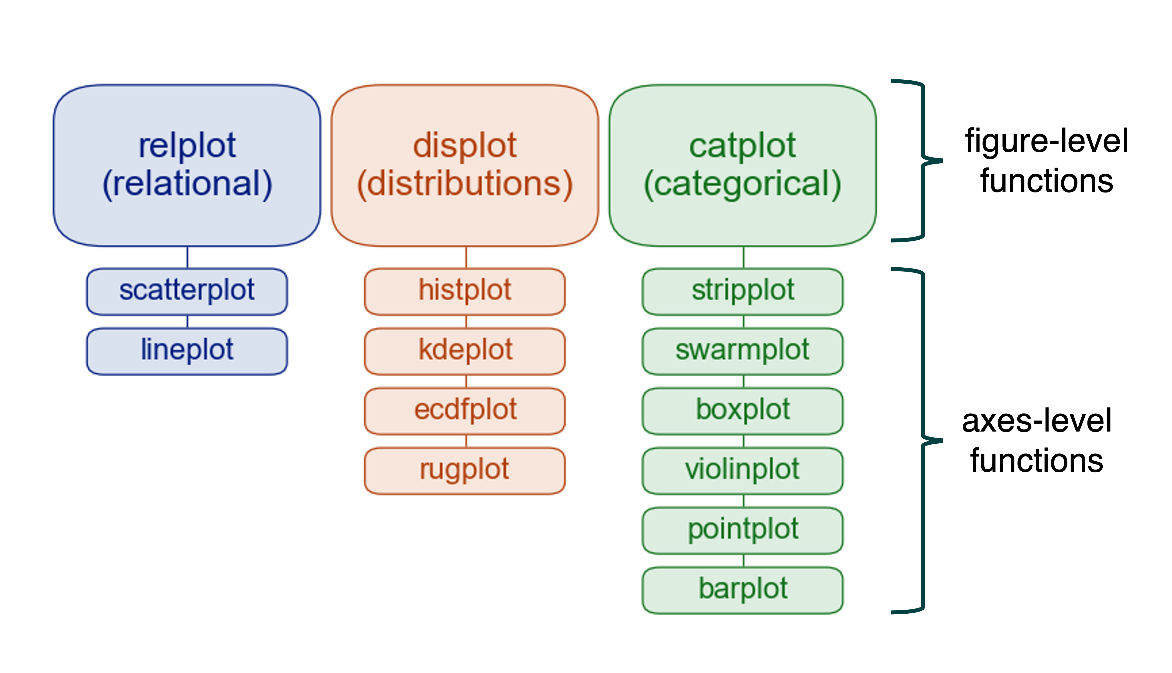
Each figure-level function manages a Grid object behind the scenes. You get the power of Grid classes with less code and better defaults. You don’t need to know the details of matplotlib figure management or Grid class APIs. Just call the function with your data, and Seaborn figures out the rest.
Let me show you how remarkably simple these functions make complex visualizations.
catplot: Categorical Data Across Facets
The catplot() function creates categorical plots on a FacetGrid. The kind parameter controls which type of categorical plot you get - box plots, violin plots, bar plots, and more.
Let’s say you want to compare tips across days, split by sex and smoking status. With catplot():
g = sns.catplot(data=tips, x='day', y='tip',
                row='sex', col='smoker', kind='violin')
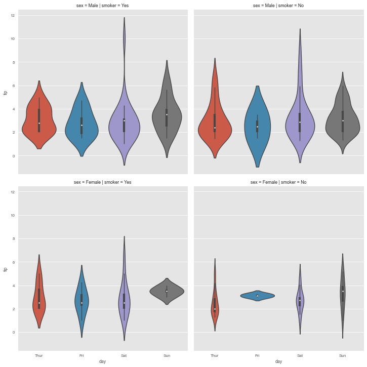
One line. That’s all it took to create a 2×2 grid of violin plots, each properly labeled, consistently styled, and ready for interpretation. Try doing that with matplotlib alone - you’d need dozens of lines managing subplot creation, styling, labeling, and layout.
This is what I mean by Seaborn’s philosophy: the library removes friction between your question and your visualization. You want to see “how do tips vary by day, and does this pattern differ between men and women, smokers and non-smokers?” You express that question almost directly in code, and Seaborn handles the rest.
lmplot: Regression Across Conditions
The lmplot() function combines regression plots with faceting. It’s designed for fitting regression models across different subsets of your data.
sns.set_theme(color_codes=True)

g = sns.lmplot(x="size", y="total_bill", hue="smoker", col="day",
               data=tips, height=6, aspect=.4, x_jitter=.1)
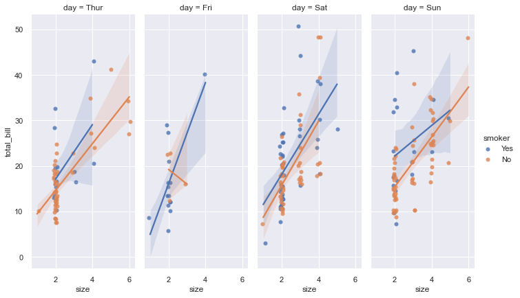
Each facet shows a different day of the week, with separate regression lines for smokers versus non-smokers. The relationship between party size and bill total is immediately comparable across days. Is the pattern consistent? Do certain days show different trends? The faceting makes these questions easy to answer visually.
The x_jitter=.1 parameter adds small random noise to x-coordinates so overlapping points become visible. Party size is discrete (you can’t have 3.7 people), so without jitter, many points would stack exactly on top of each other, hiding the true density.
pairplot: Quick Pairwise Exploration
The pairplot() function wraps PairGrid for common use cases. It’s your go-to for initial dataset exploration when you want to see everything at once:
g = sns.pairplot(iris, hue="species", corner=True)
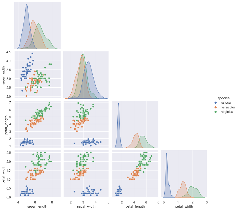
The corner=True parameter is clever - it shows only the lower triangle of the grid since the upper triangle would be redundant (just mirrored versions of the same relationships). This creates a cleaner, more compact visualization without losing information.
Look at how quickly you can spot patterns in this visualization. Setosa species (one of the colors) separates cleanly from the other two across most variable pairs. Petal length and petal width show strong correlation within species. These insights emerge naturally from the visualization.
When you’re starting to work with a new dataset, run pairplot() early. It gives you a comprehensive overview in seconds. You’ll spot potential relationships, identify variables that might need transformation, and notice outliers - all without writing complex exploration code.
jointplot: Focused Bivariate Analysis
Finally, jointplot() provides easy access to JointGrid functionality:
g = sns.jointplot(data=penguins, x="bill_length_mm", y="bill_depth_mm",
                  kind="scatter", palette="BuPu", hue='species')
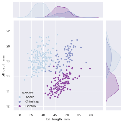
This gives you the scatter plot showing bill dimensions, with marginal histograms showing the distribution of each dimension separately. The species separation is visible in both the main plot and the marginals, providing a complete picture of how these measurements relate and how they’re distributed.
The kind parameter lets you change the center plot type - try "hex" for hexagonal binning with large datasets, "kde" for density contours, or "reg" to add a regression line.
Choosing Your Tool
By now you might be wondering: when do I use Grid classes directly versus using figure-level functions? Here’s the decision framework:
Start with figure-level functions. They’re simpler, have better defaults, and handle most scenarios. Use catplot(), lmplot(), pairplot(), displot(), and jointplot() as your first choice.
Switch to Grid classes when you need more control. If you want to use different plot types in different parts of the grid (like we did with PairGrid), or if you need to call custom functions (like our mean annotation), or if you’re doing something unusual that the figure-level functions don’t support well - then use the Grid classes directly.
Think of figure-level functions as the automatic transmission in your car. They work great for most driving. Grid classes are the manual transmission - more control when you need it, but more work to operate.
The Complete Picture
Across this three-part tutorial series, you’ve built comprehensive mastery of Seaborn’s visualization capabilities.
In Part 1, you learned the essentials: bar plots for comparisons, count plots for frequencies, line plots for trends, scatter plots for relationships, and heat maps for matrix data. These five plot types handle 80% of everyday visualization needs.
In Part 2, you added statistical depth: histograms for distributions, box plots for comparisons, letter-value plots for large data, violin plots for distribution shapes, regression plots for relationships, and complementary plots for added detail. These tools let you conduct visual statistical analysis.
In Part 3, you’ve mastered multivariate visualization: FacetGrid for conditional comparisons, PairGrid for exploring all relationships, JointGrid for focused bivariate analysis, and figure-level functions that make everything remarkably simple. These techniques let you handle complex, high-dimensional datasets with ease.
The Core Principle
Throughout this entire series, one theme remains constant: Seaborn removes the friction between your questions and your visualizations. It handles the statistical computations, manages the layouts, applies professional styling, and provides a consistent API. Your job is simply to understand your data and choose visualizations that tell its story clearly.
There’s no universally best way to visualize data. Different questions need different approaches. A time series needs a line plot. A distribution needs a histogram. Relationships need scatter plots. Categorical comparisons need bar or box plots. Complex multivariate data needs faceting.
What makes Seaborn powerful isn’t that it makes one type of visualization easy - it makes all types easy. The consistent high-level API lets you switch between visualization strategies as naturally as you’d switch between different analyses. Need to compare distributions across many categories? Switch from histogram to faceted histograms with one additional parameter. Need to understand all variable relationships? One function call gives you a complete pairplot.
This flexibility accelerates both exploration and communication. During exploration, you can rapidly try different visualizations to understand your data from multiple angles. During communication, you can choose the visualization that best serves your audience and message.
Moving Forward
You now have comprehensive mastery of Seaborn’s capabilities. You know the core plot types, you understand faceting and Grid classes, and you can choose appropriate visualizations for different scenarios. More importantly, you understand the philosophy: remove friction, make good defaults, let the analyst focus on understanding rather than configuration.
The best way to solidify this knowledge is practice. Take a dataset you’re curious about - maybe from your work, maybe from Kaggle, maybe just the built-in Seaborn datasets - and explore it. Try different plot types. Create faceted visualizations. Make pairplots. See what stories the data tells when you look at it from different angles.
As you practice, you’ll develop intuition for which visualizations work best for which questions. You’ll get faster at creating sophisticated plots. Most importantly, you’ll start seeing your data in new ways, noticing patterns you’d have missed with simpler approaches.
Visualization is thinking made visible. With Seaborn, you have the tools to think clearly and deeply about complex data.
Now go create something remarkable.
Essential Resources
For continued learning and reference:
Official Documentation:
- Seaborn Tutorial - Comprehensive guide to all features
- Example Gallery - Visual inspiration with code
- API Reference - Complete function documentation
This Tutorial Series:
- Part 1 covered essential plots for everyday visualization
- Part 2 covered distributions and statistical analysis
- Part 3 (this tutorial) covered multivariate visualization with Grid classes
- Code and Datasets - Download and experiment
Thank you for following this journey through Seaborn. May your visualizations be beautiful and your insights profound.
References
[1] Tufte, Edward (1990). Envisioning Information. Graphics Press. p. 67. ISBN 978-0961392116.
Data Science 