Customer Segmentation using RFM Analysis
Introduction
Marketing analytics spans an incredible range of techniques, from mining social media sentiment to optimizing realtime bidding strategies. But beneath all these sophisticated approaches lie three deceptively simple questions that most businesses still struggle to answer: Who are my customers? Which ones deserve my attention and marketing budget? And what will they be worth to my business in the future?
Today we’re going to tackle the first two questions using one of the most powerful tools in the marketing analyst’s toolkit: RFM analysis combined with hierarchical clustering. By the end of this walkthrough, you’ll understand not just how to segment customers, but why this approach works and when it makes business sense.
The Segmentation Problem
Imagine you’re running an online retail business with thousands of customers. You can’t treat them all the same way. Offering everyone identical products at identical prices with identical messaging would be a recipe for mediocrity. Some customers are willing to pay premium prices for exclusive items. Others hunt for bargains. Some buy frequently, others make rare but valuable purchases. The diversity is staggering.
In today’s digital world, that “thousands of customers” quickly becomes tens of thousands or even millions. Your database grows faster than your ability to understand it. Treating each customer individually becomes impossibly expensive. You need to find patterns, groupings, natural clusters of similar behavior that let you customize your approach without drowning in complexity.
This is where segmentation saves you. The art lies in finding that sweet spot: simplifying enough to make your insights actionable, but not so much that you lose the statistical and managerial relevance that makes those insights valuable.
Understanding RFM Analysis
RFM analysis cuts through the noise by focusing on three behavioral dimensions that matter most for predicting future purchases: Recency, Frequency, and Monetary value. Think of these as the three coordinates that map your customer’s relationship with your business.
Recency tells you when a customer last made a purchase. The logic is intuitive: someone who bought from you yesterday is far more likely to buy again soon than someone whose last purchase was three years ago. That distant customer might have lost interest, found a competitor, or simply forgotten you exist. Recency captures the freshness of the relationship.
Frequency counts how many times a customer has purchased within a given period. This metric reveals commitment. A customer with ten purchases has demonstrated consistent interest in what you’re selling. Someone with only one or two purchases remains an unknown quantity. They might become loyal, or they might disappear forever.
Monetary value measures how much a customer has spent over time. This isn’t just about revenue (though that matters). High-spending customers often have different needs, different price sensitivities, and different expectations about service quality. They deserve different treatment because they represent different opportunities.
These three metrics work together beautifully because they capture different aspects of customer behavior. You might have a high-frequency, low-value customer who buys often but cheaply. Or a low-frequency, high-value customer who makes rare but significant purchases. Each pattern suggests different strategies.
Building the Analysis in Python
Let’s get our hands dirty with real data. We’ll start by setting up our environment and loading the necessary tools.
import numpy as np
import pandas as pd
import matplotlib.pyplot as plt
from sklearn.preprocessing import scale
from scipy.spatial.distance import pdist
from scipy.cluster.hierarchy import dendrogram, linkage, cut_tree
import squarify

# Set up our notebook environment
pd.options.display.float_format = '{:,.2f}'.format
plt.rcParams["figure.figsize"] = (12,8)

# Load the dataset
headers = ['customer_id', 'purchase_amount', 'date_of_purchase']
df = pd.read_csv('../Datasets/purchases.txt', header=None,
                 names=headers, sep='\t')
Exploring the Data
Our dataset contains 51,243 transactions spanning January 2005 through December 2015. Each row captures three things: which customer made a purchase, how much they spent, and when it happened. The data is clean, which means we can dive straight into the interesting parts without spending hours on data quality issues.
df.info()
<class 'pandas.core.frame.DataFrame'>
RangeIndex: 51243 entries, 0 to 51242
Data columns (total 3 columns):
 #   Column            Non-Null Count  Dtype
---  ------            --------------  -----
 0   customer_id       51243 non-null  int64
 1   purchase_amount   51243 non-null  float64
 2   date_of_purchase  51243 non-null  object
dtypes: float64(1), int64(1), object(1)
memory usage: 1.2+ MB
The date column needs attention first. Right now it’s stored as text (an object type), but we need it as an actual date so we can perform time calculations.
# Convert dates to proper datetime objects
df['date_of_purchase'] = pd.to_datetime(df['date_of_purchase'], format='%Y-%m-%d')

# Extract the year for later analysis
df['year_of_purchase'] = df['date_of_purchase'].dt.year
Now comes a clever trick for calculating recency. We’ll set January 1, 2016 as our reference point (just after our data ends) and count backwards to find how many days have passed since each customer’s purchases.
# Calculate days since each purchase
basedate = pd.Timestamp('2016-01-01')
df['days_since'] = (basedate - df['date_of_purchase']).dt.days
This days_since column becomes the foundation for our recency calculation.
Computing RFM Metrics
Here’s where things get interesting. We have 51,243 transactions, but far fewer unique customers. Each customer might have made multiple purchases, and we need to aggregate those purchases into our three RFM metrics.
For recency, we want the minimum days_since value for each customer. That minimum represents their most recent purchase. For frequency, we count how many times each customer appears in the dataset. For monetary value, we average their purchase amounts.
We could write this using complex pandas groupby operations, but there’s a cleaner approach using native pandas aggregation:
# Compute RFM metrics for each customer
customers = df.groupby('customer_id').agg({
    'days_since': 'min',           # Minimum days = most recent purchase
    'customer_id': 'count',         # Count = number of purchases
    'purchase_amount': 'mean'       # Average spending per purchase
}).rename(columns={
    'days_since': 'recency',
    'customer_id': 'frequency',
    'purchase_amount': 'amount'
})

# Reset index to make customer_id a column again
customers = customers.reset_index()
This gives us one row per customer with their three RFM scores. Let’s peek at the first few entries:
customers.head()
   customer_id  recency  frequency  amount
0           10     3829          1   30.00
1           80      343          7   71.43
2           90      758         10  115.80
3          120     1401          1   20.00
4          130     2970          2   50.00
Customer 90 stands out immediately. They’ve purchased ten times with an average transaction of $115.80, and their last purchase was 758 days ago. That’s someone worth understanding better.
Understanding the Distributions
Before we jump into clustering, we need to understand what we’re working with. Statistical summaries reveal the shape of our customer base:
customers[['recency', 'frequency', 'amount']].describe()
         recency    frequency      amount
count   18417.00     18417.00    18417.00
mean     1253.04         2.78       57.79
std      1081.44         2.94      154.36
min         1.00         1.00        5.00
25%       244.00         1.00       21.67
50%      1070.00         2.00       30.00
75%      2130.00         3.00       50.00
max      4014.00        45.00     4500.00
These numbers tell a story. The median customer made their last purchase 1,070 days ago (almost three years), has made just two purchases total, and averages $30 per transaction. But look at those maximums: one customer made 45 purchases, and someone spent $4,500 on average. The variation is enormous.
Let’s visualize these distributions to see the patterns more clearly.
# Plot the recency distribution
plt.style.use('seaborn-whitegrid')
customers.hist(column='recency', bins=31)
plt.ylabel('Customers', fontsize=15)
plt.xlabel('Days Since Last Purchase', fontsize=15)
plt.xlim(0,)
plt.tight_layout()
plt.savefig('recency_distribution.png', dpi=150, bbox_inches='tight')
plt.show()
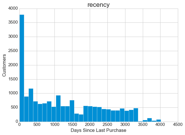
The recency distribution reveals something fascinating. Notice that sharp peak on the left side? That represents a surge of recent activity. The rest of the distribution spreads relatively evenly across time, which tells us that customers have been churning at a fairly steady rate over the years. That left-side spike could indicate a successful recent marketing campaign, a seasonal effect, or perhaps a popular sale event that drew people back. Whatever the cause, it represents an opportunity to understand what triggered those recent purchases and potentially replicate that success.
# Plot the frequency distribution
customers.hist(column='frequency', bins=41)
plt.ylabel('Customers', fontsize=15)
plt.xlabel('Number of Purchases', fontsize=15)
plt.xlim(0, 20)
plt.tight_layout()
plt.savefig('frequency_distribution.png', dpi=150, bbox_inches='tight')
plt.show()
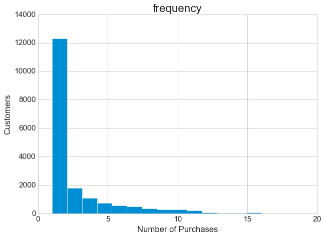
The frequency story is even more dramatic. The distribution is massively right-skewed, with nearly half of all customers having made just a single purchase. This pattern appears in almost every retail business, but that doesn’t make it less important. These one-time purchasers represent your biggest opportunity and your biggest challenge. Are they recent first-timers who haven’t had time to return? Or are they dissatisfied customers who tried once and left? The distinction matters enormously for your marketing strategy.
# Plot the monetary distribution
customers.hist(column='amount', bins=601)
plt.ylabel('Customers', fontsize=15)
plt.xlabel('Average Amount in $', fontsize=15)
plt.xlim(0, 400)
plt.ylim(0,)
plt.tight_layout()
plt.savefig('amount_distribution.png', dpi=150, bbox_inches='tight')
plt.show()
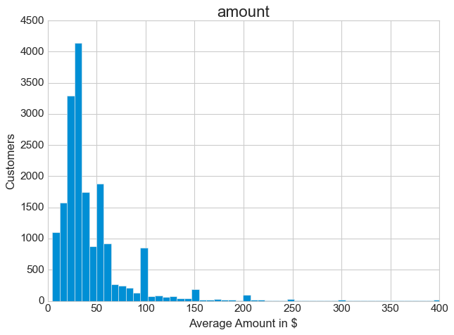
The monetary distribution shows a strong concentration in the low range, with a long tail of higher-value customers. Half of all transactions fall between $5 and $30. Those extreme outliers at the high end, while rare, could represent your most valuable customers or perhaps unusual bulk orders. The median tells a more reliable story here than the mean, given how skewed the data is.
These exploratory analyses do more than show us pretty pictures. They help us form hypotheses. Maybe those one-time purchasers are actually recent customers who need a targeted reengagement campaign. Maybe that recency spike came from a successful promotion we should study and replicate. Good exploratory analysis generates questions worth answering.
Preparing Data for Clustering
Clustering algorithms measure similarity using distances, and distances only make sense when all your variables use comparable scales. Right now, recency is measured in days (ranging from 1 to 4,014), frequency in counts (1 to 45), and monetary value in dollars (5 to 4,500). These scales are completely incompatible.
We need to transform our data in two ways. First, we’ll deal with the skewness in the monetary values. Then we’ll standardize everything to a common scale.
# Make a copy to preserve the original data
new_data = customers.copy()
new_data.set_index('customer_id', inplace=True)

# Transform amount to a logarithmic scale
new_data['amount'] = np.log10(new_data['amount'])
Why logarithms? Extremely skewed data can dominate clustering algorithms, giving outsized weight to those few high-value outliers. A logarithmic transformation compresses the scale, making the distribution more symmetric and preventing extreme values from overwhelming the analysis.
Let’s see how well this worked:
# Visualize the transformed distribution
fig, ax = plt.subplots()
new_data['amount'].plot(kind='hist', density=True, bins=40, alpha=0.6)
new_data['amount'].plot(kind='kde', linewidth=2)
plt.xlabel('Log10(Amount)', fontsize=13)
plt.ylabel('Density', fontsize=13)
plt.xlim(0, 4)
plt.ylim(0,)
plt.tight_layout()
plt.savefig('log_transformed_amount.png', dpi=150, bbox_inches='tight')
plt.show()
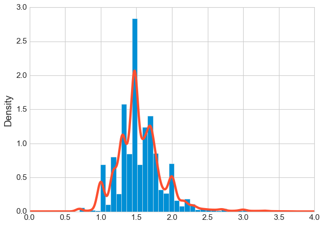
Much better. The distribution now looks roughly bell-shaped instead of having that aggressive right skew. The density plot (the smooth curve) shows a nice symmetric peak, which means our clustering algorithm can now treat this variable more fairly.
Now we standardize all three variables. Standardization means subtracting each variable’s mean and dividing by its standard deviation. After this transformation, every variable has a mean of zero and a standard deviation of one. They’re finally on equal footing.
# Standardize all variables
new_data = pd.DataFrame(
    scale(new_data),
    index=new_data.index,
    columns=new_data.columns
)
The Sampling Decision
Hierarchical clustering requires computing distances between every pair of customers. With 18,417 customers, that means calculating (18,417 × 18,416) / 2 = 169,548,136 pairwise distances. While modern computers can handle this, the resulting dendrogram becomes cluttered and hard to interpret. More importantly, for a tutorial focused on understanding the technique, working with a manageable subset makes the process clearer.
We’ll take a random sample of 10% of customers. This approach maintains the statistical properties of the full dataset while making our analysis more interpretable:
# Take a random 10% sample for clustering
np.random.seed(42)  # For reproducibility
sample_size = int(len(new_data) * 0.1)
new_data_sample = new_data.sample(n=sample_size, random_state=42)

# Get the corresponding customer information
customers_sample = customers.set_index('customer_id').loc[new_data_sample.index].reset_index()
Let’s look at a few random customers from our sample:
new_data_sample.sample(5)
customer_id    recency  frequency    amount
69760           1.78      -0.61      0.62
147990          0.61      -0.61      0.44
100510          1.37      -0.61      0.62
138990         -1.14       2.53      0.95
258230         -1.11      -0.61      1.24
These standardized values might look strange, but they’re now directly comparable. Customer 138990 has a negative recency (meaning they purchased recently, which is good), high frequency (2.53 standard deviations above average), and high monetary value. That’s a customer worth keeping happy.
Performing Hierarchical Clustering
Hierarchical clustering builds a tree of similarities. It starts by finding the two most similar customers and grouping them. Then it finds the next most similar pair (or the next customer most similar to the first group) and combines them. This process continues until all customers are connected in a single hierarchical tree called a dendrogram.
The beauty of this approach is that you don’t need to specify the number of clusters in advance. The dendrogram shows you the natural groupings at every level, and you can choose the most meaningful cut point.
# Compute pairwise distances using Euclidean distance
d = pdist(new_data_sample, metric='euclidean')

# Perform hierarchical clustering using Ward's method
hcward = linkage(d, method='ward')
We’re using Ward’s method for the linkage, which minimizes the variance within clusters. This tends to produce compact, spherical clusters that work well for RFM analysis. The method merges clusters in a way that keeps each group as internally similar as possible.
Now let’s visualize the dendrogram:
# Create the dendrogram
plt.figure(figsize=(14, 8))
plt.title("Customer Dendrogram - Hierarchical Clustering", fontsize=16, pad=20)
dend = dendrogram(
    hcward,
    truncate_mode='lastp',
    p=45,
    show_contracted=True,
    leaf_rotation=90,
    leaf_font_size=10
)
plt.xlabel('Customer Clusters', fontsize=13)
plt.ylabel('Distance (Ward Linkage)', fontsize=13)
plt.tight_layout()
plt.savefig('dendrogram.png', dpi=150, bbox_inches='tight')
plt.show()
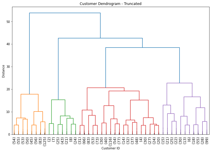
Reading a dendrogram takes practice, but the key insight is in the heights of the horizontal lines. Each horizontal line represents a merge, and its height shows how dissimilar the merged groups are. Low merges indicate very similar customers. High merges indicate the groups being combined are quite different from each other.
Choosing the Number of Clusters
RFM practitioners often use 11 clusters based on frameworks developed by experts like Putler, with detailed descriptions for each segment and corresponding marketing actions. But that’s not a hard rule. The right number of clusters depends on your business context, your ability to execute different strategies, and what the data actually shows.
Looking at our dendrogram, we can see some clear natural breaks. The four tallest vertical lines (before everything merges at the top) suggest four distinct groups might make sense. Four clusters also offers a practical advantage: it’s simple enough to be actionable. You can design four different marketing strategies much more easily than eleven.
# Cut the dendrogram to create 4 clusters
members = cut_tree(hcward, n_clusters=4)

# Assign cluster labels to each customer in our sample
customers_sample['group'] = members.flatten()

# Calculate the average RFM values for each cluster
clusters = customers_sample[['recency', 'frequency', 'amount', 'group']].groupby('group').agg({
    'recency': 'mean',
    'frequency': 'mean',
    'amount': 'mean'
}).round(2)

# Count customers in each cluster
cluster_sizes = customers_sample['group'].value_counts().sort_index()
clusters['n_customers'] = cluster_sizes

print(clusters)
group    recency  frequency  amount  n_customers
0        2612.50       1.30   29.03          521
1         193.65      10.62   42.02          130
2         712.52       2.55   31.12          859
3         972.55       2.76  149.70          332
These numbers reveal four distinct customer personas. Each cluster tells a different story about customer behavior and value.
Interpreting the Segments
Understanding what these clusters mean requires looking at them holistically, considering all three RFM dimensions together.
Cluster 0 has the highest recency (2,612 days since last purchase), the lowest frequency (1.3 purchases), and low monetary value ($29). These customers have essentially left. They bought something once, years ago, and never came back. Trying to reactivate them would be expensive and likely futile. This is your “Lost” segment.
Cluster 1 shows the opposite pattern: very low recency (193 days), high frequency (10.6 purchases), and moderate monetary value ($42). These customers buy often and recently. They’re engaged, reliable, and valuable. This is your “Loyal” segment, and they deserve your best treatment. Ask them for reviews. Offer them early access to new products. Thank them for their business. These are the customers who will advocate for your brand.
Cluster 2 sits in the middle with moderate recency (712 days), low-to-moderate frequency (2.6 purchases), and low monetary value ($31). This is your largest group with 859 customers. They’ve bought a couple of times but haven’t been back in two years. They’re not lost yet, but they’re drifting. Call this your “Needing Attention” segment. A targeted reengagement campaign could pull many of them back before they disappear into Cluster 0.
Cluster 3 presents an interesting puzzle: moderate-to-high recency (972 days), moderate frequency (2.8 purchases), but very high monetary value ($149.70). These customers spent significantly more than anyone else, but they haven’t been back in nearly three years. They’re your “Can’t Lose Them” segment. Something drove them away despite their initial high value. Win them back with personalized outreach. Find out what went wrong. These customers represent substantial potential revenue if you can reengage them.
Let’s visualize the relative importance of each segment:
# Assign descriptive names to our clusters
clusters['cluster_names'] = ['Lost', 'Loyal', 'Needing Attention', "Can't Lose Them"]

# Create a treemap visualization
plt.figure(figsize=(12, 8))
plt.set_cmap('tab10')

# Sort by recency and amount for better visualization layout
clusters_sorted = clusters.sort_values(by=['recency', 'amount'], ascending=[True, False])

squarify.plot(
    sizes=clusters_sorted['n_customers'],
    label=clusters_sorted['cluster_names'],
    alpha=0.6,
    text_kwargs={'fontsize': 14, 'weight': 'bold'}
)
plt.title("Customer Segments by Size", fontsize=18, pad=20)
plt.axis('off')
plt.tight_layout()
plt.savefig('segment_treemap.png', dpi=150, bbox_inches='tight')
plt.show()
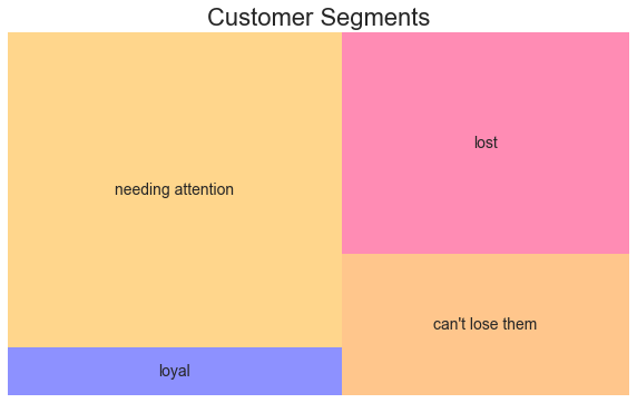
The treemap makes the business implications visual. Your “Needing Attention” segment dominates in size, representing nearly half your customer base. This is where your near-term opportunity lies. The “Loyal” segment is smaller but precious. The “Can’t Lose Them” segment represents high-value customers you need to recover. And the “Lost” segment, while large, probably isn’t worth the investment to reactivate.
Practical Implications
These segments translate directly into marketing actions. Your loyal customers need recognition and rewards, not aggressive discounting. The customers needing attention require timely intervention, perhaps a “we miss you” campaign with relevant product recommendations based on past purchases. The high-value lapsed customers deserve personal outreach, maybe even a phone call to understand what went wrong and how to make it right.
The key insight from RFM analysis is that not all customers deserve the same investment. The expected profitability must exceed the cost of reaching each segment. Your loyal customers might respond to a simple email. Your lapsed high-value customers might require a personalized offer from a human salesperson. Your lost customers might not be worth any investment at all.
Limitations and Considerations
RFM segmentation isn’t perfect. Customer behavior changes constantly, so segments need regular updating. New customers flow into your database continuously, and their behavior patterns evolve. The segments you identify today might capture seasonal buying patterns that don’t generalize to other times of year. A customer who looks highly engaged in December (holiday shopping) might be completely dormant in February.
Frequent updates can be expensive unless you automate the entire pipeline. This is partly why many companies still rely on simpler rule-based segmentation instead of statistical approaches. A manager might simply decide that “customers who haven’t purchased in 6 months need reengagement,” without building a clustering model.
But here’s the thing: even if you ultimately prefer simple rules for operational reasons, running statistical segmentation at least once reveals patterns you might otherwise miss. You might discover that three purchases is the magic threshold where customer loyalty really takes hold. Or that spending over $100 predicts dramatically different future behavior. Those insights can then inform the rules you set up for ongoing segmentation.
The best approach often combines both methods. Use statistical segmentation to discover the natural patterns in your data. Then build simple, scalable rules around those patterns for day-to-day operations.
Conclusion
Customer segmentation using RFM analysis and hierarchical clustering gives you a data-driven way to understand your customer base. The three metrics of Recency, Frequency, and Monetary value capture the essence of customer behavior in a way that’s both statistically sound and intuitively understandable to business stakeholders.
The technique we’ve walked through here scales from small businesses to large enterprises. The code is straightforward once you understand the logic. The results are actionable. And the insights you gain can transform how you allocate marketing resources, moving from treating everyone the same to giving each segment what it needs to maximize lifetime value.
The most important lesson isn’t the specific clusters we found in this dataset. It’s the approach: let the data reveal natural groupings, interpret those groupings in business terms, and then match your marketing strategy to each segment’s needs and potential value. That’s how you turn transaction data into profitable customer relationships.
References
-
Karl Melo. Customer Analytics I - Customer Segmentation. 2016
-
Navlani, A. Introduction to Customer Segmentation in Python. DataCamp, 2018.
-
Lilien, Gary L, Arvind Rangaswamy, and Arnaud De Bruyn. 2017. Principles of Marketing Engineering and Analytics. State College, PA: DecisionPro.
-
Jim Novo. Turning Customer Data into Profits
-
Anish Nair. RFM Analysis For Successful Customer Segmentation. Putler, 2022.
-
Kohavi, Ron, Llew Mason, Rajesh Parekh, and Zijian Zheng. 2004. “Lessons and Challenges from Mining Retail E-Commerce Data.” Machine Learning 57 (1/2): 83-113.
-
Dataset from Github repo. Accessed 25 October 2021.
Data Science 