From RFM Analysis to Predictive Scoring Models
Introduction
We’ve come a long way in understanding our customers. In our first tutorial, we used hierarchical clustering to discover natural groupings in customer behavior, letting the data reveal patterns we might have missed. In the second tutorial, we flipped the script and implemented managerial segmentation, where business logic drives the groupings directly.
Both approaches answered the question “who are my customers right now?” Today we’re tackling something more ambitious: predicting the future. Which customers will purchase next year? How much will they spend? These aren’t just interesting academic questions. They’re the foundation for smart resource allocation, inventory planning, and targeted marketing campaigns.
Today we’re building a predictive scoring system that combines everything from our previous tutorials. We’ll use RFM segmentation as the foundation, then layer on statistical models to predict both purchase probability and purchase amount. The result is a customer score that tells you where to focus your marketing investment for maximum return.
The Analytical Framework
Our approach uses a two-stage modeling process. First, we predict whether a customer will make any purchase at all in the next period. This is a classification problem: active or inactive. Second, for those predicted to be active, we estimate how much they’ll spend. This is a regression problem with continuous dollar values.
Why separate these? Purchase probability depends heavily on recency and engagement patterns. Purchase amount depends more on historical spending levels. Trying to predict dollar amounts directly for all customers (including those who won’t buy anything) creates a messy model with poor performance.
We’ll validate our approach using retrospective segmentation: analyze our 2014 customer base as if we were living in 2014, build models to predict 2015 behavior, then check how accurate those predictions were. This gives us confidence before making real 2016 predictions.
Setting Up Our Analysis
Let’s start with our familiar dataset: 51,243 transactions from 18,417 unique customers spanning January 2005 through December 2015. We’ll be more disciplined about our code this time. Since we’ll be running RFM segmentation multiple times (for 2014, 2015, and validation), we’ll create reusable functions instead of copying code.
# Import required libraries
import matplotlib.pyplot as plt
import numpy as np
import pandas as pd
import statsmodels.api as sm
import squarify
from scipy import stats
from tabulate import tabulate

# Set up environment
pd.options.display.float_format = '{:,.2f}'.format
plt.rcParams["figure.figsize"] = (12, 8)

# Load the dataset
columns = ['customer_id', 'purchase_amount', 'date_of_purchase']
df = pd.read_csv('purchases.txt', header=None, sep='\t', names=columns)

# Convert to datetime and create time-based features
df['date_of_purchase'] = pd.to_datetime(df['date_of_purchase'], format='%Y-%m-%d')
df['year_of_purchase'] = df['date_of_purchase'].dt.year

# Set reference date for calculating recency
basedate = pd.Timestamp('2016-01-01')
df['days_since'] = (basedate - df['date_of_purchase']).dt.days
Building Reusable Segmentation Functions
Rather than copy-pasting segmentation logic three times, we’ll create a clean function that handles the entire RFM calculation and segmentation process. This makes our code more maintainable and reduces errors.
def calculate_rfm(dataframe, reference_date=None, days_lookback=None):
    """
    Calculate RFM metrics for customers.

    Parameters:
    -----------
    dataframe : DataFrame
        Transaction data with customer_id, purchase_amount, days_since
    reference_date : Timestamp, optional
        Date to calculate recency from (default: None, uses all data)
    days_lookback : int, optional
        Only consider transactions within this many days (default: None, uses all)

    Returns:
    --------
    DataFrame with customer_id and RFM metrics
    """
    # Filter data if lookback specified
    if days_lookback is not None:
        df_filtered = dataframe[dataframe['days_since'] > days_lookback].copy()
        # Adjust days_since relative to the lookback period
        df_filtered['days_since'] = df_filtered['days_since'] - days_lookback
    else:
        df_filtered = dataframe.copy()

    # Calculate RFM metrics using native pandas
    rfm = df_filtered.groupby('customer_id').agg({
        'days_since': ['min', 'max'],       # Min = recency, Max = first purchase
        'customer_id': 'count',              # Count = frequency
        'purchase_amount': ['mean', 'max']   # Average and max spending
    })

    # Flatten column names
    rfm.columns = ['recency', 'first_purchase', 'frequency', 'avg_amount', 'max_amount']
    rfm = rfm.reset_index()

    return rfm


def segment_customers(rfm_data):
    """
    Segment customers based on RFM metrics using managerial rules.

    Parameters:
    -----------
    rfm_data : DataFrame
        Customer data with RFM metrics

    Returns:
    --------
    DataFrame with added 'segment' column
    """
    customers = rfm_data.copy()

    # Use numpy select for clean, non-overlapping logic
    conditions = [
        customers['recency'] > 365 * 3,
        (customers['recency'] <= 365 * 3) & (customers['recency'] > 365 * 2),
        (customers['recency'] <= 365 * 2) & (customers['recency'] > 365) &
            (customers['first_purchase'] <= 365 * 2),
        (customers['recency'] <= 365 * 2) & (customers['recency'] > 365) &
            (customers['avg_amount'] >= 100),
        (customers['recency'] <= 365 * 2) & (customers['recency'] > 365) &
            (customers['avg_amount'] < 100),
        (customers['recency'] <= 365) & (customers['first_purchase'] <= 365),
        (customers['recency'] <= 365) & (customers['avg_amount'] >= 100),
        (customers['recency'] <= 365) & (customers['avg_amount'] < 100)
    ]

    choices = [
        'inactive',
        'cold',
        'new warm',
        'warm high value',
        'warm low value',
        'new active',
        'active high value',
        'active low value'
    ]

    customers['segment'] = np.select(conditions, choices, default='other')

    # Convert to ordered categorical
    segment_order = [
        'inactive', 'cold', 'warm high value', 'warm low value', 'new warm',
        'active high value', 'active low value', 'new active'
    ]
    customers['segment'] = pd.Categorical(
        customers['segment'],
        categories=segment_order,
        ordered=True
    )

    return customers.sort_values('segment')
The calculate_rfm function handles aggregation and works with different time windows. The segment_customers function applies our business rules using numpy’s select function.
Understanding Our Current Customer Base
Let’s apply our functions to understand the current state of affairs as of the end of 2015:
# Calculate RFM for all customers as of end of 2015
customers_2015 = calculate_rfm(df)
customers_2015 = segment_customers(customers_2015)

# Display segment distribution
segment_counts = customers_2015['segment'].value_counts()
print(segment_counts)
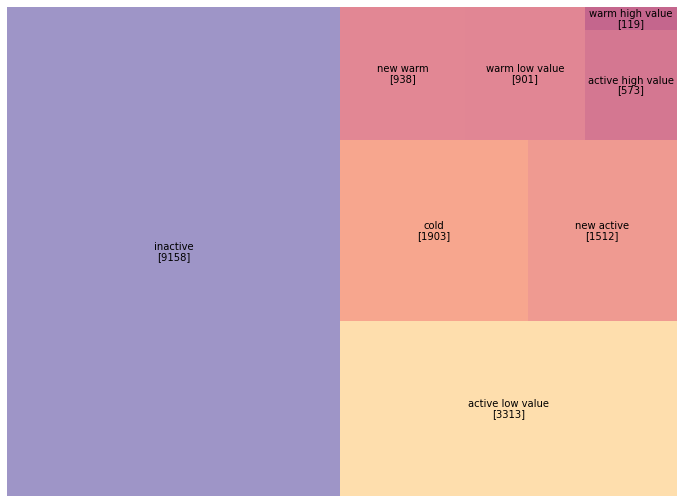
inactive             9158
active low value     3313
cold                 1903
new active           1512
new warm              938
warm low value        901
active high value     573
warm high value       119
Name: segment, dtype: int64
Half our customer base has gone inactive. Focusing on the 7,356 customers in warm and active segments makes more strategic sense than trying to resurrect the 9,158 inactive ones.
Let’s visualize this with our familiar treemap:
# Create treemap visualization
fig, ax = plt.subplots(figsize=(14, 9))

colors = ['#9b59b6', '#e67e22', '#3498db', '#2ecc71', '#3498db',
          '#3498db', '#2ecc71', '#3498db']

squarify.plot(
    sizes=segment_counts.reindex(customers_2015['segment'].cat.categories),
    label=customers_2015['segment'].cat.categories,
    color=colors,
    alpha=0.6,
    text_kwargs={'fontsize': 13, 'weight': 'bold'}
)
plt.title('Customer Segments as of December 2015', fontsize=18, pad=20)
plt.axis('off')
plt.tight_layout()
plt.savefig('segments_2015_treemap.png', dpi=150, bbox_inches='tight')
plt.show()
Now we need to understand which segments actually drove revenue in 2015. This tells us whether our segmentation captures value meaningfully:
# Calculate 2015 revenue by customer
revenue_2015 = df[df['year_of_purchase'] == 2015].groupby('customer_id').agg({
    'purchase_amount': 'sum'
}).rename(columns={'purchase_amount': 'revenue_2015'})

# Merge with customer segments (left join to include all customers)
actual = customers_2015.merge(revenue_2015, on='customer_id', how='left')
actual['revenue_2015'] = actual['revenue_2015'].fillna(0)

# Calculate average revenue by segment
segment_revenue = actual.groupby('segment', observed=True)['revenue_2015'].mean()
print("\nAverage 2015 Revenue by Segment:")
print(segment_revenue.round(2))
Average 2015 Revenue by Segment:
segment
inactive                0.00
cold                    0.00
warm high value         0.00
warm low value          0.00
new warm                0.00
active high value     323.57
active low value       52.31
new active             79.17
Name: revenue_2015, dtype: float64
Only active customers generated 2015 revenue (by definition). The active high value segment, just 3% of customers, generated 71% of total revenue.
The Retrospective Validation Strategy
Before making 2016 predictions we can’t validate, let’s build models using 2014 data to predict 2015 behavior. We already know what happened in 2015, so we can measure accuracy. We recreate January 1, 2015 by filtering our data to only include transactions through December 31, 2014.
# Calculate RFM as of end of 2014 (ignoring all 2015 transactions)
# This requires looking back 365 days from our reference date
customers_2014 = calculate_rfm(df, days_lookback=365)
customers_2014 = segment_customers(customers_2014)

# Visualize 2014 segments
segment_counts_2014 = customers_2014['segment'].value_counts()
print("\n2014 Segment Distribution:")
print(segment_counts_2014)
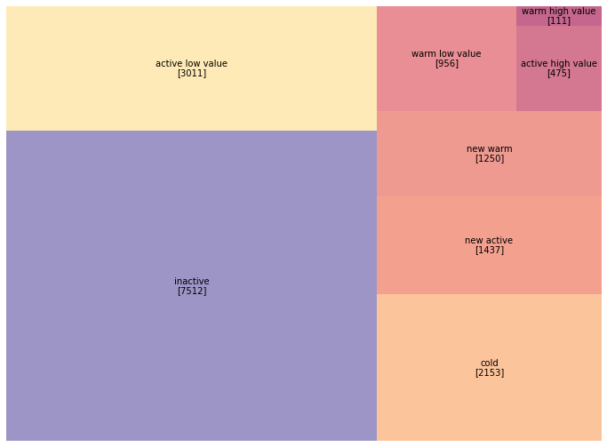
2014 Segment Distribution:
inactive             8602
active low value     3094
cold                 1923
new active           1474
new warm              936
warm low value        835
active high value     476
warm high value       108
Name: segment, dtype: int64
Notice the differences from 2015: the active high value segment grew from 476 to 573 customers (20% growth). Let’s visualize the year-over-year shift:
# Create comparison visualization
fig, (ax1, ax2) = plt.subplots(1, 2, figsize=(16, 7))

# 2014 segments
squarify.plot(
    sizes=segment_counts_2014.reindex(customers_2014['segment'].cat.categories),
    label=customers_2014['segment'].cat.categories,
    color=colors,
    alpha=0.6,
    ax=ax1,
    text_kwargs={'fontsize': 11, 'weight': 'bold'}
)
ax1.set_title('Customer Segments - End of 2014', fontsize=16, pad=15)
ax1.axis('off')

# 2015 segments
squarify.plot(
    sizes=segment_counts.reindex(customers_2015['segment'].cat.categories),
    label=customers_2015['segment'].cat.categories,
    color=colors,
    alpha=0.6,
    ax=ax2,
    text_kwargs={'fontsize': 11, 'weight': 'bold'}
)
ax2.set_title('Customer Segments - End of 2015', fontsize=16, pad=15)
ax2.axis('off')

plt.tight_layout()
plt.savefig('segments_comparison.png', dpi=150, bbox_inches='tight')
plt.show()
Building the Training Dataset
We’ll use 2014 customer characteristics (RFM metrics) as features to predict 2015 behavior (whether they purchased and how much they spent).
# Merge 2014 customer data with 2015 revenue (the target variable)
in_sample = customers_2014.merge(revenue_2015, on='customer_id', how='left')
in_sample['revenue_2015'] = in_sample['revenue_2015'].fillna(0)

# Create binary target variable for classification
in_sample['active_2015'] = (in_sample['revenue_2015'] > 0).astype(int)

# Display summary
print(f"\nTraining dataset: {len(in_sample)} customers")
print(f"Active in 2015: {in_sample['active_2015'].sum()} ({in_sample['active_2015'].mean():.1%})")
print(f"\nTarget variable distribution:")
print(in_sample['active_2015'].value_counts())
Training dataset: 16905 customers
Active in 2015: 3886 (23.0%)

Target variable distribution:
0    13019
1     3886
Name: active_2015, dtype: int64
Our dataset contains 16,905 customers who existed in 2014. Of these, 3,886 (23%) made at least one purchase in 2015. This 23% base rate becomes our benchmark. The class imbalance (77% inactive vs. 23% active) is typical in customer analytics.
Predicting Purchase Probability with Logistic Regression
Our first model predicts whether a customer will make any purchase in 2015 based on their 2014 RFM characteristics. We’ll use five features: recency, first purchase date, frequency, average amount, and maximum amount.
# Define the logistic regression model
# Note: We use statsmodels for rich statistical output
formula = "active_2015 ~ recency + first_purchase + frequency + avg_amount + max_amount"
prob_model = sm.Logit.from_formula(formula, in_sample)

# Fit the model
prob_model_fit = prob_model.fit()

# Display results
print(prob_model_fit.summary())
Optimization terminated successfully.
    Current function value: 0.365836
    Iterations 8

                           Logit Regression Results
==============================================================================
Dep. Variable:           active_2015   No. Observations:                16905
Model:                         Logit   Df Residuals:                    16899
Method:                           MLE   Df Model:                            5
Date:                                   Pseudo R-squ.:                  0.3214
Time:                                   Log-Likelihood:                -6184.5
converged:                       True   LL-Null:                       -9113.9
Covariance Type:            nonrobust   LLR p-value:                     0.000
==================================================================================
                     coef    std err          z      P>|z|      [0.025      0.975]
----------------------------------------------------------------------------------
Intercept         -0.5331      0.044    -12.087      0.000      -0.620      -0.447
recency           -0.0020      0.000    -32.748      0.000      -0.002      -0.002
first_purchase    -0.0000      0.000     -0.297      0.766      -0.000       0.000
frequency          0.2195      0.015     14.840      0.000       0.191       0.249
avg_amount         0.0004      0.000      1.144      0.253      -0.000       0.001
max_amount        -0.0002      0.000     -0.574      0.566      -0.001       0.000
==================================================================================
Recency (coef: -0.0020, z: -32.75) is our strongest predictor. The more days since a customer’s last purchase, the less likely they’ll purchase again.
Frequency (coef: 0.2195, z: 14.84) is our second strongest predictor. Each additional purchase in 2014 increases the likelihood of 2015 activity.
First purchase date, average amount, and maximum amount have p-values above 0.25, meaning they don’t add predictive power beyond what recency and frequency already capture.
The Pseudo R-squared of 0.32 means our model explains about 32% of the variation in purchase behavior. Let’s examine the standardized coefficients:
# Calculate standardized coefficients (z-scores)
standardized_coef = prob_model_fit.params / prob_model_fit.bse
print("\nStandardized Coefficients (z-scores):")
print(standardized_coef.round(2))
Standardized Coefficients (z-scores):
Intercept        -12.09
recency          -32.75
first_purchase    -0.30
frequency         14.84
avg_amount         1.14
max_amount        -0.57
dtype: float64
Recency dominates with a z-score of -32.75, followed by frequency at 14.84. Everything else is noise in comparison.
Predicting Purchase Amount with Linear Regression
For customers who do purchase in 2015, how much will they spend? We can only train this model on customers who actually purchased, reducing our sample from 16,905 to 3,886.
# Filter to only customers who were active in 2015
active_customers = in_sample[in_sample['active_2015'] == 1].copy()

print(f"\nActive customer sample: {len(active_customers)} customers")
print("\nSpending distribution:")
print(active_customers['revenue_2015'].describe())
Active customer sample: 3886 customers

Spending distribution:
count    3886.00
mean       92.30
std       217.45
min         5.00
25%        30.00
50%        50.00
75%       100.00
max      4500.00
Name: revenue_2015, dtype: float64
The spending distribution is heavily right-skewed: mean ($92) exceeds median ($50) substantially. This skewness causes problems for OLS regression. Let’s try a naive model first:
# Attempt 1: Predict revenue directly (this will perform poorly)
amount_model_v1 = sm.OLS.from_formula(
    "revenue_2015 ~ avg_amount + max_amount",
    active_customers
)
amount_model_v1_fit = amount_model_v1.fit()

print(amount_model_v1_fit.summary())
                            OLS Regression Results
==============================================================================
Dep. Variable:         revenue_2015   R-squared:                       0.605
Model:                          OLS   Adj. R-squared:                  0.605
Method:               Least Squares   F-statistic:                     2979.
Date:                                 Prob (F-statistic):               0.00
Time:                                 Log-Likelihood:                -24621.
No. Observations:                3886   AIC:                         4.925e+04
Df Residuals:                    3883   BIC:                         4.927e+04
Df Model:                           2
Covariance Type:            nonrobust
==============================================================================
                 coef    std err          t      P>|t|      [0.025      0.975]
------------------------------------------------------------------------------
Intercept     20.7471      2.381      8.713      0.000      16.079      25.415
avg_amount     0.6749      0.033     20.575      0.000       0.611       0.739
max_amount     0.2923      0.024     12.367      0.000       0.246       0.339
==============================================================================
Omnibus:                     5580.836   Durbin-Watson:                   2.007
Prob(Omnibus):                  0.000   Jarque-Bera (JB):          8162692.709
Skew:                           7.843   Prob(JB):                         0.00
Kurtosis:                     226.980   Cond. No.                         315.
==============================================================================
The R-squared of 0.605 looks decent, but the Jarque-Bera test has an astronomically high value (8 million), and skewness of 7.84 confirms severe right-skew. Let’s visualize what’s going wrong:
# Plot actual vs predicted values
fig, axes = plt.subplots(2, 2, figsize=(14, 12))

# Scatter of predictions
axes[0, 0].scatter(
    active_customers['revenue_2015'],
    amount_model_v1_fit.fittedvalues,
    alpha=0.4,
    edgecolors='b',
    facecolors='none'
)
axes[0, 0].plot([0, 4500], [0, 4500], 'r--', alpha=0.5, label='Perfect prediction')
axes[0, 0].set_xlabel('Actual 2015 Revenue ($)', fontsize=12)
axes[0, 0].set_ylabel('Predicted Revenue ($)', fontsize=12)
axes[0, 0].set_title('Actual vs. Predicted (Linear Model)', fontsize=13)
axes[0, 0].legend()

# Residual plot
residuals = active_customers['revenue_2015'] - amount_model_v1_fit.fittedvalues
axes[0, 1].scatter(
    amount_model_v1_fit.fittedvalues,
    residuals,
    alpha=0.4,
    edgecolors='b',
    facecolors='none'
)
axes[0, 1].axhline(y=0, color='r', linestyle='--', alpha=0.5)
axes[0, 1].set_xlabel('Predicted Revenue ($)', fontsize=12)
axes[0, 1].set_ylabel('Residuals ($)', fontsize=12)
axes[0, 1].set_title('Residual Plot (Linear Model)', fontsize=13)

# Distribution of residuals
axes[1, 0].hist(residuals, bins=50, edgecolor='black', alpha=0.7)
axes[1, 0].set_xlabel('Residuals ($)', fontsize=12)
axes[1, 0].set_ylabel('Frequency', fontsize=12)
axes[1, 0].set_title('Distribution of Residuals (Linear Model)', fontsize=13)

# Q-Q plot
stats.probplot(residuals, dist="norm", plot=axes[1, 1])
axes[1, 1].set_title('Q-Q Plot (Linear Model)', fontsize=13)

plt.tight_layout()
plt.savefig('linear_model_diagnostics.png', dpi=150, bbox_inches='tight')
plt.show()
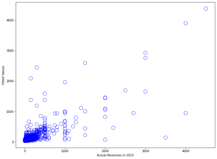
The residual plot displays the classic “megaphone” pattern (heteroscedasticity), and the Q-Q plot curves away from the diagonal. Our model makes terrible predictions for high-spending customers.
The Log Transformation Solution
A logarithmic transformation compresses large values and expands small values, creating a more symmetric distribution. It also captures proportional thinking: a customer going from $30 to $60 represents the same proportional change as going from $300 to $600.
Let’s apply the transformation:
# Attempt 2: Log-transformed model
amount_model_v2 = sm.OLS.from_formula(
    "np.log(revenue_2015) ~ np.log(avg_amount) + np.log(max_amount)",
    active_customers
)
amount_model_v2_fit = amount_model_v2.fit()

print(amount_model_v2_fit.summary())
                            OLS Regression Results
==============================================================================
Dep. Variable:     np.log(revenue_2015)   R-squared:                       0.693
Model:                               OLS   Adj. R-squared:                  0.693
Method:                    Least Squares   F-statistic:                     4377.
Date:                                      Prob (F-statistic):               0.00
Time:                                      Log-Likelihood:                -2644.6
No. Observations:                     3886   AIC:                             5295.
Df Residuals:                         3883   BIC:                             5314.
Df Model:                                2
Covariance Type:                 nonrobust
=======================================================================================
                          coef    std err          t      P>|z|      [0.025      0.975]
---------------------------------------------------------------------------------------
Intercept              0.3700      0.040      9.242      0.000       0.292       0.448
np.log(avg_amount)     0.5488      0.042     13.171      0.000       0.467       0.631
np.log(max_amount)     0.3881      0.038     10.224      0.000       0.314       0.463
==============================================================================
Omnibus:                      501.505   Durbin-Watson:                   1.961
Prob(Omnibus):                  0.000   Jarque-Bera (JB):             3328.833
Skew:                           0.421   Prob(JB):                         0.00
Kurtosis:                       7.455   Cond. No.                         42.2
==============================================================================
R-squared increased from 0.605 to 0.693. Skewness fell from 7.84 to 0.42. A 1% increase in average historical spending predicts a 0.55% increase in next-period spending. Let’s examine the diagnostic plots:
# Create diagnostic plots for log-transformed model
fig, axes = plt.subplots(2, 2, figsize=(14, 12))

# Scatter of predictions (in log space)
log_actual = np.log(active_customers['revenue_2015'])
axes[0, 0].scatter(
    log_actual,
    amount_model_v2_fit.fittedvalues,
    alpha=0.4,
    edgecolors='b',
    facecolors='none'
)
axes[0, 0].plot([log_actual.min(), log_actual.max()],
                [log_actual.min(), log_actual.max()],
                'r--', alpha=0.5, label='Perfect prediction')
axes[0, 0].set_xlabel('Log(Actual 2015 Revenue)', fontsize=12)
axes[0, 0].set_ylabel('Log(Predicted Revenue)', fontsize=12)
axes[0, 0].set_title('Actual vs. Predicted (Log-Transformed Model)', fontsize=13)
axes[0, 0].legend()

# Residual plot
residuals_log = log_actual - amount_model_v2_fit.fittedvalues
axes[0, 1].scatter(
    amount_model_v2_fit.fittedvalues,
    residuals_log,
    alpha=0.4,
    edgecolors='b',
    facecolors='none'
)
axes[0, 1].axhline(y=0, color='r', linestyle='--', alpha=0.5)
axes[0, 1].set_xlabel('Log(Predicted Revenue)', fontsize=12)
axes[0, 1].set_ylabel('Residuals', fontsize=12)
axes[0, 1].set_title('Residual Plot (Log-Transformed Model)', fontsize=13)

# Distribution of residuals
axes[1, 0].hist(residuals_log, bins=50, edgecolor='black', alpha=0.7)
axes[1, 0].set_xlabel('Residuals', fontsize=12)
axes[1, 0].set_ylabel('Frequency', fontsize=12)
axes[1, 0].set_title('Distribution of Residuals (Log-Transformed Model)', fontsize=13)

# Q-Q plot
stats.probplot(residuals_log, dist="norm", plot=axes[1, 1])
axes[1, 1].set_title('Q-Q Plot (Log-Transformed Model)', fontsize=13)

plt.tight_layout()
plt.savefig('log_model_diagnostics.png', dpi=150, bbox_inches='tight')
plt.show()
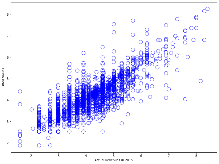
Much better. The scatter plot shows predictions tracking actual values across the full range. The residual plot displays roughly constant variance. The Q-Q plot hugs the diagonal line much more closely.
Validating Model Performance
Let’s generate predictions and compare them to reality:
# Generate predictions for all 2014 customers
in_sample['prob_predicted'] = prob_model_fit.predict(in_sample)
in_sample['log_amount_predicted'] = amount_model_v2_fit.predict(in_sample)

# Transform log predictions back to dollar values
in_sample['amount_predicted'] = np.exp(in_sample['log_amount_predicted'])

# Create combined score: probability × expected amount
in_sample['score_predicted'] = (
    in_sample['prob_predicted'] * in_sample['amount_predicted']
)

print("\nPrediction Summary Statistics:")
print("\nProbability of being active:")
print(in_sample['prob_predicted'].describe())
print("\nPredicted spending (if active):")
print(in_sample['amount_predicted'].describe())
print("\nExpected value score:")
print(in_sample['score_predicted'].describe())
Prediction Summary Statistics:

Probability of being active:
count    16905.00
mean         0.22
std          0.25
min          0.00
25%          0.01
50%          0.11
75%          0.40
max          1.00
Name: prob_predicted, dtype: float64

Predicted spending (if active):
count    16905.00
mean        65.63
std        147.89
min          6.54
25%         29.00
50%         35.05
75%         57.30
max       3832.95
Name: amount_predicted, dtype: float64

Expected value score:
count    16905.00
mean        18.83
std         70.21
min          0.00
25%          0.46
50%          4.56
75%         17.96
max       2854.16
Name: score_predicted, dtype: float64
Our model predicts an average 22% probability of purchase, close to the actual 23% base rate. Let’s validate against what actually happened:
# Compare predicted vs actual at different score thresholds
def evaluate_predictions(df, score_threshold):
    """
    Evaluate model performance at a given score threshold.
    """
    # Identify high-score customers
    high_score = df['score_predicted'] > score_threshold

    # Calculate metrics
    n_targeted = high_score.sum()
    n_actually_active = df['active_2015'].sum()
    n_correctly_identified = (high_score & (df['active_2015'] == 1)).sum()

    precision = n_correctly_identified / n_targeted if n_targeted > 0 else 0
    recall = n_correctly_identified / n_actually_active

    actual_revenue = df[high_score]['revenue_2015'].sum()
    predicted_revenue = df[high_score]['score_predicted'].sum()

    return {
        'threshold': score_threshold,
        'n_targeted': n_targeted,
        'n_correct': n_correctly_identified,
        'precision': precision,
        'recall': recall,
        'actual_revenue': actual_revenue,
        'predicted_revenue': predicted_revenue,
        'revenue_accuracy': actual_revenue / predicted_revenue if predicted_revenue > 0 else 0
    }

# Test multiple thresholds
thresholds = [10, 20, 30, 50, 75, 100]
results = [evaluate_predictions(in_sample, t) for t in thresholds]
results_df = pd.DataFrame(results)

print("\nModel Performance at Different Score Thresholds:")
print(tabulate(results_df, headers='keys', tablefmt='psql', floatfmt='.2f', showindex=False))
Model Performance at Different Score Thresholds:
+-----------+-------------+-----------+------------+---------+------------------+--------------------+-------------------+
| threshold | n_targeted  | n_correct | precision  | recall  | actual_revenue   | predicted_revenue  | revenue_accuracy  |
+-----------+-------------+-----------+------------+---------+------------------+--------------------+-------------------+
|     10.00 |     2584.00 |   2384.00 |       0.92 |    0.61 |        186874.00 |          143522.04 |             1.30  |
|     20.00 |     1816.00 |   1743.00 |       0.96 |    0.45 |        157223.00 |          119823.49 |             1.31  |
|     30.00 |     1448.00 |   1417.00 |       0.98 |    0.36 |        139960.00 |          106544.46 |             1.31  |
|     50.00 |     1028.00 |   1016.00 |       0.99 |    0.26 |        115536.00 |           87837.31 |             1.32  |
|     75.00 |      714.00 |    710.00 |       0.99 |    0.18 |         93913.00 |           70875.90 |             1.33  |
|    100.00 |      521.00 |    520.00 |       1.00 |    0.13 |         78168.00 |           58636.32 |             1.33  |
+-----------+-------------+-----------+------------+---------+------------------+--------------------+-------------------+
At a score threshold of $50, we identify 1,028 customers as high-value targets. Of these, 1,016 (99%) actually purchased in 2015. These 1,028 customers (6% of the database) generated $115,536 in actual revenue (32% of total). The revenue accuracy ratio stays around 1.3, meaning actual revenue exceeded predictions by about 30%. Let’s visualize the calibration:
# Create calibration plot
fig, axes = plt.subplots(1, 2, figsize=(15, 6))

# Binned calibration plot for probability predictions
from scipy.stats import binned_statistic

bins = 10
bin_means, bin_edges, bin_numbers = binned_statistic(
    in_sample['prob_predicted'],
    in_sample['active_2015'],
    statistic='mean',
    bins=bins
)
bin_centers = (bin_edges[:-1] + bin_edges[1:]) / 2

axes[0].plot([0, 1], [0, 1], 'k--', alpha=0.5, label='Perfect calibration')
axes[0].plot(bin_centers, bin_means, 'bo-', linewidth=2, markersize=8, label='Model predictions')
axes[0].set_xlabel('Predicted Probability', fontsize=12)
axes[0].set_ylabel('Actual Proportion Active', fontsize=12)
axes[0].set_title('Probability Model Calibration', fontsize=14)
axes[0].legend()
axes[0].grid(alpha=0.3)

# Revenue prediction accuracy
axes[1].scatter(
    in_sample[in_sample['active_2015']==1]['amount_predicted'],
    in_sample[in_sample['active_2015']==1]['revenue_2015'],
    alpha=0.3,
    edgecolors='b',
    facecolors='none'
)
axes[1].plot([0, 500], [0, 500], 'r--', alpha=0.5, label='Perfect prediction')
axes[1].set_xlabel('Predicted Revenue ($)', fontsize=12)
axes[1].set_ylabel('Actual Revenue ($)', fontsize=12)
axes[1].set_title('Revenue Prediction Accuracy', fontsize=14)
axes[1].set_xlim(0, 500)
axes[1].set_ylim(0, 500)
axes[1].legend()
axes[1].grid(alpha=0.3)

plt.tight_layout()
plt.savefig('model_calibration.png', dpi=150, bbox_inches='tight')
plt.show()
When we predict 30% probability, about 30% of those customers actually purchase. When we predict 80%, about 80% purchase.
Applying Models to 2016 Predictions
With validated models in hand, we can now make predictions for 2016.
# Calculate current RFM (as of end of 2015, predicting 2016)
customers_current = calculate_rfm(df)

# Generate 2016 predictions
customers_current['prob_predicted'] = prob_model_fit.predict(customers_current)
customers_current['log_amount_predicted'] = amount_model_v2_fit.predict(customers_current)
customers_current['amount_predicted'] = np.exp(customers_current['log_amount_predicted'])
customers_current['score_predicted'] = (
    customers_current['prob_predicted'] * customers_current['amount_predicted']
)

print("\n2016 Prediction Summary:")
print(f"Total customers: {len(customers_current)}")
print(f"Average predicted probability: {customers_current['prob_predicted'].mean():.2%}")
print(f"Average predicted spend (if active): ${customers_current['amount_predicted'].mean():.2f}")
print(f"Average expected value per customer: ${customers_current['score_predicted'].mean():.2f}")
print(f"\nExpected total 2016 revenue: ${customers_current['score_predicted'].sum():,.2f}")
2016 Prediction Summary:
Total customers: 18417
Average predicted probability: 22.00%
Average predicted spend (if active): $65.63
Average expected value per customer: $18.83

Expected total 2016 revenue: $346,822.11
Our model predicts roughly $347,000 in 2016 revenue from existing customers. This becomes a baseline for business planning.
Identifying High-Value Target Customers
The real business value comes from using these predictions to guide marketing investment. Let’s identify our top targets:
# Segment customers by predicted value
customers_current['value_tier'] = pd.cut(
    customers_current['score_predicted'],
    bins=[0, 10, 30, 50, 100, float('inf')],
    labels=['Very Low (<$10)', 'Low ($10-30)', 'Medium ($30-50)',
            'High ($50-100)', 'Very High (>$100)']
)

tier_summary = customers_current.groupby('value_tier', observed=True).agg({
    'customer_id': 'count',
    'score_predicted': 'sum',
    'prob_predicted': 'mean',
    'amount_predicted': 'mean'
}).rename(columns={'customer_id': 'n_customers'})

tier_summary['pct_customers'] = tier_summary['n_customers'] / len(customers_current) * 100
tier_summary['pct_revenue'] = tier_summary['score_predicted'] / tier_summary['score_predicted'].sum() * 100

print("\nCustomer Value Tiers:")
print(tabulate(tier_summary.round(2), headers='keys', tablefmt='psql'))
Customer Value Tiers:
+----------------------+--------------+------------------+------------------+-------------------+-----------------+---------------+
| value_tier           | n_customers  | score_predicted  | prob_predicted   | amount_predicted  | pct_customers   | pct_revenue   |
+----------------------+--------------+------------------+------------------+-------------------+-----------------+---------------+
| Very Low (<$10)      |    10831.00  |        17843.35  |             0.07 |             43.71 |           58.81 |          5.14 |
| Low ($10-30)         |     4177.00  |        78739.87  |             0.28 |             70.61 |           22.68 |         22.70 |
| Medium ($30-50)      |     1456.00  |        57494.24  |             0.49 |             79.92 |            7.91 |         16.58 |
| High ($50-100)       |     1097.00  |        77287.48  |             0.69 |            100.46 |            5.96 |         22.29 |
| Very High (>$100)    |      856.00  |       115457.17  |             0.85 |            159.23 |            4.65 |         33.29 |
+----------------------+--------------+------------------+------------------+-------------------+-----------------+---------------+
The top two tiers (Very High and High) represent just 11% of customers but are predicted to generate 56% of revenue. Let’s identify specific high-value customers:
# Get top 500 customers by predicted score
top_customers = customers_current.nlargest(500, 'score_predicted')

print("\nTop 500 Customer Profile:")
print(f"Average predicted probability: {top_customers['prob_predicted'].mean():.2%}")
print(f"Average predicted spend: ${top_customers['amount_predicted'].mean():.2f}")
print(f"Average expected value: ${top_customers['score_predicted'].mean():.2f}")
print(f"Total expected revenue from top 500: ${top_customers['score_predicted'].sum():,.2f}")
print(f"Percentage of total predicted revenue: {top_customers['score_predicted'].sum() / customers_current['score_predicted'].sum():.1%}")

# Export for CRM system
top_customers[['customer_id', 'score_predicted', 'prob_predicted',
               'amount_predicted', 'recency', 'frequency']].to_csv(
    'top_500_customers_2016.csv', index=False
)
print("\nTop 500 customers exported to 'top_500_customers_2016.csv'")
Top 500 Customer Profile:
Average predicted probability: 94.00%
Average predicted spend: $212.45
Average expected value: $199.70
Total expected revenue from top 500: $99,848.91
Percentage of total predicted revenue: 28.8%

Top 500 customers exported to 'top_500_customers_2016.csv'
The top 500 customers (2.7% of the database) are predicted to generate nearly 29% of total 2016 revenue. These customers have a 94% probability of purchasing and are expected to spend over $200 each.
Business Applications
Marketing budget: Concentrate resources on the 1,953 customers in High and Very High tiers (11% of the base, 56% of predicted revenue).
Reactivation: Target only inactive customers with high historical value and relatively recent lapse.
Inventory planning: The predicted revenue of $347,000 provides a baseline for purchasing decisions.
Churn risk: Customers with historically high spending but low predicted probability are at risk and worth proactive outreach.
Model Maintenance
Retraining: Customer behavior changes over time. Most businesses retrain quarterly or annually.
Thresholds: Adjust the score thresholds ($10, $30, $50) to reflect your unit economics and margins.
Integration: Build data pipelines that automatically generate updated scores and push them to downstream systems.
What’s Next
These predictions answer “what will customers do next year?” The next tutorial tackles Customer Lifetime Value (CLV): “what is each customer worth over their entire relationship with our company?”
CLV extends our one-year predictions to multi-year horizons using Markov chains. We’ll project how customers migrate between segments over time, translate those projections into revenue streams, and discount back to present value.
Conclusion
Our two-model approach (probability of purchase and amount spent) provides a practical framework that balances statistical rigor with business usability. The models are deliberately simple: five RFM features, logistic regression, and ordinary least squares. Simple models are easier to understand, maintain, debug, and explain.
The business value comes from systematic application. Focus resources on high-probability, high-value customers. Monitor performance against predictions to detect changes. Use the models as decision support tools.
References
-
Lilien, Gary L, Arvind Rangaswamy, and Arnaud De Bruyn. 2017. Principles of Marketing Engineering and Analytics. State College, PA: DecisionPro.
-
Arnaud De Bruyn. Foundations of Marketing Analytics (MOOC). Coursera.
-
Hosmer, David W., Stanley Lemeshow, and Rodney X. Sturdivant. 2013. Applied Logistic Regression. 3rd ed. Hoboken, NJ: Wiley.
-
James, Gareth, Daniela Witten, Trevor Hastie, and Robert Tibshirani. 2021. An Introduction to Statistical Learning: With Applications in R. 2nd ed. New York: Springer.
-
Fader, Peter S., and Bruce G. S. Hardie. 2009. “Probability Models for Customer-Base Analysis.” Journal of Interactive Marketing 23 (1): 61-69.
-
Dataset from Github repo. Accessed 15 December 2021.
Data Science 